Standardize "Find a FamilySearch Center"

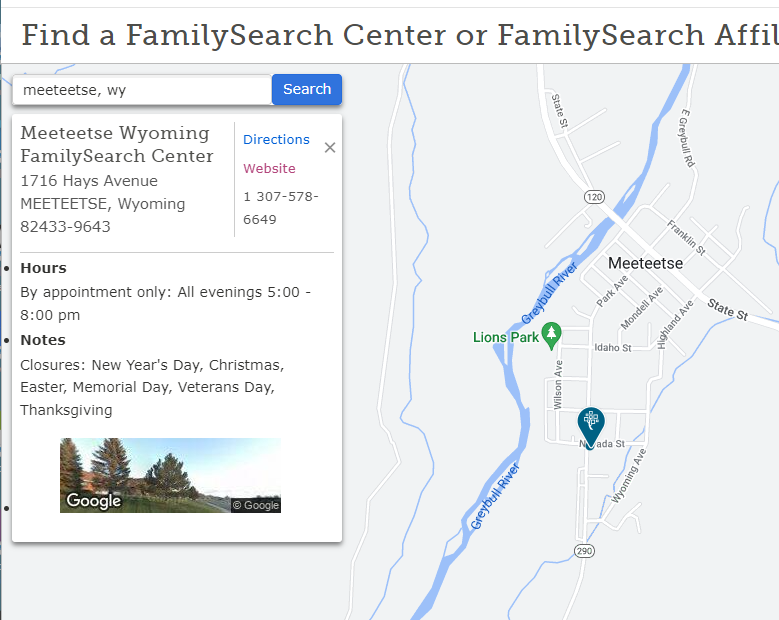
I did see other discussions about the link on the "Contact Us" page for North America, and agree to some extent with how bland the map pin designating the FSC on the map page is when you search for a FSC using the "Find a Center" search box:
I can click on the "Website" button and it takes me to the WIKI page with all of the information about my FSC.
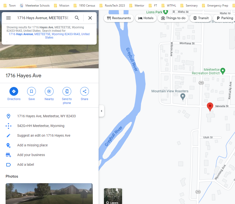
But if I am signed in to FamilySearch.org, go to the "Contact Us" page, and click on the listing under "Center near me" which would seem to be the default map, I get a map from Google Maps:
The map pin is a nice bright red color, easy to see, but I don't get the FSC information (hours of operation, phone number, etc.,) and the link to the WIKI page is not included.
My suggestion is to incorporate the suggestions about making the map pin more visible and that you take the guest to the same page whether you use the "Find a Center" search box or click on the "Center near me" link.

