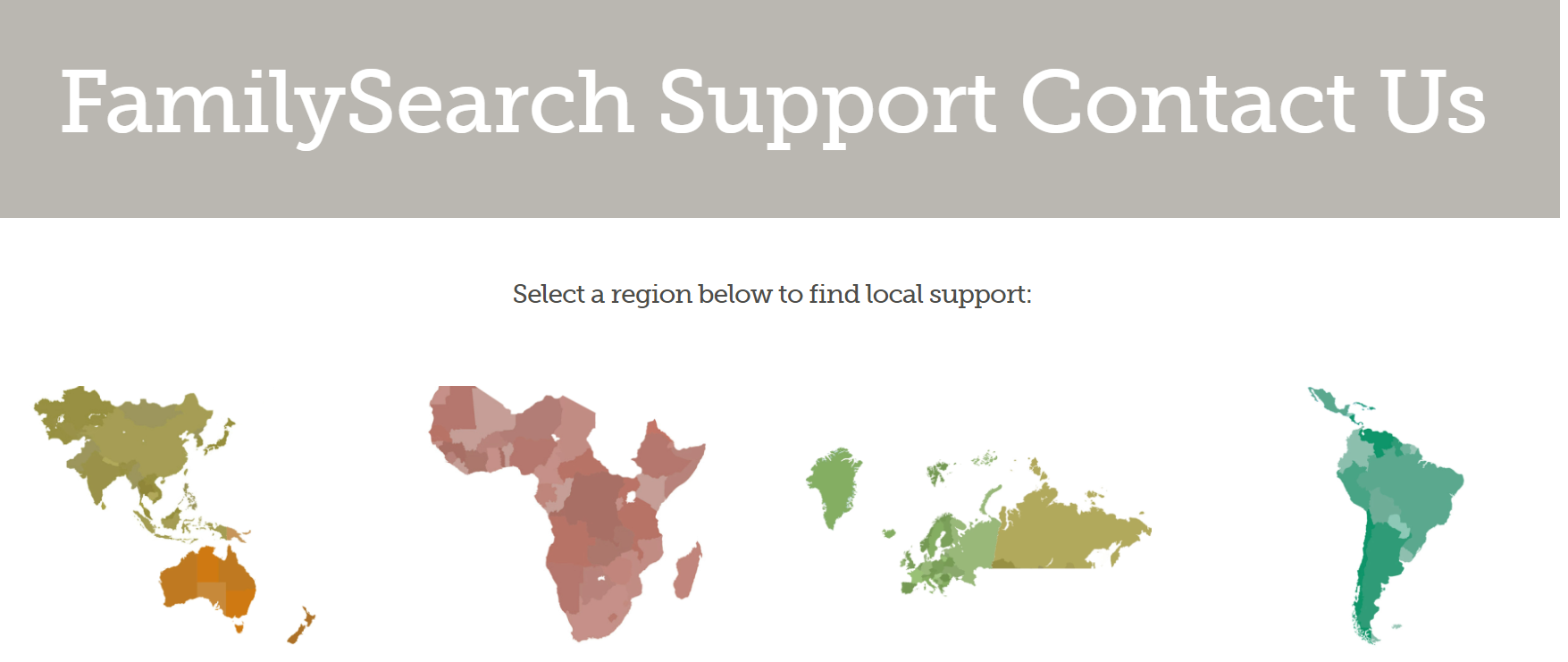
Contact Us page is not straightforward to use

When clicking on Contact Us a page opens with maps representing the areas of operation. The maps are deceptive and not recognisable. Many people click on the Europe area thinking it looks like North America. It doesn't look like either!
I do not see the title Europe until I scroll down slightly. I work on online consultations, most of which seem to be from patrons in the US who think they are clicking on their homeland.
Could the map outlines be improved so that they better represent their area?
Many thanks
Comments
-
. . ."scroll down slightly" ??
On my laptop - I see all 7 images on a single screen clearly identified by name.
and for Europe Greenland, Scandinavia and Spain make it pretty recognizable.
0 -
I must have a smaller screen size than you then.
 0
0 -
On my screen I see the above as a first row, then there is a second row which includes "North America and Canada" as the last item. The seven areas are all labelled
1