Commentary on new layout for display of sources with suggestions for improvement

Here is the new layout on a 13" Macbook using Safari 14.0:
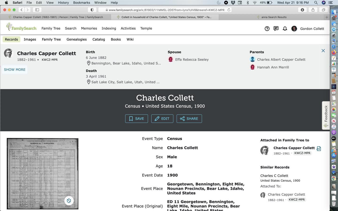
I like that the basic information about the person I came to this record from is still present, that it has a slightly different background color to separate it from the source itself, but I really like that one can still dismiss it since it takes a fair amount of room on the page. Getting rid of that information lets me see a lot more of the source:

I like that the information on who the record is attached to is given more prominence, making it easier to see if it is attached to the right person. I'm neutral to the fact that the image is now on the left side of the page instead of the right. This does give more room and prominence to the Similar Records. I'm also pretty neutral to the font change as long as it is legible, which this is. People tend to complain a lot about font style changes but then adjust in a week or two and forget it ever looked any different. I like having the label and the information in different weights of font to make it easier to see which is which.
(I'm going to split this up so I don't lose it all when posting. More likes and a major dislike below)
Comments
-
I really like that the information on the associated people in the record can be viewed without leaving the source and that it can be either closed:

Or opened:

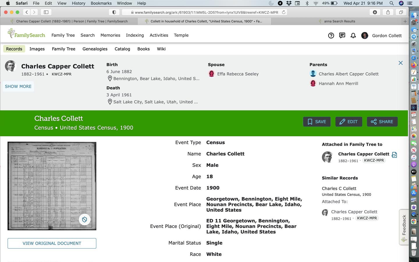
One other item I really like is that the header for the source remains at the top of the page and gets smaller as I scroll down the page:
 0
0 -
Now onto what I really, really do not like at all, that big, wide, harsh, distracting banner that makes it hard to see anything else on the page:

Just having this the smaller size it when when scrolled to the top of the page would be an improvement:

Even better would be to soften it some to better match the tone of the rest of the page:

Maybe even a color?
That choice is too dark for the overall style of the page. Going lighter would be better which would require going to black rather than white for the banner text:

Thank you for your continued work on improving Family Search. But please do something about that banner.
2 -
HATE the new displays. What used to fit easily on one screen now requires scrolling and scrolling. Go back or at least give us a way to set a preference to the old way.
3 -
I use my cell a lot, and now when Ancestry sends me to a source to view the original, I can't see it, just a lot of information that tells me no more than I had before (and Way to big and in your face!). What I really want to see is the original. I saw some have posted what it looks like on their laptops, so I'll try to see if I can see more there. But, I don't know why it's gone when I used to be able to see the original docs near the bottom of the page. Maybe it's user error, but I'd really like to know how to see the docs quickly, as before. When I touch different links, to try to find the docs, one takes me to a page where I'd have to input my relative's info all over again. I'd appreciate any help with this.
0 -
I like your idea to have a way to set a preference to view the information the "old way".
0