Show different icon if Search Results record is attached to your person instead of someone else
The Search Results have three icons to the right of each record; View and optionally Attached and/or Image. The Attached icon indicates that the record is attached to someone. It can be your person or someone else. If it's your person you can skip it but if it's someone else it still might belong to your person or the person might be a duplicate of your person.
The only way to find out who it is is to open it. This is tedious if there are a lot of records attached. It would be very helpful if there were two icons, one showing it's already attached to your person and another that it's attached to someone else.
Comments
-
How exactly would Search-Records determine who you consider to be "yours"?
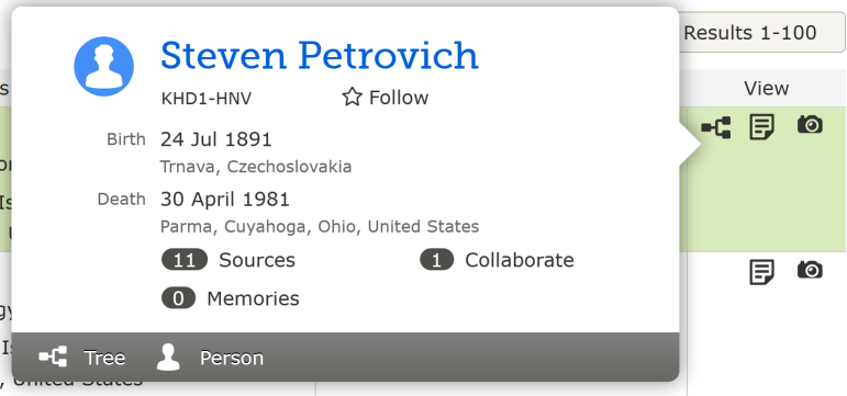
Also, you don't need to open anything to see who it's attached to: just click the tree-stublet icon to bring up a person summary card. In most cases, this is plenty to determine whether that's the person you're working on or not.
1 -
This would work and could be very helpful if one entered the search from a person's detail page and had the "bread crumb" listing at the top of the page. When I'm working on a large family with multiple indexed records that all have a couple of duplicates existing in Family Tree and the father is listed 50 times with all records having the tree icon but each one representing another duplicate of the father, it would really be helpful to see which I have already merged together into the final copy of the father and which are duplicates I haven't merged in yet. I tend to click on the pedigree icons and look at the summary cards over and over again before I can conclude that I really haven't missed one.
That is, to have some difference in the icon if the person listed in the header was the person represented by the tree icon.
This would not be possible if one started the search from the main search pane.
The icon would have to revert to normal if the header was closed, and the header would have to behave itself and be the person the search was actually for. I rarely use the FamilySearch link on the detail page so I'm not sure how well it actually works these days. I find I have better luck with searches if I fill in all the information myself rather than have the program fill it in for me. Also, in the past, many updates ago, I noticed that this header would get stuck on the wrong person. I haven't been paying attention to see if it works the way it is supposed to now.
Maybe just an inversion of colors would work:
Picture a list of not two, but twenty correctly matching records, five of them merged together, fifteen of them needing to be, all with pedigree icons. Merge ten more, then after getting confused by all the icons, trying to find the five that still need to be merged in, and clicking the already merged ones over and over and over again to check the summary card pop up.
1 -
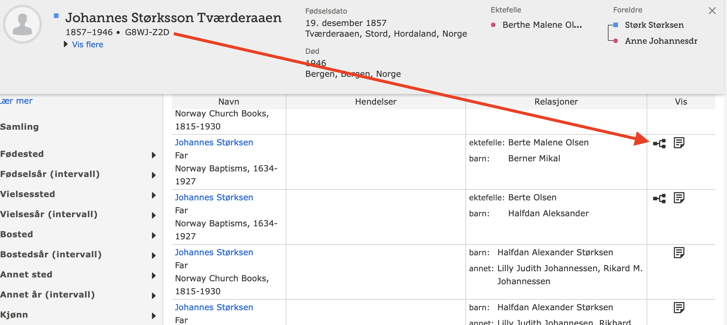
More in keeping with the current style of the Search results page and based on the assumption that since I am coming from a person's Family Tree page and have already confirmed that all the sources on that person are really for that person and assuming that it would be easy to add in programming terms and would not slow down processing by any significant amount, it would be very nice to have included a comparison of the ID in the header with the ID of the linked person shown by the pedigree icon and if the IDs are the same show this by marking the pedigree icon:
Here I would never have to click on any green icon because I already can see that they are attached to the individual in the header. As stated previously, all the green would have to disappear after any action that removed the header or from any searches from the main search page since those do not have the header.
0


