Difference in Formatting between Ideas and Q & A

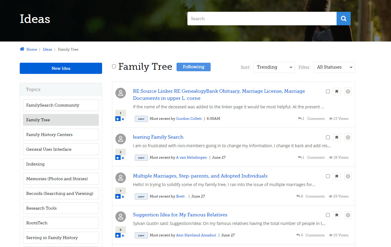
In the community there is a difference in formatting between Ideas and the Q & A section that in my opinion makes Q & A more difficult to use. In the Ideas section along the left hand side is a listing of all of the different groups (subgroups) under Ideas. This list is actually links and makes it easy to jump from one group to another - See the figure below
However, when you go to the Q & A the listing of groups (subgroups) is not included so that the user has to back up or got to the main Q & A screen to get to another group in the area. It would seem that the same formatting could be used in both places to make them consistent. This difference can be confusing to users as well as making the Q & A section more difficult to use - See the image below:

Why not make them the same for consistency and ease of use?
Comments
-
@gasmodels . Wonderful idea. Thank you for taking time to detail out the suggestion. I'll take this back to the team for discussion.
0
