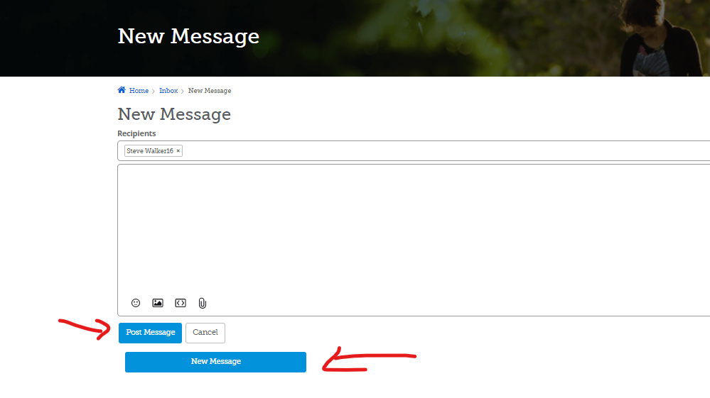
Can the New Message button on the New Message page be changed?
I find myself always clicking the larger New Message button when I am completing a message instead of the smaller Post Message button. That tells me that the New Message button is wrong somehow. Possible changes:
- Make it the same size as Post message and put it in-line with Post Message and Cancel buttons
- Move the New Message button to the top right-hand of the page, just as it appears on the main Messages pages. Perhaps even add the words 'Create another message.'
- Remove the New Message button altogether...because I'm already writing a new message, why would I leave this one half-done and go to another one? The New Message button shows up on the upper right-hand when I finish sending it a message, so I can easily go on to another new message once I've completed this one. (I vote for this one!)
In addition, can we change the words 'Post Message' to 'Send Message' as shows on the bottom of the Message page? Folks are getting confused as to whether this is a private message or a public post. Changing the words to 'Send Message' clarifies that this is going to the persons listed and no one else. (Even if technically the message is 'posted' in the same manner as a discussion post.)
Comments
-
@Anne LoForte Willson Great suggestion. Thanks for sharing such detailed suggestions. I'll mark this as under consideration.
1 -
Just in case anyone wanders by this idea. It has been implemented. There is no longer a New Message button showing when you are writing a new message.
0


