Please make it easier to see that I have messages waiting for me.

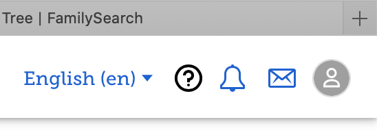
The dot in the upper right corner of the screen is so tiny that I don't usually notice that I have a message waiting. (I think the dot is red, but a color blind person like myself has a hard time seeing red if it is a very small dot or thin line.)
Thanks.
Comments
-
Gary
'Yes' ...
It WAS much more prominent when the was a "Number" in that 'Red' "Dot".
It is ashame that 'FamilySearch' DISPENSED with that "Number" in that 'Red' "Dot".
Hopefully, that "Number" in that 'Red' "Dot" can be REINSTATED; as, with a "Number" (ie. for the number of 'Messages") in that 'Red' "Dot" (even, just ONE), it would not matter if one was 'Colour-Blind', as the "Dot" WOULD (most likely) be BIGGER; as, it contains something inside.
Just my thoughts.
Brett
0 -
Suggestion for modification that fits style of the page somewhat.
No Notifications:
New Notifications:
 0
0 -
Gordon
There appears to be some 'crossed wires' here ... that needs some clarity ... from the poster
Rightly or wrongly, I was originally responding under the premise that the poster was referring to the 'Message' of "User Messaging" in 'FamilySearch'; as, the "Topic" (ie. aka: "Category") to which this post was posted was "Family Tree", rather than that of "FamilySearch Community".

Whereas ...
You have clearly responded under the premise that the poster was referring to the "Community.FamilySearch" Forum of 'FamilySearch'.
And ...
As an aside ...
Your 'mockup' for "Notifications" would certainly be another acceptable option.
But ...
That said ...
As you can 'see', all-be-it STILL rather SMALL ...

The "Indicator", for "Messages", in the "Community.FamilySearch" Forum of 'FamilySearch', is every so slightly BIGGER, with a Numeric Indication (of the Number of 'Messages'); as opposed to, that in "User Messaging" in 'FamilySearch', which DOES NOT have (ie. NO LONGER ) has a Numeric Indication (of the Number of 'Messages'), like is used to.
As I suggested ...
For 'Message' of "User Messaging" in 'FamilySearch' ...
Hopefully, that "Number" in that 'Red' "Dot" can be REINSTATED; as, with a "Number" (ie. for the number of 'Messages") in that 'Red' "Dot" (even, just ONE), it would not matter if one was 'Colour-Blind', as the "Dot" WOULD (most likely) be BIGGER; as, it contains something inside.
Just my thoughts.
Brett
0 -
Yep, I was staring at the top right corner here where the red dots on those icons aren't very big, either.
0 -
Gordon
I totally agree ... they could be BIGGER ...
And, your 'mockup' (and, possibly with a Numeric Indicator) would certainly be an acceptable alternative.
Brett
0