Need to improve navigation to and within groups.
I’ve spent a few day now in this new community and do see nice potential in it. However, I am finding that navigating though it is very frustrating and clumsy. It seems to take a lot of clicks to get anywhere and there seems to be a lot of going around in circles. Maybe I’m just doing something wrong and someone here can point out better ways of getting where I want to go.
It does seem that this should be a self-contained web community and so while I know that some of the problems I am going to illustrate can be circumvented by using browser controls such as right-clicking and the back button, these should not be necessary.
Here is what I am seeing when going to one the of groups I am in to read and answer questions.
When I come to the community and sign in, I come to the Welcome page and can return here at any time via the Home button.
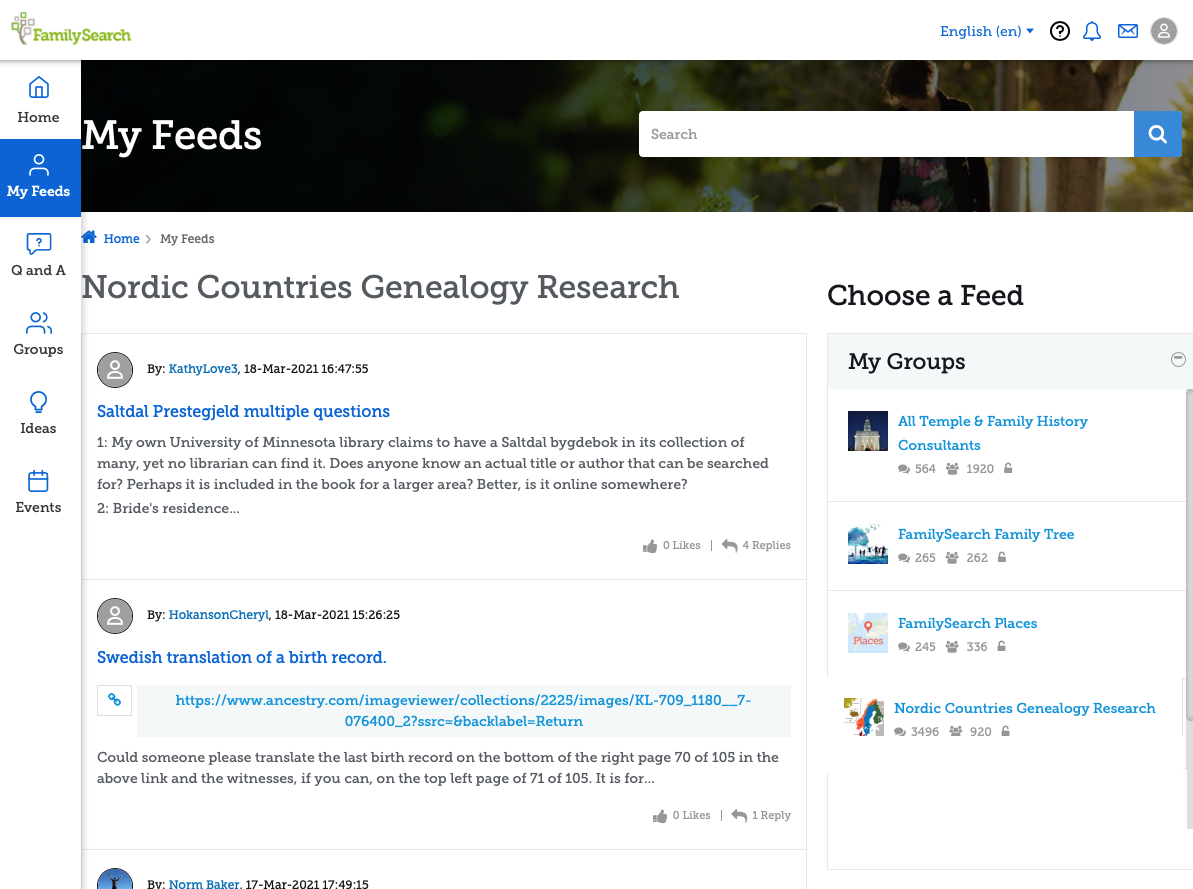
From here I click on My Feeds to come to this page:
which is a duplicate of the bottom half of the page I was just on with the addition of the Choose a Feed in the right hand column. This is the first instance of leaving a page and seeming to be right back on it. The first few times coming here, I’ve felt impelled to scan through the entire “Community Hub” section again to see if this was actually a different set of posts. It isn’t. Now it is just annoying to have all those same posts I just saw take up most most the page again.
Now I have to click again to open either My Groups, Topics I Follow, or My Bookmarks. Since this page was suppose to show my My Feeds, it would be much more efficient to eliminate the Community Hub section here and have all three tabs already open and waiting for me, like this:
Then I would be where I expected the first click to take me instead of being required to now click on My Groups and click on a group name to bring me here:
This is a bit strange, because instead of taking me to the group as I would have expected, it puts the group inside the My Feeds page. But at least I am now here and can start looking at topics.
I click on the first one to come to the post and read through it. Here I have left the My Feeds page and am actually in the Group page.
The main problem here is that at first glance, there is no way to get to the second question. I do now appear to be in the Group section but clicking on the header does nothing. On the site trail just below the main header I can click on Home, but that takes me completely back to the home page. I can click on Groups but thats me to the main Groups section, specifically to the Featured Groups page where I have to click on the My Groups link to open that page from which I need to again click on the group I want to be on again. Then I need to scroll down to find and click on the next question. That is four clicks every time I want to move on to the next question.
I would have expected the third item on the trail, "Nordic Counties Genealogy Research" to take me where I wanted to go, but it is not a link.
My other obvious option is to click on My Feeds again, click on My Groups again, and click on the group I want to view again. This is where I get this feeling of going around in circles when trying to use the community.
(I said I was not going to cover external browser controls, but let me toss in here that the obvious answer, just use the browser back command, does not work, at least in Safari. Clicking on it brings up the list of questions for about half a second and then goes back one more step the the My Feeds page showing the Community hub and Choose a Feed. So taking that route to look at the next question goes click back button, wait for the screen to flash a couple of times, click on My Groups, click on the group I want to view, click on the next question. Once again I am going in circles.)
I did finally see that if I scroll past the initial post, past all the comments, past the post comment box, there at the bottom is “Home • Nordic Countries Genealogy Research” and this time, unlike at the top of the past where it is obvious, the group name is a link to the group.
It would be much more efficient to have the initial click on a group under the My Groups tab really go to the group, not just insert a selection of the group into the My Feeds page and to have a way to efficiently move on to the next question without needing to circle through three or four other pages or scroll to the very bottom of the page.
(To be Continued)
Comments
-
The next item that I would like to see improved is to eliminate the three pages that are basically the same for viewing lists of posts without removing the best of each.
As stated above, when I first click on a group name, I get the five most recent questions with the first couple of lines of each:
This is great because what is displayed is usually enough to let me see if it is a question I can or want to try answering. But it is only five questions which is not very many.
At the bottom is a View All link. Clicking that actually brings me to the real group page:
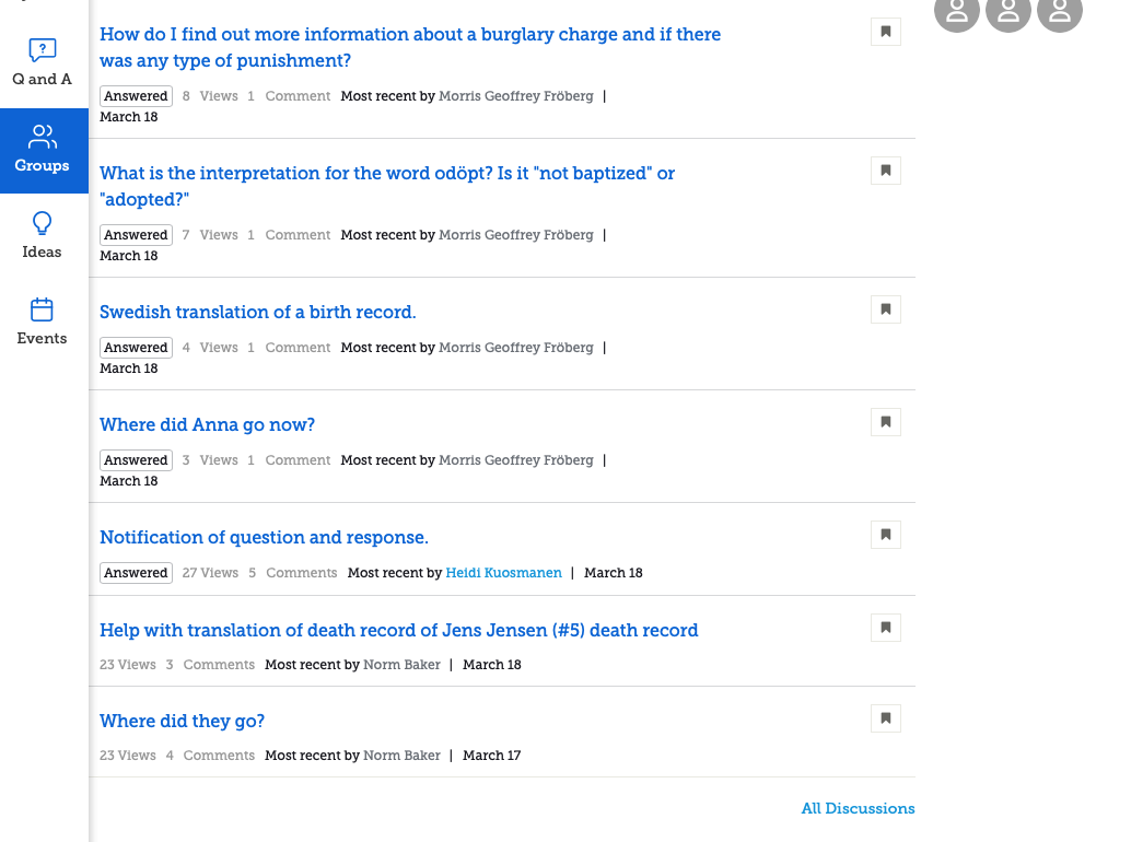
Now I get ten posts, which is not Viewing All as claimed and I lose that short summary. At the bottom is another All Discussions link. Clicking on does finally allow one to View All but removes all the other features of the group and still does not have the initial lines of the posts to allow one to see that they are about.
Why not have the initial click on the group name bring me to a combination of all three pages which would be the actual group page, have summaries of the questions, and have the links for jumping between pages like this:
This still needs some efficient way to move from one question to the next. At least here the back button does work properly. So if when I first come to the community and am at the home page, if I click five times and scroll to the bottom of pages a couple of times to get to that final All Discussions page, I can work efficiently.
I guess I could just set a browser bookmark for these Discussion pages for each of the groups I am interested and just bypass everything else in the community but that seems to avoid the entire point of this being a community.
0 -
I'm with you on this one Gordon Collett!
0 -
(Continued - I'm sure I posted this once, but it has disappeared.)
The next item that I would like to see improved is to eliminate the three pages that are basically the same for viewing lists of posts without removing the best of each.
As stated above, when I first click on a group name, I get the five most recent questions with the first couple of lines of each:
This is great because what is displayed is usually enough to let me see if it is a question I can or want to try answering. But it is only five questions which is not very many.
At the bottom is a View All link. Clicking that actually brings me to the real group page:
Now I get ten posts, which is not Viewing All as claimed and I lose that short summary. At the bottom is another All Discussions link. Clicking on does finally allow one to View All but removes all the other features of the group and still does not have the initial lines of the posts to allow one to see that they are about.
Why not have the initial click on the group name bring me to a combination of all three pages which would be the actual group page, have summaries of the questions, and have the links for jumping between pages like this:
This still needs some efficient way to move from one question to the next. At least on the full Discussions page the back button does work properly. So if when I first come to the community and am at the home page, if I click five times and scroll to the bottom of pages a couple of times to get to that final all Discussions page, I can work efficiently.
I guess I could just set a browser bookmark for these Discussion pages for each of the groups I am interested in and just bypass everything else in the community but that seems to avoid the entire point of this being a community.
0 -
For the first couple of days from this revised Community section going "live" there were responses from FamilySearch employees to questions and comments on issues like this. It is very disappointing that their presence has been withdrawn so quickly, at a time we need clarification about whether changes will be made to improve this forum, or whether this really is the "finished product".
A very similar situation occurred when Family Tree had its last major update. Extremely good attention to our queries for a short period of time (they were even allocated case numbers), then all help from the FamilySearch employees who had been providing responses disappeared - literally overnight.
Please don't let this happen again. Users of this forum need help and advice only FamilySearch employees can provide - so do not desert us so soon!
0 -
Thanks for your cogent analysis, Gordon. Interesting to see that I'm just as confused without using the MyFeeds facility. Not sure what that means...
0


