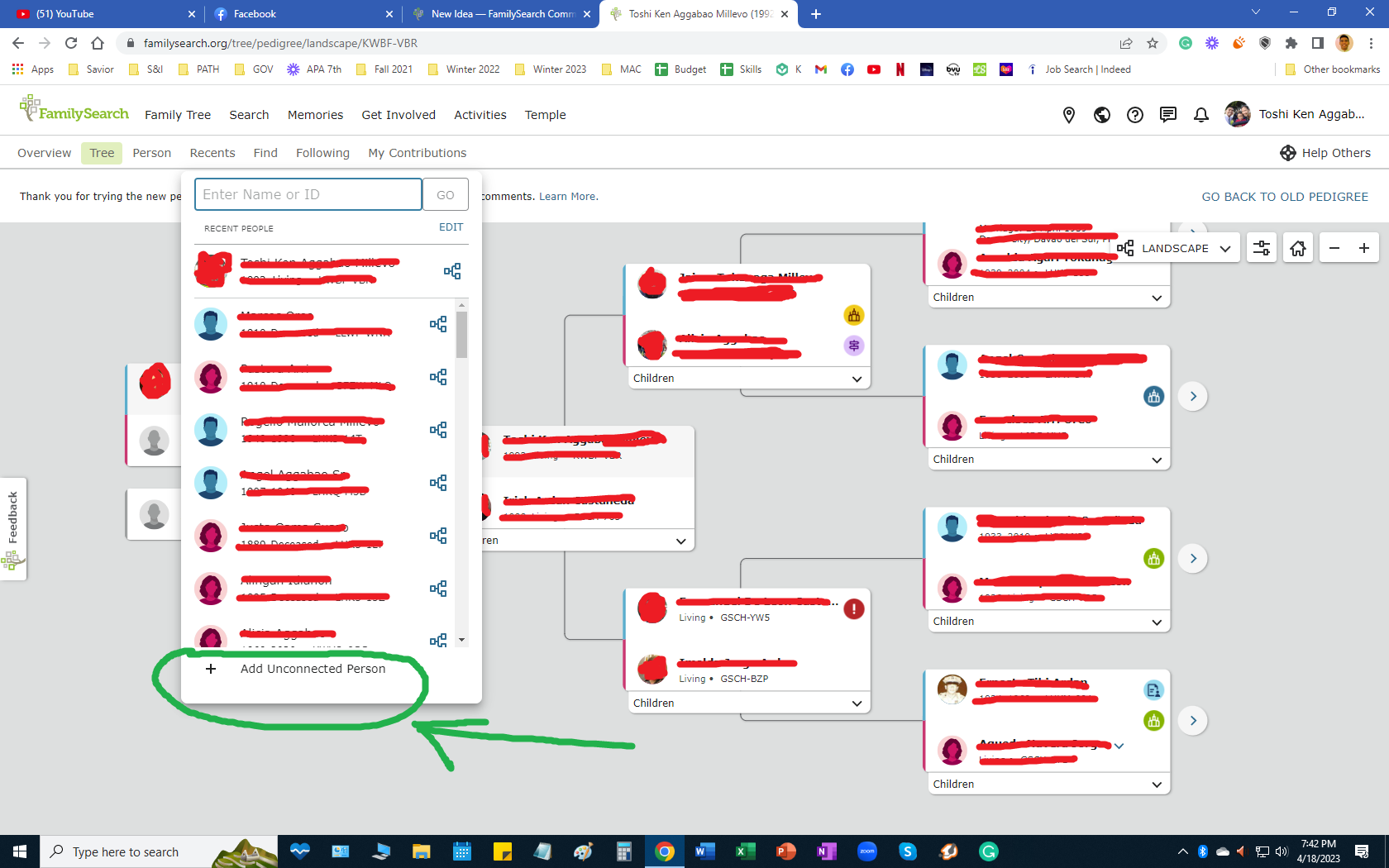
Separate the "Add Unconnected Person" from the "Recents" Tab
Hello,
I suggest that we add a specific section or portion for the "Add Unconnected Person", instead of putting it on the "Recents" tab.
I believe that if we can separate this from the "Recents" tab, it will become more accessible and easy to use especially as we add names of those who we believe to be our ancestors but don't know the exact descendency or link.
Thank you!
Sincerely,
Toshi
Comments
-
I like it. Most people aren't even aware you can create unconnected people.
0 -
It's unclear what exactly you're suggesting: where would you put it instead?
I suspect that FS does not want this feature to be particularly easy to find. People unclear on concept would use it to litter the tree with disconnected duplicates. Besides, once you learn its location, it's not hard to find at all. It's not hidden behind multiple clicks and popups, like some other things on FS. (Try figuring out who among your relatives has a divorce entered, for example.)
Also: it's much easier to find on FS than it is on Ancestry. 😐️ (Because it doesn't exist there. You can't add an unconnected person on Ancestry: you have to either start a new tree, or add a connected profile and then disconnect it.)
2 -
@Julia Szent-Györgyi It is currently found in a menu (recents) that is completely unrelated to the function of adding a new person. Person pages are where you add people. You add parents, spouses, children, and now other types of relationships. Why not put this feature in the Tools area and have it displayed on every person page? It still might be hard enough to find that most novice users won't notice it.
0 -
I totally agree it should not be under Recents, which is a wholly different function. Given the weird way that (one of) the Recents screen is actually a pop-up, even though it's a proper menu option, I suspect it's a case of "Oh we forgot to add Recents - err, and we forgot to add Add Unconnected Person". Sorry @Julia Szent-Györgyi - I suspect your logic of "FS does not want this feature to be particularly easy to find" is too clever for what happened. (Though you are right about Ancestry - the number of times I've added a child to a couple just to disconnect them... Sigh...)
If it were me, I'd put Add Unconnected Person as a suboption under menu FamilyTree / Person. That menu FamilyTree / Person currently is another poor bit of User Interface design. What it actually means (I think!) is "View Current Profile". But that's not remotely obvious from the bare word "Person". (Especially annoying if you've navigated miles away from the previously selected profile in the tree but revert back there...) I suspect it's another relic from the FS guiding principle of UI design that users can't cope with than one word (check it out - other than "My Contributions", "Get Involved", "Research Wiki" and "Family Tree", they're all one word until you reach "Activities"...)
0
