Aligning information when merging duplicates
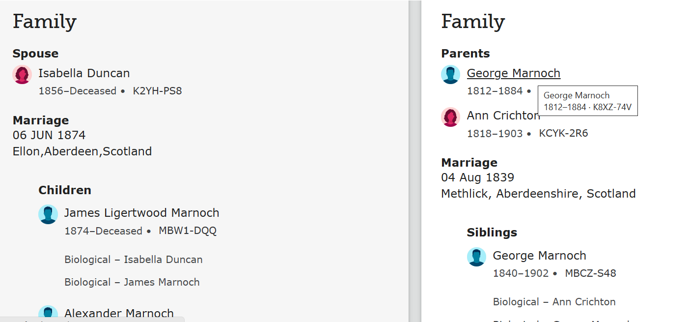
Sometimes, people get confused when reviewing information in the first step of merging. In the above example, people are puzzled when comparing the marriage date thinking one individual was married in 1874 and the duplicate was married in 1839. Of course, what's really going on here is that the one individual has a spouse but no parents, and the duplicate has parents but no spouse.
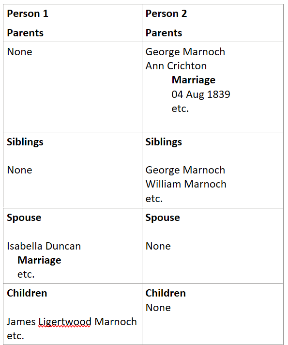
It might be easier if the information was presented as follows:
Aligning common data fields from both individuals makes it easier to compare and confirm the merge makes sense.
Comments
-
"Aligning common data fields from both individuals makes it easier to compare and confirm the merge makes sense."
This would be incredibly helpful. Sometimes the number of"children" or "siblings" is so large, that it is necessary to scroll up and down the page to compare any listed "parents" or "spouses". The fields are so out of alignment, it is annoying.
0

