Fix false tooltip in search results
When a search result has an associated Record Hint on a Family Tree profile, there is a "portrait" icon (circle above a half-circle) at the right of the entry. Clicking the icon goes to Source Linker with the index entry lined up with the suggested Tree match. (Other than the button-like appearance, it acts like an old-fashioned basic link: left-click hijacks the results list, right-click allows opening it in a new tab.)
I'm not sure how to succintly describe this behavior in a tooltip, but the actual tooltip is Definitely Not It.
"View possible tree matches" implies, first of all, that there could be more than one, and that if so, the result of clicking will show all of them. It also strongly implies that the result of clicking will take you somewhere in Family Tree, where you can look at full profiles, not just Source Linker's grudging summaries. In other words, this tooltip is entirely false. That's not at all what clicking that icon will do.
Given that Source Linker is really not the place to evaluate an indexed record's applicability to a Tree profile -- the necessary information simply isn't visible there -- it seems to me that the best and easiest solution is to make the icon actually do what the tooltip says (after removal of the plural): have it open the profile that has the hint.
In summary, my suggestion: change that tooltip to read "View possible tree match" instead of the current plural, and have the button/link actually do that, by going to the Tree profile, not to Source Linker.
Comments
-
I agree this would be preferable. Just a couple of things to point out. If that icon jumps to the person page, the search result is right there on the detail page as a source hint. It also gives the user the opportunity to evaluate all the other record hints on the person to help evaluate if the current hint is correct. Also, the hinting engine is often a much better searcher than your average user and being taken to all those other hints can save a lot of time since the user does not have to try and come up with the correct search criteria to find those records.
Here is the first random example I pulled out of a record collection I work in a lot:
1 -
I spoke with a friend today about this, who mentioned that she doesn't like going to profile pages for all and sundry, because it makes people "fall off" of her Recents list too fast. I told her about editing that list, which might reduce her reluctance a little, but what she said gave me an idea: what if left-clicking that portrait icon produced the person summary card instead of the profile page? The same could apply to the tree-stublet icon for already-attached records, allowing a "lower-investment", quick way to check on hints and attachments.
This would have the desirable side effect of regularizing the behavior of those icons: instead of behaving like links half the time and like buttons the other half of the time (to the point where I can never keep track of what will hijack the page versus what will open a sidebar), all of the button-looking things would behave like buttons.
0 -
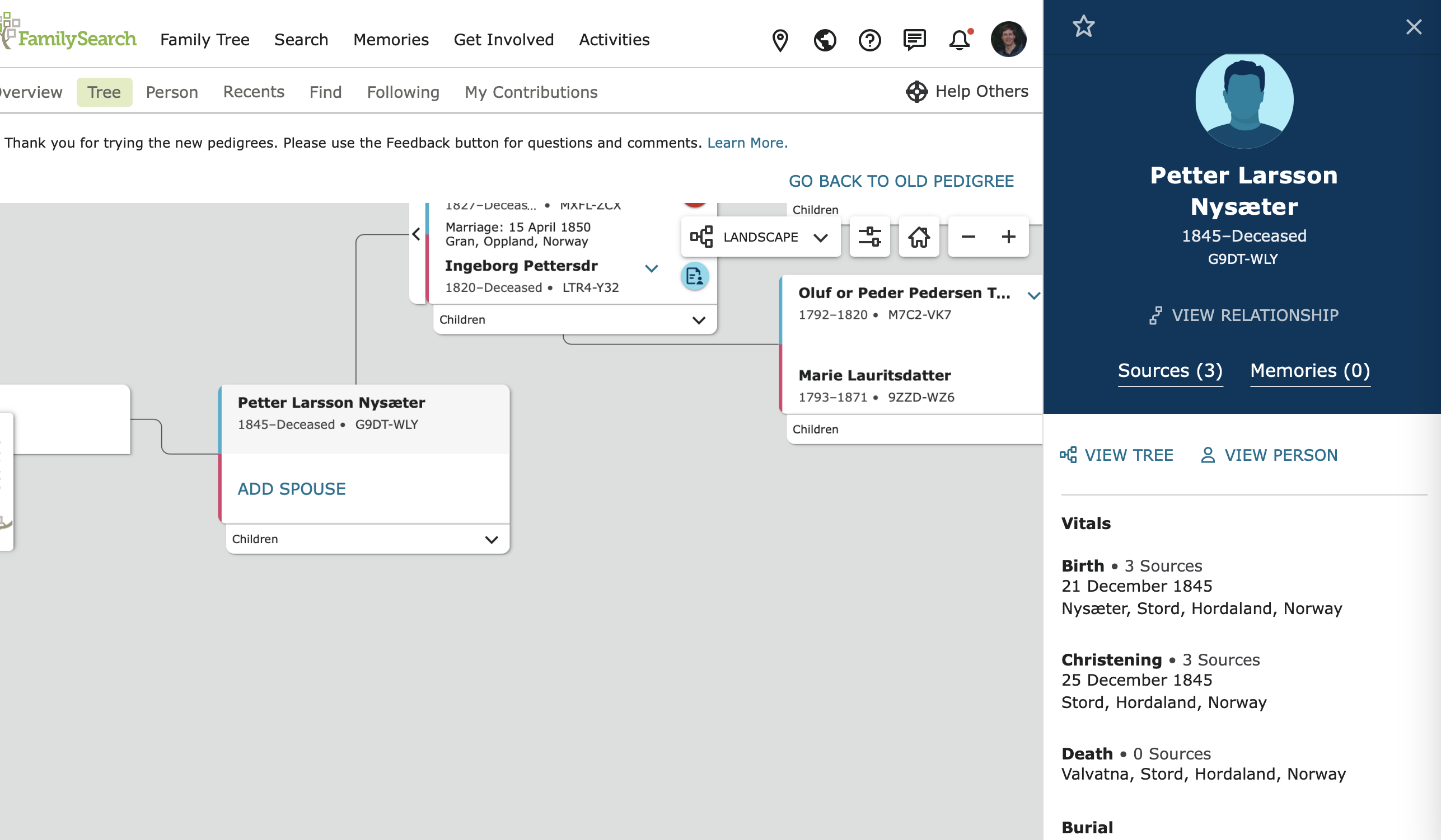
Why not go a step farther and just pull in the full side panel that we get on the landscape pedigree now?
With a clear title at the top so people don't get confused: "This record is attached to:" if the tree icon is clicked on or "This might be a source for:" if the suggested person icon is clicked on.
Something like this:
Click in box to open source side bar:
Click on the pedigree icon and get an "attached person" side bar:
Click on person hint icon and see the suggested person:
That existing side bar scrolls to show quite a bit more information than the summary card.
0 -
The advantage of the summary card over the sidebar would be that you could then compare the card to the record summary in the sidebar (instead of the much-more-abbreviated entry in the results list). Granted, it's not a major advantage, since the card is so bare-bones.
0 -
True.
And it would be pretty crowded to open two side bars. Or would it? Two side bars, scrolling independently?
0


