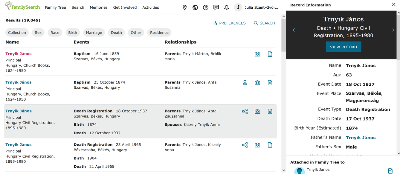
Re-enable record details in right hand search column
As reported in https://community.familysearch.org/en/discussion/141251/record-details-no-longer-appear-in-right-hand-search-column,
Previously, if one clicked on a person's name in the search results list, the record details would appear in the right-hand column of that page. This is desirable since it takes fewer clicks to attach a record and allows one to maintain a view of the search results list. t would be great if this behavior was re-enabled. Thanks.
Comments
-
I don't understand the motivation behind the name link and the record link behaving identically, with both of them taking over the search results page with the index detail page, but the useful sidebar hasn't entirely gone away: you now have to click anywhere but the links to get it, that is, somewhere in the area that turns grey when you move your cursor over the search result.
I have used the "Feedback" tab to ask about this (undesirable) change.
1 -
The search team will be looking into it.
0 -
Julia,
Thank you very much for figuring out that the greyed area does bring up the record detail. I have always just clicked on the name, which has changed behavior. I wonder if others who have tested this and reported no problem clicked on the name or the gray area.
Anne
0 -
I can see now that the curser turns into the hand (for a live link) in the gray area with no URL at the bottom of the page. When I hover over the name or the record detail icon, the same URL appears at the bottom of the page, e.g. https://www.familysearch.org/search/ark:/61903/1:1:X5BK-F9H. When I hover over the Family Tree icon, it turns blue and a tool tip appears, but no URL appears at the bottom of the page.
0

