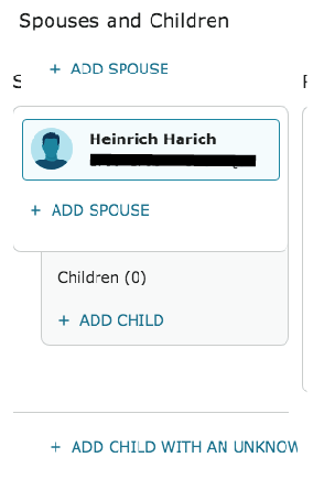
Moving location of secondary 'add spouse'
Knapp
✭
My recommendation to the wonderful site you have created is to move the location of the ' add spouse button (for adding additional spouses). The space between the 'add child' and 'add spouse' is too close. Sometimes I find that I am adding a spouse instead of a child. While it is infrequent, those mixups are a hassle to identify and correct.
One option would be to place it above the current couple. This I believe was how it was done in the past. There are probably many other options that would work.
1
Comments
-
Thank you for your comment. There is a group in the community specifically for sharing feedback about the New Person Page. You may want to comment there.
0
This discussion has been closed.

