Please make it easier to make comments and find direct help on website problems
I've spent over 30 minutes trying to figure out how to ask a question or provide comments on features in Family Search. The new person page has several changes that are not user-friendly and the previous version had features that are not available on the new one.
Please add easier access to contact someone about website comments. Each time I tried to find a comment screen this past half hour I went in circles until I stumbled onto this screen.
Please make it easier to make comments and find direct help.
Comments
-
There is actually a whole entire Community Group dedicated to the new person page (https://community.familysearch.org/en/group/316-new-person-page). You need to join it in order to post in it, but joining is the matter of clicking the "Join" button (just above the Announcements header). The engineers have been very responsive to our suggestions and bug reports.
I am not aware of anything available in the old layout that isn't also available in the new one, and the new layout adds several new features that are not available in the old one, such as alert notes, the Other Relationships section, and source-tagging of the Other Information section. What is it that you haven't found in the new layout?
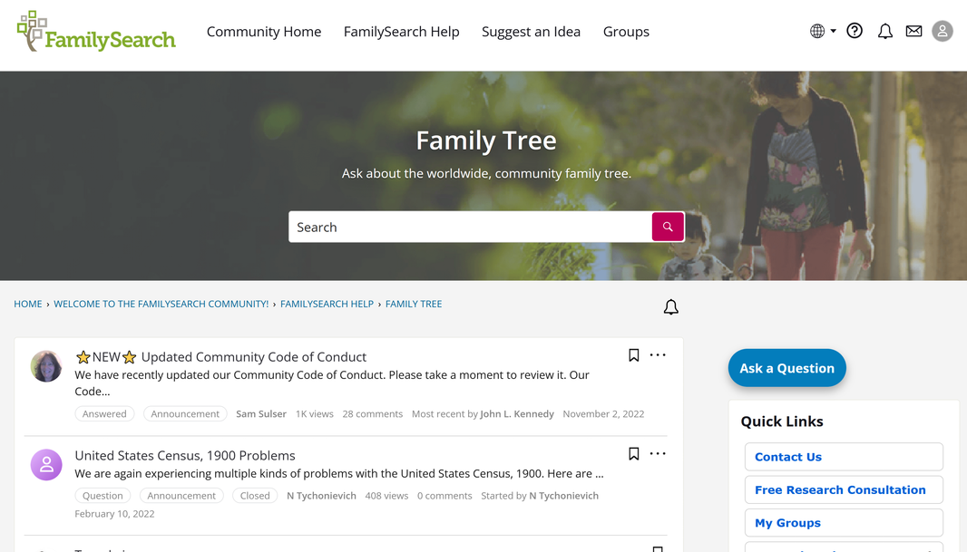
As for using the Community, I wonder if you're using a device with a relatively narrow screen? That can cause the page layout to "helpfully" hide things like the big blue Ask a Question button that's shown on wider screens.
1
