Improve Fonts, font size for better readability
I have repeatedly tried your new look, pedigree, individual pages, etc. The size of everything has been changed it is not as large or bold as it was previous old view. This may seem minuscule to you in the reduction of size and boldness. (as it seems to young eyes not that much difference.) Believe me it is a huge thing!! I do not have poor eyesight yet, but even for me it is very noticeable. I worked in ophthalmology and eye care for nearly 40 years. And what you are doing to this website is inexcusable as it is used by more elderly than young people. Most elderly people have some sort of eye problems. I understand when you are a young engineer you cannot comprehend old age eyes. You say you can hit the plus or minus button, but when you look at something initially and cannot see it well, discouragement occurs right away. If I were you, I would reevaluate why things are so much smaller. To help with this process, is to get glasses that simulate eye problems. Put them on and see how you do. There are websites that sell them. I would recommend getting the full set. A full set of the simulating glasses only run around $35.00. This may not change how you have changed the size and font. (I am sure there must be a reason for it.) But I for one unfortunately will not be using family search near as much. I know I am only one fish in the ocean. But when you consider the degree and amount of people that use this program and get disgruntled about not seeing it as well. And if they too, use it less. Then to me this does not go along with the program of the church trying to get more involved. If they can't see it, they are not going to use it. I hope you can go back to the larger bolder fields and fonts. Sincerely, Robin Kiser
Comments
-
@Robin Raye Griffis Kiser Your suggestion has been sent to the appropriate manager. Thank you for contributing!!!
0 -
It would be helpful for the designers and engineers if you would join the New Person Page group here: https://community.familysearch.org/en/group/316-new-person-page and give specific examples of the text that is being a problem. They can't fix anything unless they know exactly what is wrong!
I've been working on the Person details page a lot and as far as I can tell, all the fonts are the same size or a little bit bigger.
For example, in the Header:
The name is noticeably bigger and the dates are just a little bigger.
2 -
Here is an example from the Vitals section:
The title line is a little bigger. The date and place are the same size. The font style is identical.
This is why you need to post specific examples. Anyone reading your post will have the same question: Where?
3 -
Also, if you have problems reading any screen, whether on FamilySearch or elsewhere, it is an easy matter to zoom in. For example, using Chrome, click the three vertical dots near the top right hand corner then click the + to the right of Zoom.
0 -
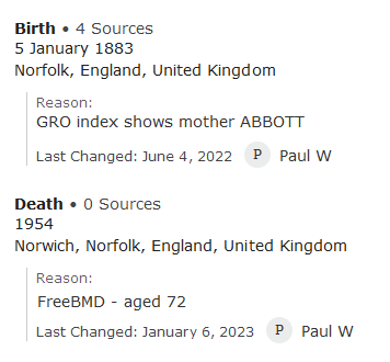
Here's one example where I find difficulty with the new page fonts - relating to reason statements. Here's a comparison between "old and new", but you really need to view from the actual pages, as pasting here doesn't illustrate the problem too clearly. Go to any Details page where you have placed reason statements. Switch backwards and forwards between the two versions and I'll think you'll see how much more difficult it is to notice the comments when on the new person page. (No difference? Then you haven't got the reading problems of the "average oldie" who visits these pages!)
Old:
New:
1 -
Yes, a shame this (original) post was not made at https://community.familysearch.org/en/group/316-new-person-page, as Gordon has mentioned.
0 -
That is what I mean by they need examples! I agree that shrinking and lightening the text of the reason statement makes it harder to read. I like the old version with "Reason..." grey and the text black and a little bigger. However, I do like the extra spacing in the new version, user name being grey instead of blue, and Edit being out of the way.
@Paul W, if you post your suggestion in the New Person Page group to revert the text of the reason statement to the size and color of the old page like this blend of your images:
I would certainly mark that I agree!
3 -
Have taken up your suggestion, Gordon.
1


