New Person Page - Tightening Add Event and Add Fact Menus

WDan5
✭✭
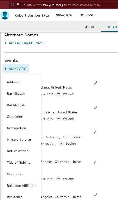
The Add Event and Add Fact drop down menus have an awful lot of space between items which leads my most frequently accessed item, Residence, way down below my screen margin at most times. Would it be possible to reduce the amount of space between items to let the drop down be shorter?
1
Comments
-
Thank you for your comment. There is a group in the community specifically for sharing feedback about the new person page. You may want to share your feedback there. https://community.familysearch.org/en/group/316-new-person-page
0 -
There's a group dedicated to the new person page where the relevant people are more likely to see your suggestion (https://community.familysearch.org/en/group/316-new-person-page).
1 -
Okay. Thanks.
0

This discussion has been closed.