Why do we need a new Person page?
Thank you for the work you do, but please do not change something that is simply elegant into something that seems more complicated with hidden features. Why the changes in the format? The color schemes and layout seem less visually friendly for me. The basic no-nonsense organization of the previous format was a joy to me. I could find my way by intuition if I needed to learn a new functionality. When I have a tool that works, I want to keep using that tool. Can't you give us the option to keep using the old format as you are now offering? I did try the new format, but I have eyesight limitations, and I need a familiar template. For example, there is now a smaller font for the links to other sites, etc. Best wishes, Cynthia
Best Answer
-
Why do we need a new person page?
Over the course of time, older technologies are not as useful or cost effective as new ones that are created in the industry.
We have to ensure that our apps continue to work in more languages, current browsers, operating systems and mobile devices. To do this we use current technologies and development stacks. Staying current on new technologies is more cost effective than trying to maintain a system on unsupported frameworks.
During this process, we are building a unified look and feel for the whole website. This unified look and feel should help users navigate different areas of the website more easily, because the features are similar to the area they already know.
The person page is used more than any other page on the site. It’s vital that we get it right. This is a period of time that both the old and the new page are available. We hope during that time we can make the New Person Page prefered over the current experience.
The more specific you can be in your feedback the better we can address concerns. Please join the New Person Page Group to help us make improvements at https://community.familysearch.org/en/group/316-new-person-page
5
Answers
-
as an example of regression, I would like to see the date/place "standardization icon" on the new person page as it was on the previous person page. I don't think this has anything to do with keeping current with technologies, etc.
DL Melville
1 -
@melville,dl, given how absolutely everyone misunderstands the meaning of those icons, getting rid of them is one of the best features of the new page.
3 -
I did try to join the new person page group community and got lost in dead-end non-direct pages. If I can't see it, I can't find it. The place to make a comment was not immediately present. It required further steps with indirect hidden features. I only got to this Question place by hit-and-miss random guessing.
0 -
in response to Julia, I guess "ignorance is bliss" and "standardization" is not as important as I thought so it can save me a lot of work not to worry about it.
0 -
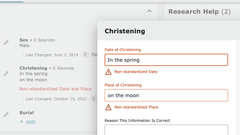
@melville,dl What about the missing standard warning should we change?
If you hover over the text for the place, it shows the standardized place chosen.
There is a misconception that original text and standard text need to match. Many people prefer to have the exact text from a document in the original text and select the appropriate standard.
Here’s an example of something not standardized.
0 -
@melville,dl, see, you're demonstrating the problem with those dratted icons.
Once again, with feeling: absence of the icon DOES NOT MEAN lack of standardization. A place or date can be fully and correctly standardized and yet be missing the icon.
If I enter "Balassagyarmat, Nógrád, Hungary" in the old interface, it gets a map pin, since it happens to exactly match the English label for the standardized place. If I then change the interface language to Hungarian, the map pin goes away, because the database entry is labeled "Balassagyarmat, Nógrád, Magyarország" in that language.
That's just one of the many ways to get a fully-and-correctly-standardized location without a map pin.
So as I said, doing away with the dratted things was one of the best decisions FS has recently made.
3 -
Julia, I honor your opinion .... it would be nice if you reciprocated.
1 -
lyle, my point is simply that I should not have to edit the field in order to find out if it is already standardized, which is the case with the new page, but not with the previous version. ..... all I'm saying.... I didn't intend to generate a discussion on the whys and wherefores and special cases of place standardization ... sorry
0 -
@melville,dl, if there's no data error flag (red exclamation mark), then the data is standardized. You can find out what standard has been selected by simply hovering your cursor over the conclusion.
1 -
And the same thing with detail view turned off:
(Since the forum software is still eating all of the screenshots if you include more than one.)
1 -
@melville,dl Here is an example of why it is important to get rid of the map pins.
This place name is correctly entered, accurate, complies with the intended functioning of Family Tree and is fully supported by the programming:
It will never have a map pin. Ever. Too many people in the old pages would look at this and because it has no map pin declare it illegal, unacceptable, and taboo then promptly delete everything in front of Denver even though this is correctly standardized, thereby degrading the information on this person.
3 -
Here is what the above entry would look like if it was not standardized:
To repeat what I have posted a few hundred times now:
To standardize a place name in Family Tree means to link an accurate place name to the best available, representative place name for that location in the Places database. The displayed place name may have more information than the standard, be identical to the standard, or have less information than the standard. To standardize a place name in Family Tree does not mean to only enter place names as found in the Places database.
5 -
As pointed out above, to quickly see what standard a place name is linked to, just hover over the place name and check the tool tip. My example would look like this:
To repeat: This place name is correctly entered and correctly standardized. Those map pins had to go. They were making much worse an already confusing situation that many people have trouble understanding until they see the true beauty and power of Family Tree's programming in regards to incorporating both accurate place names and accurate localizations of those place names.
3 -
There is no option to add a comment on https://community.familysearch.org/en/group/316-new-person-page. I have contributed regularly to Family Search adding family names and merging / collating families. I have been so pleased with all the improvements that have happened over the years to bring about this product. However, I have neurological condition and the new Person page causes me mental distress. I have a physical response to viewing the page.
The font is too small and the spacing between blocks of information are too far apart.
Having to scan my eyes from side to side to find information in the 2 columns adds to my symptoms.
Changing the colour background has made it more difficult to view the screen. I no longer want to go onto Family Search.
I now find it difficult to distinguish blocks of information.
I am morally deflated with the New Person page as an activity that brought me joy now only brings me distress.
0 -
@denisecynthiawatson1 In Groups, you have to join before you can post comments. Click the Join button and immediately you will be able to post.
Sorry to hear about the difficulty you have reading the page. We've been told a dark mode is in the works. I hope that will help you out. It's funny, but the font size of the actual data, if you put the old and new side by side is actually the same.
If you go down to the Tools section and choose "My Layout Settings" you can set the page to have just one column instead of two.
Here is the new page in single column format on the right and the old page on the left where you can see that the data font size is the same:
They have put more space between the items and made the titles a little bigger. But they have gotten rid of those distracting and rather harmful map pins. The background color for the text is the same.
The background color of the new page is a little greyer while the old one had a bit of brown tone to it. Here again the new is on the left and the old on the right:
Can you identify exactly what it is with the change of tone that causes your distress?
2 -
As you probably know by now, I am one of those who just can't adapt to these new pages (still really struggling with the "new" Record page layout at least one year on). I, too, get a headache after working on the new Details page for a lengthy period and find reverting to the old page makes things a lot easier. Probably psychological (rather than physical) in my case, but definitely a worry for when the the old page does finally disappear.
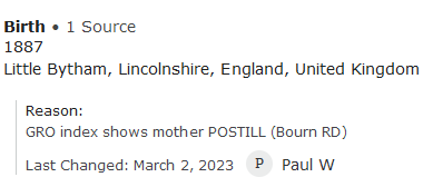
On your point regarding fonts, the one that definitely has been reduced in size is that for the reason statement fields. Hard to illustrate with screenshots, but I find the reason statement is much easier to overlook now.
Here's an example, in any case:
Old page:
New page:
0 -
In the group but several months ago so it is impossible to find now there was a whole discussion about the size of the reason statement font and that the older style with less emphasis on the title and more emphasis on the reason was better and I wish they would make the reason text a little larger. I do like that they shorted the title.
1 -
Rant warning
A contributor on one branch of my family only uses "because" sometimes abbreviated to "b" for the many changes she makes. The font won't make any difference in visibility.
0


