Am I the only one that has issues with new format?

extremely disappointing. I am sorry, but that is as constructive as I can get. Information is 100 times harder to find and 200 times harder to fix when someone messes it up. That WAS the reason I liked familysearch so much better than ancestry, ease of entering information. It seems now they have just copied ancestry format. SO disappointed in new changes. It was hard enough to keep profiles fixed when new comers come and change everything to theories that were debunked 30 years ago. It is now SO much harder. And countless times harder to read the information that is there. Took a great clean format and made it hard to read.
Please tell me I am not the only one!?
edit to add - finally spotted the use previous version at the top of the page. Never been so thankful for that type of option!
Best Answer
-
@Kathysexton70 I would suggest that you join the "New Person Page" group. There you will have an opportunity to provide specific feedback and learn about some of the changes before they are rolled out.
https://community.familysearch.org/en/group/316-new-person-page
Also - you can still switch back to the old format.
2

Answers
-
Thank you, I spotted that and came her to edit my post. I had not seen you had answered at that point. I really do appreciate the info. I will look into the group. Not sure why a new page is needed when the old one works so well
1 -
not quite as bad once I figured out you could get rid of that silly double column and put things in the right order. Still not nearly as streamlined and nice looking as the original but it says the good one is going away soon so we will be stuck with the lesser quality one, so I am attempting to use it. Such a shame to mess up something that was so good though ☹️
4 -
I concur KathyS. My sentiments and experience exactly. Simple crisp and clear has been decked out w/ a bunch of makeup. Add the new features w/out the extravagant facelift.
3 -
I've been using the new pages ever since they were released for public comment about four months ago when the Try The New Person Page link appeared for everyone to see, use and comment on. I've come to quite like the two column view but that doesn't need to be discussed since we have the option to use either one.
However, regarding the information on the page. I do actually find it easier to read and focus on now:

The font is just enough bigger, darker, and crisper to be easier to read. The distracting blue of the "Detail View" is gone and it was not made bigger. The repetitive and distracting Edit link is gone and we can just click anywhere on the data to first view and then edit the data. These are all nice improvements.
2 -
I am now seeing a banner stating the old Details page will go away in 2023. Then we won't have choice of which one to use.
0 -
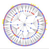
the only problem with that is it is extremely hard on the eyes. big headache after only about 20 minutes. the high contrast of the page is awful. Going to see if someone has made a greasemonkey script to eliminate it. that might make it usable. Would be very helpful to get rid of the bright blue box around names that make them unreadable as well
0 -
yes, that is the worst part. I haven't used grease monkey in a while but I am hoping someone made a scropt to remove the colors at least. the new on is not usuable for more tha a few minutes a day. I normally spend hours each day on the site, but cannot with the new page
0 -
missing the old format!! why change it if nothing is broken?
3 -
Be sure to join the New Person Page Group. There you can hear firsthand from some of the development staff about what is changing and why and offer your feedback.
1 -
Yes, @Kathysexton70, as noted in yesterday's FamilySearch blog, "The new page will now become the default on FamilySearch.org, but the toggle to switch back and forth between the old and new will still be available for a little while yet. We hope users will continue to explore the new features and keep giving feedback."
Joining the New Person Page group would definitely be a good idea, as has been suggested! There's a lot going on and suggestions are being considered - our voices make a difference!
2 -
I did join it and voiced my opinion of how bad it is (as have many others) this is probably not going to change anything. The new format is hard to read and has garish colors (the blue isn't to horrible but that pink is attroicious) - who decides on these colors anyway. they are not even close to being standard over the world. I think anyone using a website can read what sex the person has been designinated on their profile. I did notice that detail view ON is still not standard so we still have to deal with new members not seeing all the available information and changing things that have to be fixed as soon as they are noticed, why not fix that instead of "fixing" something that wasn't broken? It just makes no sense to me, there ARE issues with the site that need work, the profile page was not one of them
3 -
As has been mentioned elsewhere, there are outdated technologies used in the platform that need to be updated to continue to offer the service.
1 -
Would be very helpful to get rid of the bright blue box around names that make them unreadable as well.
Is this the blue box you are referring to?

The one that outlines the person whose detail page you are already on? Or some other blue box?
If so, this is the type of feedback they need, with specific information about what blue box you are talking about, that this particular blue is too intense for you and interferes with legibility. They originally did not have that but just designated the person by the bold type. People complained that they could not tell the difference between the bold and regular type clearly enough to tell whose page they were on so they added the highlighting to make this more obvious. What would you like to see instead that matches the overall page style?
By the way, have you fiddled with the brightness and contrast settings on your monitor? The first thing I do when I sit down at my computer is to turn the brightness all the way up because my other family members always turn it down, saying the brightness hurts their eyes. But I need it fully turned up to get the light level and high contrast that my high myopia requires to see the text clearly.
I did notice that detail view ON is still not standard...
I'm not so sure this is the case. Another user complained in a post that he or she did not like the "new feature" on the new page of displaying the last date of change and who made the change, stating it cluttered up the screen to much and that if the user wanted to see that he or she would just go to the change log. Apparently, the Detail View was on when the new page was set to the default and this person had never noticed or tried that option before or realized it can be turned on and off.
1 -
yes, that blue box (or the pink on females.) I hope you are correct about detail view. The banner at the top of the page is very hard to read with the new color combinations. most people can easily see black writing on white. other colors are very hard for some of us to look at much less read. The person that mentioned outdated tech. I understand that too, but radical design change with hard to read sections is not necessary to update tech. and I cannot figure out where to change preferred status at on the new profiles. I also don't understand the purpose of the about page, it is just repeated information as far as I can tell
eta = at least I finally found the tiny blue writing to set preferred) the check mark was so much easier. and so many pop ups now. everything you click seems to open in a new window, very time consuming and frustrating. ☹️
0 -
Thank you for the input. For the blue or pink box in the Family section, happy to take another run at it again. As mentioned, there are been a few options tested. Even the current one was not well liked by some users at first over 2 years ago. Please let us know a potential solution.
About Page: Good ? The About page is designed for new users and discovery experiences when users want to get a quick overview on the persons profile without intended to edit or do research. Could be links from home pages, blogs articles, other country user experiences, and search engines for user using Google to find their family. Works very well for those needs.
Also note these other new or updated features:
- Sources side sheet. You can now view a person's sources from the Details tab. In the Tools section, click Sources. The sources appear in a list along the right side of the screen.
- Improved sourcing. You can now tag sources to all types of information in the Vitals and Other Information sections.
- My Layout Settings. You can now reorganize the Details tab:
- You can choose whether to display the information in the Vitals and Other Information sections in one or two columns.
- Change the order of the sections.
- Alert notes. Each person in Family Tree provides a new alert notes to feature. It notifies other users about the presence of research notes or warnings that other users should read before making edits.
- Other relationships. You can now record relationships between people that are not direct parent-child or spouse relationships.
- Improved filtering and layout of the Memories tab.
- About tab. The new person page has an "About" tab that provides an engaging way to learn about a person in Family Tree.
Thanks for all the feedback.
FamilySearch Tree Development Team.
3 -
I just now first saw the box at the top about alert notes, but when I clicked on learn more, it said page not found. as for suggestions for the boxes...get rid of them. Just make active person bold type. much easier on the eyes. The memories part I think is much worse. I see no way to seperate the silly little sotries some people add from important items. I have always left these stories alone as it seemed to make people feel better and had their own section. Now, there seems there will be no choice but to delete them so they don't clutter up actual records and photos
2 -
Ok, I figured out the alert notes. LOVE THEM!
0 -
@Kathysexton70 . There is a Filter when you are in Memories. Click Filter then you can view Photos , Stories, Documents or Audios one catagory at a time or in any combination.
1 -
Sources side sheet. You can now view a person's sources from the Details tab. In the Tools section, click Sources. The sources appear in a list along the right side of the screen.
I find this sidebar not at all helpful. A well sourced profile can have 20, 50, 100 or more sources attached. Trying to navigate and engage with them in the sidebar involves too much scrolling. FamilySearch over-reliance on scrolling is contributing to repetitive strain injuries in my hands.
3 -
I agree the colored background on the focal person interferes with legibility. The box around the person seems like an improvement, though. Perhaps make the box outline bold black, like the name?
Like this:
 2
2 -
Improved sourcing. You can now tag sources to all types of information in the Vitals and Other Information sections.
I like this. I think it will help a great deal with finding and removing spurious Residence events left over when bad merges and unrelated source attachments are repaired.
1 -
Maybe Bold the box when it is the object person and lose the color background idea completely.
3 -
thank. that is very helpful
0 -
Yes, please, losing the background color on female profiles would be a Very Good Thing, because I still haven't figured out how I'm supposed to tell that it's not yelling at me about an error.
3