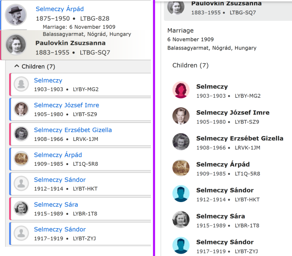
color bands for each person in the family
the blue/pink color bands have been removed from each individual - this is quite frustrating
when there is an actual profile picture, the gender distinction is gone - some names that we might think (today) are definitely male or definitely female, were often used for either gender
Michael, Lesley, Gerald, even Dorothy
and the profile picture is not always a clear indication of gender - in those cases, to know the gender, we have to click out of the page we are on and go into the page for the uncertain gender to be sure we have it correctly - even looking through sources
it is nice, currently, to be able to look at a family, and readily count the number of sons vs daughters - a feel secure in that assessment
Comments
-
Um, the new person page's color strip is ginormous. Where are you seeing this lack of gender-coding?
0 -
In the Family Members section if there is a portrait on a person. The colored dot is completely replaced by the image. (I'd post a screen shot but that is being kind of futile currently.)
1 -
Ah! I see what you mean. They've exchanged very-similar gray generic icons for highly-colorful ones, but the very-similar icons actually worked better, because they were accompanied by a nice-and-discreet little strip of color (so discreet that I never even really noticed it, consciously). The new way is OK if everyone has the generic icon, but if it's replaced with a portrait, then there's no longer any color-coding.
I'm taking the risk and attaching a before-and-after screenshot. (Notice how it also demonstrates the much better use of space in the old layout.)
1 -
thank you Julia Szent-Györgyi for putting the visual into your comment - i wanted to but didn't/don't know how
and yes the placement of family members is much better in the old format - much better use of space, and much more visually organized - i made another post about that very thing - here is what i wrote:
"as the old page has been, i would like to continue the practice of the children having a separate "box" under the parents, and each child having his/her own box - it separates them better visually
i guess it's not absolutely crucial, but the change made to this part of the person page has made it less easy to see many things at a glance
also, it has been very helpful to have the names in blue (a point which another post made), with the name of the person whose page it is being in bold black - just much easier to quickly see who is in front of me
again, there might be specific reason/s why this change was made, but i feel the need to mention that the visuals on the new page tend to slow down the quick looking at various things"
also, i made a post about the huge color band across the top of each person page:
"can we rethink the color in the name field
when i looked at the new page for the first time, i did not like the bold banner - it is very distracting, and almost irreverent looking - but the hardest part about it for me is looking at white letters on dark background, and then black on white for the rest of the page - i don't know how to adequately explain it, but it is very jarring for my eyes
also when there is a profile picture, it is very secondary to the banner color - and it's almost lost
the way it has been is very clean and calming, with the color a simple line"
0 -
I really dislike these changed to the new Details page.
Everywhere possible I turn portraits off while I am working on building the tree. Otherwise I ignore them. Now important information is run in with the portraits so they cannot be ignored. Argh! I want to turn off the red and blue heads! They are too distracting. I thought the random landscapes and grave markers were worse than nothing, but these are worse. The way they are run in with other portraits turns the whole set into so much chart junk.
I am not against portraits per se. I even contribute portraits sometimes. For browsing or showing the tree off to others, portraits can be a plus.
Please keep the red and blue (and grey for Unknown!) color tabs, and go back to low contrast grey default portraits. I work a lot with 1790-1840 United States census records that give only head counts, so I need to be able to count easily how many female and male persons are in the family. And the colors help me see when a couple is inverted and needs to be switched.
1

