📣📣 Come try out the new Person page and give us your feedback!!

The engineers have been busy updating the Person page in Family Tree. It's is available now to try on FamilySearch.org. The engineers are looking for feedback so here is your chance to help us!
➡➡➡ Create a new post in the group to give feedback.
Click the link below for more info on the new features, what changed, and how to give feedback.
Answers
-
Please don’t move the life sketch to the bottom of the page. It is sometimes used to place important notes about a person, especially things like “John Doe is NOT the son of Joseph Doe despite what you’ve seen elsewhere.” Sure, that rightfully belongs under the collaborate tab but sometimes putting it at the top of the first page where people are much more likely to see it has been very successful in preventing well intentioned but erroneous changes. I have an ancestor where we had to correct changes about once per week, but after putting an explanation in the life sketch these changes dropped off dramatically.
17 -
Don't like it. Stop trying to 'improve' something that was already working
6 -
Please do suppress the Life Sketch as much as possible. Bottom of the page is a start. The Life Sketch often is misused to make prominent edit-warring and mud-slinging between contributors.
3 -
I don't want to see any background graphics, profile images, or other chart junk. Less clutter, not more. Please!!!
I like the Other Relationships block. That could be useful.
6 -
@EricShelton The miss-use of a feature, like lifesketch, is usually an indication of a missing feature. Help us figure out what that feature should be. This post is helpful.
https://community.familysearch.org/en/discussion/128844/suggestion-for-the-collaborate-section
More ideas like this help everyone get what they want.
1 -
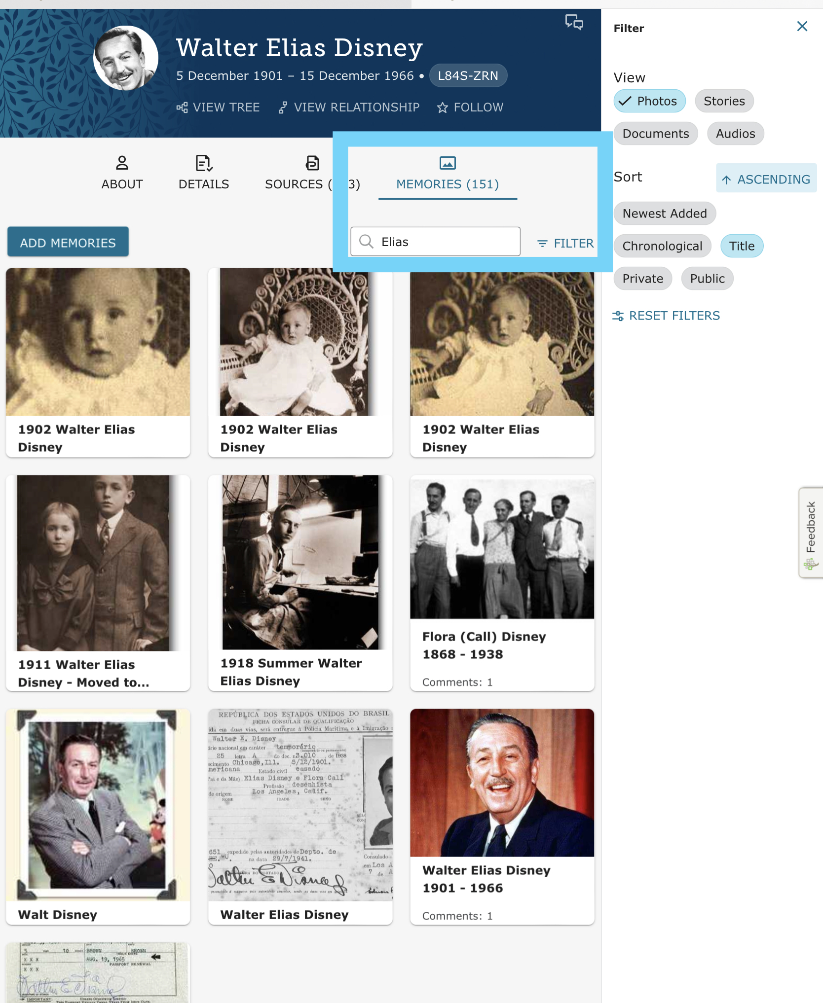
don't like the way memories are presented. No distinction between a picture, document or story.
don't like the presentation for Custom Events, combined with Residence.
don't like just a pencil icon for Edit .... not intuitive for many older users .... sorry!
In general, I agree with previous users about why changes just for change sake. I'm on the verge of going from a "power user" to a "non-user". These type changes makes things very difficult for instructors as well patrons in a Family History Center environment.
BTW, does anyone know what happened to the "Help Others" option on the new Home Page?
5 -
2
-
Please do not move the life sketch. One of the BIGGEST complaints about FamilySearch is how people can change each other's "correct" information. This will continue to get worse if you make it MORE difficult to see any form of communication intended for other editors of the person in question. You need life sketch BACK TO THE TOP, and while you are at it, please quit trying to hide collaboration. Some people think that comments about the life of the person don't go in the life sketch, they go in collaboration. Now you have moved the collaboration link even farther away. I would put the life sketch back at the top and to the right of it, add all the collaboration threads as a list, most recent at the top. See how you have "latest changes" listed? Do that with collaboration.
FamilySearch, you have a serious problem with people not working together. Enable cooperation. Don't make it harder.
8 -
SUMMARY: It's bigger, slower, adds very little, and involves more effort to acheive the same thing.
FOR: It's prettier. Two column layout has benefits (although it's not without issues).
AGAINST:
1: Data Volume: The page requires 700Kb of web traffic compared with 400kb for the original page. That's an increase of 75%. Multiply that by the number of times you load a person page and you will reach your data limit or incur excess charges a lot sooner. This is not an improvement.
2: Animation: Transition animations introduce delay, are annoying, and provide no tangible value. Simply making an edit now incurs extra delay. Multiply by the number of times a user makes an edit ..etc. and it now takes longer to achieve the same objective. This is not an improvement.
3: Whitespace: Although the Vitals section is now two columns which is better, and the Life Sketch is moved (see later), the content overruns the bottom of the viewable area more than the previous format. This is not an improvement.
4: Reduction in Display Area: The right hand section containing Reseach Help etc. has increased in width, thus reducing the available space for the person data, which is actually the desired object. This is not an improvement.
5: Truncation: Within the Other Information section, a single item will be truncated within the left half of the available space even when there is nothing in the right half. The two column layout is not valid when there is only a single item to display. This is a unwanted side effect that can be fixed easily.
6: Print Menu: The Print menu is now embedded within the Tools menu, thus requiring an additional step to be able to print. Seemingly not much, but multiply by the number of times ... etc... and it now takes longer to achieve. This is not an improvement.
7: Significant Change in Structure: Life Sketch. (Area of significant debate) I would like to know how many people queued around the block for weeks to bang on your door and demand that Like Sketch should be moved. I cannot beleive that a change such as this was allowed to happen without instruction, so we must assume that somebody gave the instruction in a requirement specification or design document, and that they must have had a reason. Can we be allowed to know what the reason was, and if there was no such instruction, then how was this change allowed to be made and not corrected. As @dontiknowyou says, this section is known to be used for purposes other then the original intention, nevertheless unless a better object is created in a prominent position to allow significant data to be presented at the head of the page, then the Life Sketch will still be a neccessary item for the display of such information. Sometimes it contains as little as the occupation of the person, to allow immediate distinction from another with the same name. With this information now at the bottom of the page, such simplicity has been removed. I would argue that if the position of Life Sketch *must* stay at they bottom for whatever reason (if one exists) then a new object is required at the head of the page for the presentation of significant or explanatory information. This object would be collapsible in the same way as other sections, so users would not be compelled to view the edit-wars or mud-slinging referred to in the earlier post. Perhaps a suitable name for the Section should be "Research Notes" and as with life sketch the normal layout would only show a few lines of the whole content unless expanded.
OVERALL SCORE: ½ out of 7
15 -
Deleted feedback as I have placed it into the new group.
0 -
Brad Felmey Can you post a link to the new group? Never mind. I found it the second time looking.
0 -
Do not like it!
1 -
I am not a fan of the new layout. It is more colorful but the information is in smaller text making it more difficult to read.
I prefer having the life sketch at the top as that is where I communicate information re: the individual. Mostly about how the Swedish household records have carried forward the incorrect birth information and where the record is actually found, etc. It gives people a "heads up" as to why all the record hints do not match the actual information.
4 -
Many users click Feedback at the bottom of the page since that is available for all pages on the site. What are the steps for them to enter feedback in Communities. I don't see a clear way for them to do it from this workflow:
1 -
@Sam Sulser Thanks for sharing this. I am a creature of habit and don't like change, but...I really like the layout of it. I do think it would be nice if the life sketch were added after the events and not at the very bottom of the page because unless you scroll down, you will not see it. On the About page, it would be nice if the author of the Story Highlight were added so we could know where that information came from and if there were anything that might be added or corrected we would be able to contact that person or correct it on this page. I really like where the collaboration is placed as it is easy to find and add information to those to whom you are collaborating with.
Overall, I REALLY like the change and I think it will be easy to navigate and get used to. Thanks for sharing this with us!
Shannon
3 -
Are they planning to get rid of the old person page because working on the tree without it will be a total disaster.
The new person page may look "prettier" in the ABOUT section but it is completely inefficient to do work on the tree anywhere else in the new person page.
Change for the sake of change is not better. The tree needs to be able to be worked on efficiently and nothing about the new person page does that.
The old person page is cleaner and more efficient for working on the tree.
Many of the interface changes over the last few years here have literally made things fundamentally worse.
This is like web 2.0 all over again, taking things that work and breaking them with inefficient interfaces.
Adding anything but the new ABOUT page as a tab will make things much much worse.
The recent poorly done changes to the search interface here caused many heated discussions and FS wound up (silently) adding back in almost all of the valid interface complaints that were ignored.
So why do this, what is the point? Why make the interface worse?
2 -
The missing feature causing this is moderation.
0 -
@CESchultz The old/current Person page is outdated and will be replaced by the new person page. So now is the time to detail specifically what doesn't work as well. This way the team can assess what need to be fixed before the old page is turned off. I like to show side-by-side of the current and the new to show issues.
1 -
My thoughts:
On the DETAILS tab:
1) LIFE SKETCH should be moved to the top. A sketch of a person's life should appear first, not last, and I agree with others that the life sketch sometimes contains information that should be noted before research continues for that individual.
2) For the LIFE SKETCH, there is now a pop up if you click on MORE. On the old screen, users could expand the life sketch field and still scroll down the page to see events and other details related to that person. It was easy to cross-check information. The new pop up prevents users from scrolling the rest of the page without first closing the pop up. No pop up please.
3) The EVENTS section is confusing with events structured not vertically, but horizontally. Events now appear as
EVENT 1 EVENT 2
EVENT 3 EVENT 4
instead of
EVENT 1
EVENT 2
EVENT 3
EVENT 4
This would be OK if dates were not involved, but since dates are involved, it is more difficult to follow the timeline of events for an individual. For example, as I'm working on an individual, I check EVENTS to see where that person resided at a specific date, what s/he was doing during that timeframe. This helps me focus on what dates to look for additional information. Please change EVENTS back to a vertical listing.
4) I agree that the pencil icon should be replaced with "edit" as it was in the past. Older users or even those with visual impairment may have a harder time finding a light gray icon that is also further away from the text.
Also the TIMELINE tab appears to be missing? I see a TIME LINE on the ABOUT tab, but it does not offer a map view.
8 -
The new person page format is not nice. I don't like the big color banner at top, it just wastes space, and the LIFE SKETCH is not at the bottom, that really needs to be at the top. Please change that back.
The new format makes the page stretch to many pages we have to scroll through.
Basically I don't like it.
Alan Jones
4 -
I find the new interface MUCH less efficient to drive, but I believe you when you say you're going to cram this down our throats no matter what, so I'm trying to force myself to use it anyway, even though the search from it is broken (loses date ranges), the location standardization is partially broken, the "Show All" for other family members WILL NOT stay toggled, and the events don't read chronologically when in a zig-zag.
As a pretty heavy user, I'm in love with the ability (FINALLY) to tag sources for events/etc., but thus far that is the only bright spot for my tastes.
Based upon what I've read in these groups I'm very curious what alpha testers or metrics come into play when evaluating a proposed UI direction. Lately the record is.... uh... spotty, based upon the visible feedback and my own biased impressions.
2 -
Do you seriously want moderation for Life Sketch and / or collaboration? How many people would that tie down? How long would we have to wait before something would be visible?
3 -
No I don't but I am simply suggesting that there is no missing feature that can handle edit warring, which is why some people have their profiles on here locked from editing.
1 -
That is a total disaster as the new person page is inefficient, bloated and slow as if it was only designed for mobile users. The old interface is so clean, easy to edit and read. The old interface exists why can we just leave it for expert users to leave on as an option? If they want to move people to a new slower, less efficient interface that is fine but why can we not have a choice to keep something that works so well? All these changes lately are not improvements. The new search pages were a perfect example and had to be extensively edited after implementation to be anywere close to as useable as the old one.
Can the engineers please talk to the team members who made the old interface as they apparently made the major changes to the "new" search interface and made it useable again. I completely trust them as they seem more interested in efficiency and useability and not just the look of the UI.
7 -
Thanks for your comments. The old person page uses technology that has to be replaced. So step by step problems and issues and screens really help the engineers understand.
2


