Engineers - please think of the implications of your new page designs
When viewing records previously, the whole page of information could be viewed comfortably on my 21" monitor.
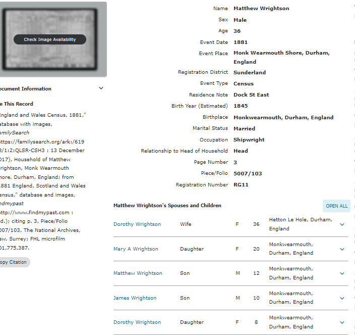
I illustrate below just one example of the current problem, with before / after screenshots relating to viewing census records. No problems in the past of viewing the whole household on one page. Now I have to hit Ctrl - three times in order to produce the same outcome.
Former result produced:
Current view (reached only after considerably reducing magnification):
Compare the two to see how you are completely wasting space in the new layouts. (This applies to other Search results pages, too - apart from census). Sorry, but anything that makes life more difficult for the user is just not an enhancement. Too late to switch back now, but please bear in mind for the future.
See https://www.familysearch.org/ark:/61903/1:1:Q271-VZ5D?from=lynx1UIV8&treeref=L87G-FZ5. With my standard settings and using a 21" monitor I can only view this record over two pages. Alternatively, I have to reduce magnification to a much lower level.
Comments
-
Also, in this example, it would be useful if I could CLOSE the record of Matthew Wrightson. There is the optional choice to OPEN ALL of the records of the other members of the household. I could reopen his record if I wanted to see the further detail (indexed from him and the rest of the family).
1 -
Totally agree. It is much harder to efficiently pull information off of pages where the info spans multiple views.
There are many other examples of this with search results, etc, but I have given up on pointing them out.
1

