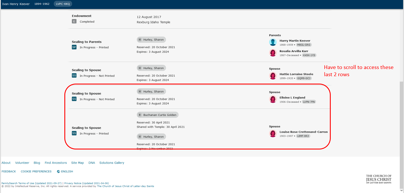
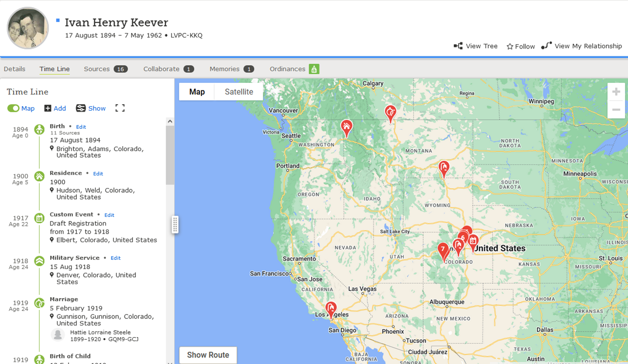
Please, please, please - never introduce the "New Person Page" (as seen in Beta)
Yes, I have raised this issue via the Feedback link on a "new person page" in the Beta version.
I believe, like all the recent similar changes in format to FamilySearch / Family Tree pages, this will make my work far more difficult. I already find the new "Record" pages almost impossible to work with - constant scrolling and having to "Open" the individual records for household members in a census record. This will make life just that much harder for me.
Do the engineers honestly find it more easy to work using their newly formatted pages? I just cannot believe that, like me, they work several hours a day in examining / adding records and can find work with these pages an improvement on what they have replaced / are replacing.
Please think of the practical considerations (e.g., does this enhance user experience?) before inflicting any more of the same upon us.
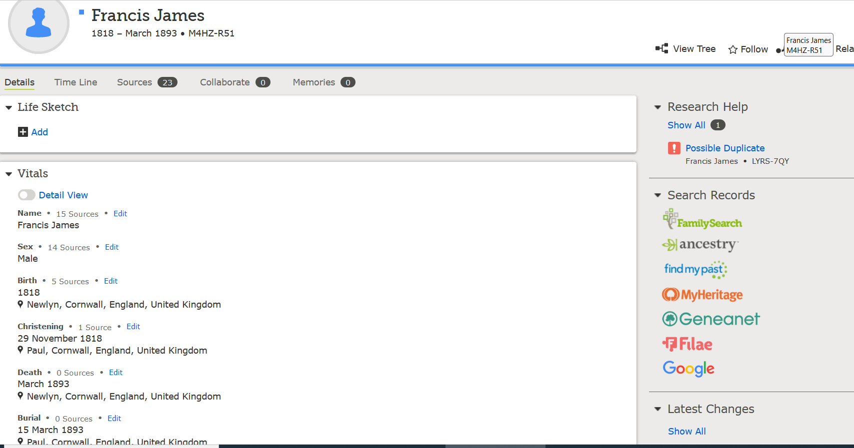
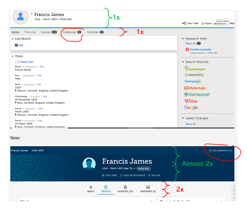
Screenshots taken using my 21" monitor with "standard" / same magnification. No, nowhere near as bad as the other "new" (search, record) pages, but far too much "in-your-face" for my liking:
Old:
New:
Comments
-
They have improved things somewhat since the last time I looked, but it still needs work.
Please, FamilySearch engineers and web designers, keep two considerations in mind when designing your site:
1. If it's not visible, the natural assumption is that it does not exist.
2. Most users avoid clicking unidentified buttons because of the possible adverse effects.
The second of these is incredibly easy to fix: all you need is a tooltip. I see that the pencil icon now has them. The problem is, they take a full second or so of mouse hover to show up. A person with even a mild tremor is never going to see them. I assume the delay is caused by the "individualization" of the tooltip in some places. This is of doubtful utility: it would be enough for it to just say "edit". Or just to be "edit" rather than a heiroglyph to begin with.... (I suppose a symbol instead of a word is an internationalization step, but given that the tooltips are currently only translated for the Vitals box, where they're not individualized, it's all kind of half-baked.)
---
But there are good things going on, too. It's all rather convoluted and involves a lot of clicking and popups, but they're working on one of our frequent requests: source-tagging conclusions in the Other Information section. There's also a new "Other Relationships" section below Family Members. The choices are currently Relationship, Apprenticeship, Employment, Godparent, Household, Lineage Gap, Neighbor, Relative, and Slavery.
2 -
@Paul W Thank you for your post. Just to be upfront, I’m one of the Quality Assurance Engineers working on the New Person Page.
Vertical spacing and crowding information is always a delicate balance. There may be a few more things we can tighten up. We’ll take a look. While the new person page is quite far a long, it is not finished. We are still looking for feedback on functionality and design. Specific details in suggestions help remove the guess work in solving the problems.
The person page is used more than any other page on the site. It’s vital that we get it right. There will be a period of time that both the old and the new page are available. We hope during that time we can make the New Person Page prefered over the current experience.
0 -
You say:
We hope during that time we can make the New Person Page prefered over the current experience.
I hope you will not think I am being too rude by saying I don't believe that will be the case. The page design already implemented in both "Search" and "Record" pages has made our work much more difficult in examining detail that used to be laid out in a conventional, easy-to-read format.
Please have more consultations with everyday users of FamilySearch / Family Tree before you proceed, if you do not want a repeat of the type of response when the new Search interface was forced upon us. FamilySearch is meant to suit the needs of its year-in-year-out users, not the whims of engineers who will probably move on to another project once their current one is completed.
I know I definitely sound rude here, but it is a known fact that the lead design engineer on the Search project left the FamilySearch organisation within months of its completion, and we are still left trying to come to terms with the results of his labour.
Having said all that, I am sincerely grateful for the other excellent enhancements you and your colleagues have produced during the ten years I have been working on the website. I am also grateful for your honest response to this specific matter, at a time when few of your colleagues now choose to participate / respond to issues raised on this forum.
Best wishes in your work - Paul
5 -
Hmm: there have been significant improvements since the last time I looked at Beta. In particular, I noticed source tagging for conclusions in the Other Information section -- a much-requested and significant feature! -- and a new Other Relationships section. There's also a new "Why Can't I Delete This Person?" link next to the disabled trashcan, which is a good idea, but I'd recommend rearranging the contents of the resulting popup: you want to encourage people to think in terms of fixing relationships, not in terms of hijacking profiles.
The other thing I noticed was the consistent use of a pencil icon for "edit". This is overall a good thing, but the implementation still has some problems: the tooltip for the icon is so slow to show up that I spent several minutes using the page before I realized that it's not actually a mystery button. It's just kind of shy. I suspect this is due to the "individualization" of the tip in the Family Members section, which seems superfluous to me: I'd rather an instant "Edit Parents" than an eventual "Edit Parents of So-and-So".
Things I dislike: the prominent placement of the fluff page (labeled "About" and placed first, where Details ought to be), and the relegation of "Collaborate" to the topmost right corner where nobody will ever find it. I also really, really dislike the blue-and-pink gender-coding. Pink and red are martial, masculine colors, and blue is a pacific, feminine color. Please stop perpetuating their reversal.
Things that I'm not sure are just incomplete or new problems: what happened to the timeline and map, and what exactly is "review attachments" supposed to do on unindexed sources?
Things I'm resigned to living with: editing sources in a popup, and the endless scrolling to get to the right section on said popup.
2 -
You write:
" In particular, I noticed.....a new Other Relationships section."
I've just been examining the production and beta versions and - apart from the expected wasted space (Engineers idea: "Why not let's fill the page with a third of the detail that can be currently viewed?" - see screenshots) - I just can't see any difference in content.
From your remark, I was hoping to see long-requested enhancements, to include marriage-related events - licence, banns, etc. - and perhaps an option to choose which item you want displayed on the Person page, where more than one has been added to the section (e.g. civil or church event).
I'm probably missing something, so would be grateful if you could provide any examples of, say, what we can do / see in beta that is not currently available in the production version.
Production / Beta versions of (Couple) Relationship Events section:
Current:
Proposed:
Doesn't illustrate too well above, but on my screen the area currently takes up about 140mm x 155mm but in beta the section takes up about 210mm x 275mm of screen. As an "oldie" (vision not too great) I suppose I should be happy about the new, larger fonts - but this is literally a waste of space, as is the case (produced by this new design - fonts / graphics) throughout all revised features in FamilySearch.
2 -
@Paul W, the Other Relationships section is below the entire Family Members section (and above the Life Sketch, the new placement of which makes me happy but will doubtless cause much angst in others).
It's addressing a different idea/suggestion than the ones you're thinking of: the choices include things like "godparent" and "slavery", so it's a way to link profiles that aren't immediate relatives, not a way to better describe familial relationships.
Regarding the wasted space: there's not much we can hope for in that regard. There's a minimalist style in web design currently in which we can be happy if the content or function is actually visible, and not hidden behind a mystery button somewhere. The visual considerations have unfortunately overridden the functional ones: they've forgotten that the natural reaction to absence is not to go looking, but to assume it doesn't exist. (And also that most of us have been well-trained not to click on unidentified buttons or links, because of the likely undesired consequences.) The new page does seem to have minimized these effects -- I haven't figured out what they've done with the timeline/map, but other content appears to all be present, and the pencil buttons do -- eventually -- have tooltips (although only the ones in the Vitals box are translated into Hungarian, so far).
0 -
Testing: it appears that using the word "s l a v e r y" (which is one of the choices in the new Other Relationships section) causes the forum software to block the comment. (There's a very brief flash of a message, something about "will appear after approval", but it actually just sits in Drafts forever.)
2 -
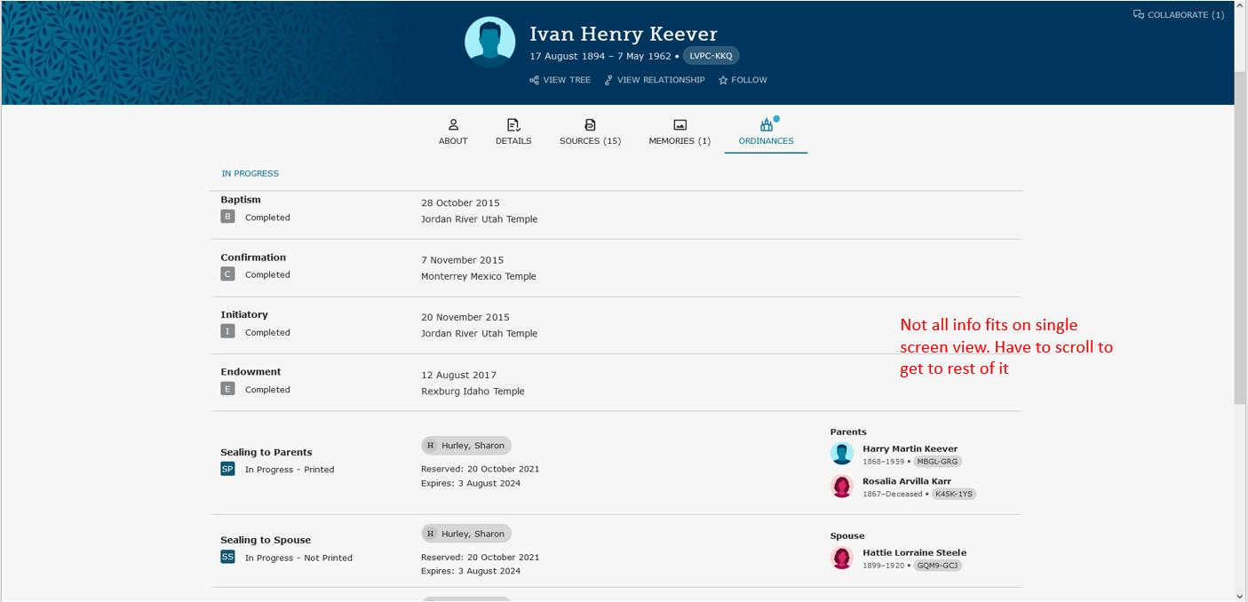
One of the difficulties in using all of the 'new' format pages is that space is not used efficiently. It requires constant scrolling to see relevant info, which requires users to remember info since they can't see it all at once. This has been pointed out on other threads, but hasn't seemed to resonate with the design team.
Here are a few examples from this new PID view. Significantly more space is consumed in the banner and tab views.
Also, why move the 'collaborate' tab up to the top right corner?
3 -
This dark top bar with an oval for a profile photo is apparently a template someone developed and sold to ALL companies everywhere - not just in genealogy.
When Ancestry revamped back in Spring 2015, they also went to that format. Much angst ensued and it finally went away.
At the time, I found that my ISP had done the same, and I saved screenshots of both at the time.
1 -
More updates have been made to the person banner. What do you think?
0 -
@lyleblunttoronto1, I don't see any difference. The person banner is still an annoyingly-large annoyingly-mostly-empty annoyingly-colored swath across the top of the page.
4 -
Differences:
1) The top accessory banner does not appear until you scroll up.
2) Font size for the name is smaller
3) A little less space between the three lines of type.
I think View Tree, etc., could still be a little closer to the dates and the space between View Tree, ect, and the bottom of the screen could be cut in half, or would that be getting too cramped?
1 -
Thanks to @Áine Ní Donnghaile for illustrating this is not an original piece of design work by the FamilySearch engineers, but one that has been adapted from other websites.
The difference is, other websites (notably Ancestry) drop features that do not meet the approval of their users, whereas FamilySearch does not. Perhaps it is because Ancestry (and other commercial concerns) have more money to throw around, so can afford to revert to how things were previously. Obviously, there's nothing impossible about reverting to original formats: the old coding must still exist, so just re-use it!
I guess that once FamilySearch has spent so much of its limited resources on making such changes, they are not prepared to write-off the expense for the sake of their users' wishes.
No, @lyleblunttoronto1, this certainly doesn't go any way in what I'd like to see used throughout FamilySearch: clearly presented information, without any elaborate heading, allowing for the optimum (no, not necessarily maximum) amount of detail to be displayed without always having to scroll - even in using reduced magnification on my 21" screen.
2 -
I just tried the New Person Page for the first time.
It is blindingly ugly and entirely not user friendly.
Why can't it be left alone?
The current form is easy to use, easy to see, and easy to understand.
If you change it to the way I just saw I can only imagine how many branches will be screwed up by people not checking family structures.
Please, please leave it alone!
3 -
Why is 'collaborate' moved away from where it used to be and up to the top right corner (where it is hard to find)?
That's a conscience effort to separate 'collaborate' from 'about/details/sources/memories' so there should be an explanation available. Otherwise, why invest the time to hide it up in the corner?
0 -
There is a new thread on this topic in Announcements. Maybe we can get everything moved to the same location, please?
1 -
I agree with other commenters that the information density loss is problematic. That is a consistent theme with all of the user interface changes rolled out since mid 2020 or so.
I don't understand why that is being done and constant scrolling makes it MUCH harder to work efficiently. Maybe the developers use 4k monitors and don't need to scroll, but nearly all monitors are 1920x1080 and the new layouts provide a very poor experience at that resolution.
I would love to see the new format adopt the same information density as the previous format.
Some examples below:
0 -
The new timeline does not have a map anymore? Is there a plan to add the map before this beta version goes 'live'?
current format:
new format:
0 -
There have been several posts from moderators that the map will be coming back. It's just not finished yet to work with the new page.
2 -
One more example of poor information density...
Again, the ask would be to retain the same level of info density as existing page.
Also, please put links to 'sources/timeline/collaborate/memories/ordinances' back in a banner so that they can be accessed easily from any scrolled position.
2 -
Oh, dear - I think I will eventually adapt to this after all! Well, I'll have to, won't I, as we know (as with the revised Search interface) once a feature has been developed (by the engineers) there is no going back to the "old" version.
Apart from Jeff's illustration about not being able to fit the three spouses on one page in the new version, at least a way has been found around the similar problem in the Vitals section. Putting Birth / Christening and Death / Burial side-by-side - instead of the existing one-below-the-other format - helps with viewing all the facts together.
I'm sure I'll find some criticisms the more I work with the new pages, but there certainly are some good ideas: especially in being able to view Discussions / Notes from the Person page.
A shame I still can't adapt to the revised Record pages, which continue to prove a real hindrance, especially when it comes to viewing a whole household in census records.
What's next - a revised Couple Relationship section? Long requested, but I still fear any final outcome, if / when it is eventually introduced.
3
