Link to Community Home in upper menu bar on new Homepage
Hi,
Would it be a good idea to make the communities more visible by placing a tab in the upper bar on the new Homepage? To my opinion it would help to get more visibility for the community and (support) groups.
Comments
-
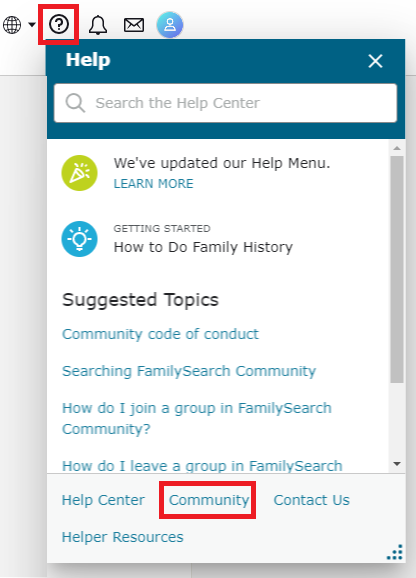
Currently, when you click the Help (circle with question mark) icon, there are several help options - Community being one:
Grouping these options under the 'help menu' seems sufficient.
0 -
Hi Genthusiast,
Thank you for answering and you're right if you're searching for help the Community link can be found in the Help Menu. However if you just want to join a group for instance a group that concentrates on a specific country or category, you wouldn't know that clicking on Help would bring you there. (and as currently the search box in the help menu isn't working (see my other discussion on reporting a bug) it's a bit difficult to find. There are support groups for help and there are also normal topical groups and as a beginner within this community I seem to get lost in the huge pile of possibilities. (please also know that English isn't my native language, so it's a bit harder for me to find my way around.)
0 -
It would also be a good idea to label it with something recognizable, like "Communites" instead of the arcane label of "Feedback".
0 -
? Does your FamilySearch native language page not have the Community link under the 'help' (circle with question mark)? ... Yes the Community> Groups is a separate place/menu item in Community...
Additionally your browser should allow you to create a Favorite/bookmark to the Community pages you wish to have a direct link to. I can appreciate that some may want a 'more prominent' Community link ... but I don't need a direct link in the header/upper bar - since I can navigate through Help ... Some people worry about the amount of clicks for certain items (perhaps alluding to 'prominence') - but since I expect that searching for family will take some time an extra click or two doesn't really bother me...
Perhaps it would be nice if the header/upper bar were 'configurable' - let people choose which items to 'drag/drop' or 'check' to appear there (that way not everyone has to have the same items)?
0

