Removing confusing indicator
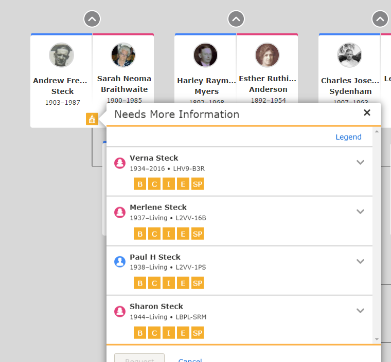
Please see the attached screen clip.
Adding the orange temple icon to Andrew and Sarah is confusing. Their work is complete.
I can see some value in indicating that there is work in their family that needs to be completed, so maybe the icon is useful.
However, I think that indicating work needs to be done for the living is not useful. Merlene, Paul, and Sharon should not appear in this list, even if Verna does have work to be done.
I'd recommend filtering out the 'living' at a minimum.
THANKS
R
Comments
-
Not displaying anything for living people is a good idea that I can certainly support.
Just in case that never happens, things will be less confusing if you keep in mind what the orange icon really means. The official definition is "Ordinances Not Available." (https://www.familysearch.org/en/help/helpcenter/article/what-do-the-different-temple-icons-and-statuses-mean ) That is, ordinances cannot be done for any of several reasons.
Regarding showing the icon on Andrew and Sarah, it will be less confusing if you keep in mind that whenever a temple icon is shown on the landscape or portrait pedigrees, it always applies to the entire family group of parents and children.
The programmers have tried to imply this by putting the icon not beside or under the person, but rather beside or under the couple.
0

