Help
The Help feature does not easily find the information you need. It seems like the knowledge articles have dwindled down to the point that it has become increasingly difficult to find on-point answers. If this is true, can we add some of these articles back in?
It is often strange to have to go to Google to find the answer to a FamilySearch answers. Going into a community, except for help in translating, is not efficient when you need an answer for a patron now.
The old help menu with the "life preserver" icon worked much better. I miss it. It seems like all of these helper resources have been trapped into a small little area and the descriptions are not intuitive. A better design is needed. The home page has become inundated with a lot of information about distant relatives that is distracting rather than helpful. Sometimes, less is more.
Thanks for considering these suggestions. Best regards, Bruce
Answers
-
I agree with Bruce that the help feature needs help. 😂
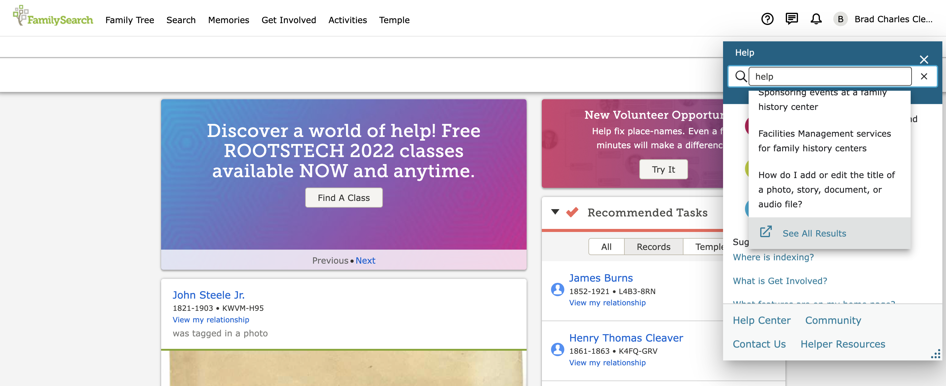
The small field that comes up with suggestions of common problems is fine when initially clicking the help button; however, after typing in the search bar, the contents should be replaced by the suggestions for the search instead of being shown in an even smaller drop down field. Below is an image exemplifying a search for the term 'help'.
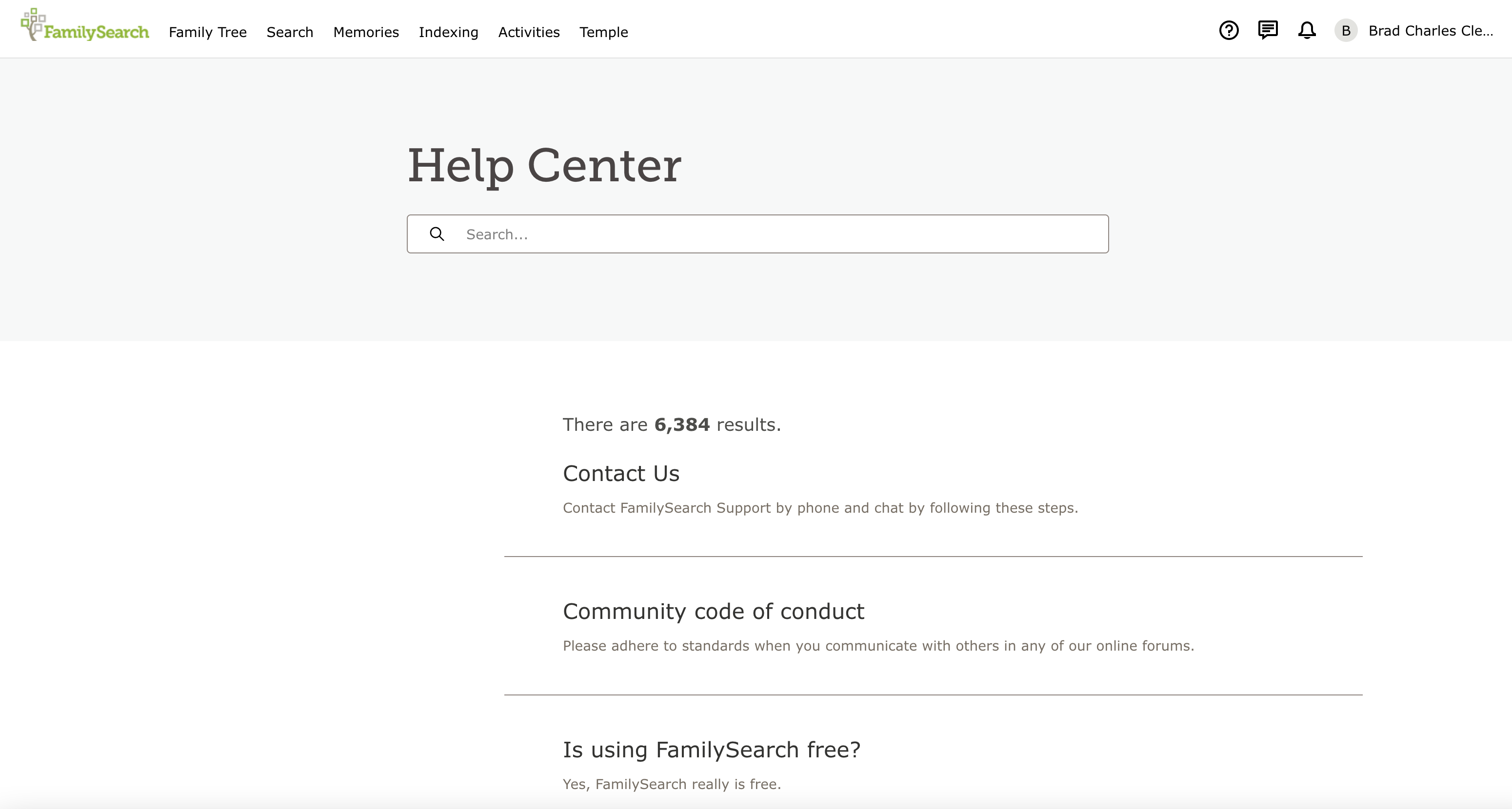
Secondly, after typing in a search and clicking "See All Results" or pressing enter, a new tab is opened but shows up as a brand new search without any articles related to the problem. In order to see the results wanted, it is necessary to retype the original search. Below are three images going through the current process using the same search term 'help'.
0 -
All
You mean, the "HelpLESS Centre" ...
As, it was 'coined', quite a while back, in the OLD 'FamilySearch' ("GetSatisfaction") 'Feedback' Forum
Brett
🤨
0


