App Improvement Request
Apple iPod (7th generation), iOS 15.3.1, Get Involved app version 1.0.0
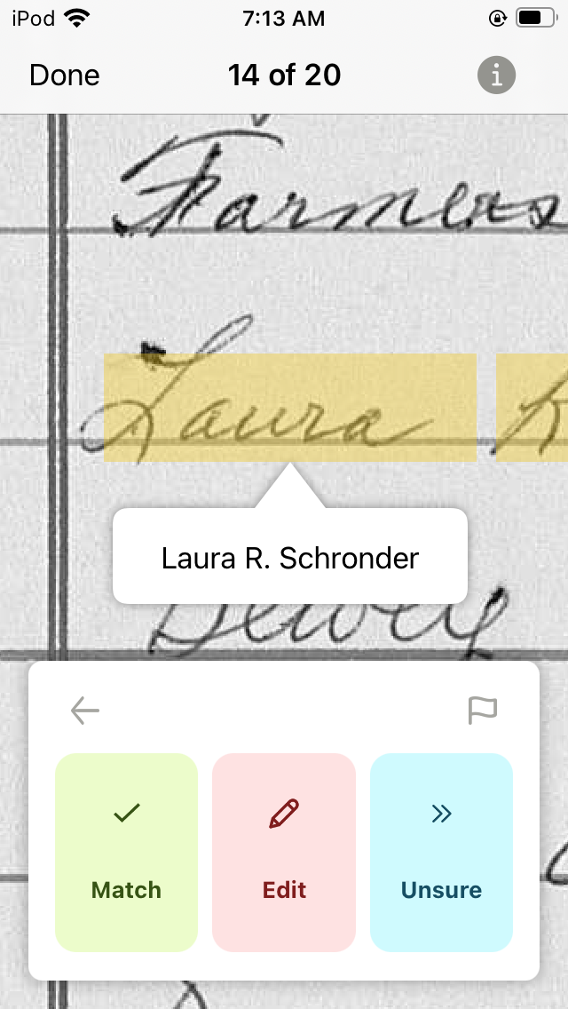
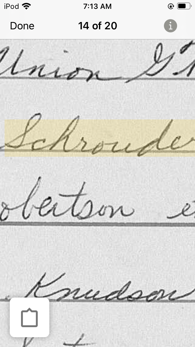
Some names are too wide for the screen:
If I drag the screen sideways to view the rest of the name, the editing box closes:
And I have to click on it to open it again:
But now I can't see the box to type in and have to try to remember what it says. Dragging to see the rest of the name, the editing box closes again:
If I open the editing box, the AI derived name isn't there at all now:
So I have to make good note of what the name actually is, Schrouder, not Schronder, drag back to the first part of the name, which closes the editing box again:
Then open the editing box one more time to finally be able to edit the name, hoping that I still remember what the edit should be.
It would be much more convenient and efficient, not to mention lead to more accurate work, if the lower editing box always stayed open no matter how the document image was moved around and if the white box where we view and edit the name always remained viewable in the center of the screen so it can be compared letter by letter to the name in the document if necessary.
Thank you.
Best Answer
-
Thank you for your feedback here and in the mobile support email; it has been reported to the product managers that work with the engineering teams. The screenshots were also helpful.
1
Answers
-
Feedback for the app is by email. In the app, lower left corner, click the More menu, scroll down, click Help, click Contact Us, click Give App Feedback, select Authorize or No (I always use No). That pops up a draft email using one of the email clients detected by the app on the mobile device.
You can send the email from any email address and any client. Just copy the To address, Subject, and boilerplate text with the app version etc. into your usual email client, and add your feedback, screen shots, etc.
The Family Tree app and web engineering teams are separate, a la Dogbert's battling business units.
0 -
Can you shrink the historical record page image? Two fingers squeeze, the usual Apple gesture?
1 -
I sent this in as an e-mail at the same time I posted it here but that is a good point for people to know.
Yes, the standard two finger squeeze to zoom out works just fine at the cost of getting the name too small to read. It also closes all the editing boxes.
1 -
Does rotating the screen/app allow the space needed?
0 -
I hadn't tried that! So I just did. The app is designed so that screen rotation is turned off.
0 -
Sorry I didn't know... My old Android won't install the app (interesting that the versioning is not compatible).
0 -
Sorry for? Sorry, that it didn't work to turn the screen? Yeah, me too. Although with the structure of it, I don't think it would fit on a rotated screen. Sorry for asking me to check something it didn't occur to me to check? Absolutely no need to be sorry for that!
0 -
In the web-app - the image settings allow you to rotate the image. If those same settings exist in the mobile app - I wonder if that would help - to fit names in a larger format for viewing? Or you could use the browser on the phone and see if the web-app image rotation helps... If the browser rotation doesn't. Rotating in browser doesn't help me - because the match, edit, unsure takes up too much room.
0 -
Thanks for following up. Feedback helps the engineers improve the app for everyone.
So this discussion can fall off the to-do list, please mark it that it has been answered.
1


