Distinguish spouses from children in Descendancy tree viewer

I am one of many contributors who spend a large part of our time on Family Tree doing heavy pruning and grafting: splitting and merging profiles, detaching supernumary and incorrect parents, etc. For this work I often use the marvelous Descendancy tree viewer.
In the Descendancy tree viewer I would like a small change to distinguish spouses from children, when the option to show spouses is turned on. For example, where spouses attach to the tree, just to the left of that point add a "+" or a short line extending to the left.
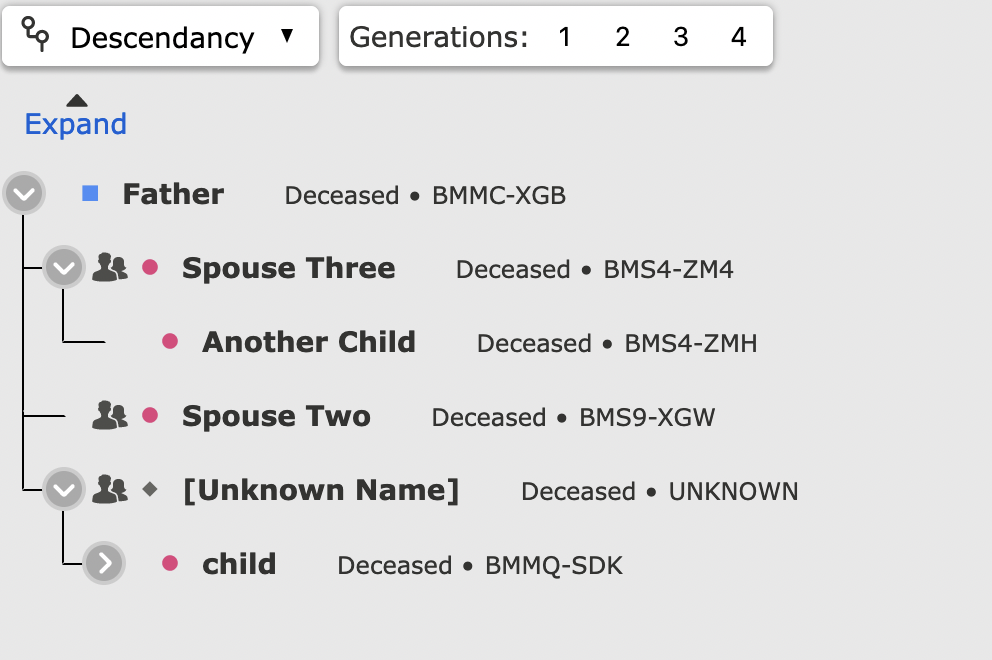
Here is an example tree, where the same man appears 3 times. I have added 2 red circles, on a spouse and a child, where I think some differentiation is needed.
Comments
-
The > means there is a spouse. If there are any children they will be on the 'down' line that attaches directly to that Spouse (> turns into chevron - and I'm actually seeing Spouse written). Perhaps a double line (=) between spouses would be sufficient?
The child listed thrice seems to need work (apparently the correct Johann isn't known - or cousins intermarry)?
0 -
The > means there is a spouse.
Hm. So, not a great example. There is a ">" only when there are children.
Two of the three instances of that one person are correct. Cousins married.
0 -
I may be misunderstanding the question or the image, but don't all the spouses have the couple icon in front of them? That is pretty easy to see. Also, although it is pretty subtle, the spouse and children are at different indent levels:
Or is the concern that you can't see that a child has a spouse until the next generation is opened?
Actually, an arrow just means there is more information under that person. It will be there if there is just a spouse, just children, or both spouses and children.
Here is an example where there is an arrow but no children:
1 -
Although the program allows children without spouse (such as entry where spouse is unknown) that of course just reflects lack of records or lack of entry. Even if guardianship - that doesn't mean there wasn't a spouse ... My main intent was that 'normally' the '>' means there is a Spouse - and in reality there was (for bio family tree) even if one is not entered ...
Yes I didn't give an example. Your graphic was enough for me ... There are spouses ... Multiple spouses would introduce more difficulty (at least with 'following the thin line relation' - but on a mobile device it kinda forces you to view each family - so the restricted view (which also has Spouse written out) enhances the view of each family.
A bolder line or double line between Spouse(s) could also work to highlight that relation. The thin line to everyone tends to get 'lost' - and I think is the source of your request/idea. Otherwise I think Gordon has illustrated the current subtle differences of icon/levels well ...
0 -
I couldn't quickly come up with an example with children but no spouse so I created a man in all three situations of spouse, no children; no spouse, with children; spouse and children:
The great big blot of the couple icon makes it pretty easy to see the difference between a person's spouse and a person's child. I don't see that anything else is really needed.
Off the point, I find it interesting that although the general advice here it to not enter "unknown" or something for an unknown spouse, here that place holder is automatically thrown in because it is required to maintain the structure of the chart.
I'll revise my interpretation of the arrow. The presence of the arrow does always mean there is a spouse although the spouse's name may not be known and may mean there are children.
1 -
Interestingly (in beta) as well ...
For descendancy - whichever preferred relationship is selected will be the only descendancy shown. For 'descendancy' you would think it would not show step/guardianship - but it does - it just depends upon which relationship is selected as preferred - but it does not indicate step/guardian - it acts as if it were actual biological descendancy. Perhaps that is an area that needs addressing - differentiating if the descendancy being show is other than biological (strictly 'descendancy' should default ONLY to biological?)
0 -
although it is pretty subtle, the spouse and children are at different indent levels
I am finding it too subtle. For a small descendancy tree, or a quick review, it is no big deal but when trying to detangle complicated tangles I struggle with the display.
The Descendancy viewer shows all parent-child relationships, not just the preferred relationship, and I like it that way. That is the situation in the screenshot I shared above: the subject man had a stepmother. In this case I removed the step-relationship because he had left his father's household before the arrival of the second wife.
0 -
I think the reason it showed multiple relations in your graphic above - is because of the 'peculiar' descendancy involved. There are cousins shown in the descendancy that intermarry - and from what you just said - another cousin/relation that became a step-parent - all within the same descendancy view...?
So it is showing the descendancy - the cousins (intermediate generation) - and because the cousins marry - yes their descendants show up twice (or thrice initially) ... Also step-siblings are showing married.
I was testing and got confused with child having multiple parent relations - if you want to see a particular path descendancy you would have to know which ancestor to start with.
In the options if you select the Portrait with Spouses options - the descendancy view looks like the above. The Portrait makes the indents for children a little more distiguishable - but takes up significantly more room.
0 -
@Gordon Collett that placeholder "spouse" is a fairly new behavior of the Descendancy tree viewer. I am not sure how I feel about it.
When I expand the tree to view many generations at once, I am losing track of which is the spouse and which is the child. Only just now did I notice the couple icon in my own screenshot. Sheesh. Is that new?
The couple icon does not appear on print-to-PDF:
...but there is room left for it.
1 -
I find that in general printing web pages on almost any site is always flaky. You can never know what you are going to get and formatting is usually a mess. I notice that not only are the spouse icons missing, but the arrows inside the circles are too.
I agree that the indenting could be a few more pixels even at the cost of the wider display area it would result in.
1 -
The printing issue must be browser dependent. I tested it in Firefox on my Mac and get a better printout than you do:
0 -
I'd actually prefer the other parent be post-fix rather than in-fix as is the style now. I think that would work better with the option to switch the spouse on and off. Here is a very casual sketch of what I mean:
I will be the first to acknowledge this arrangement kind of breaks down when there are multiple other parents.
0


