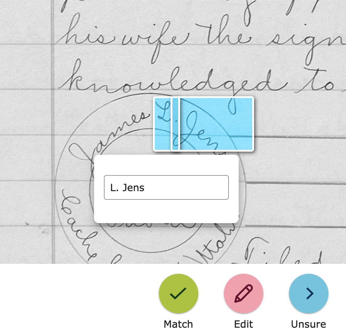
Review Names: Would be helpful if editing box could be moved
This review of machine indexed records looks to be quite a fun and valuable new opportunity. I tried a batch and quickly ran into one possible improvement. There was one name where the editing box covered part of the name:
After discovering the hidden image controls, which, by the way, would likely be best to have open by default rather than closed since many people don't bother searching pages for stuff hidden like this then complain about lack of function, I found I was able to rotate the page to see the rest of the name:
It would be easier and more natural to just be able to drag the box out of the way.
Answers
-
I was happy to discover that if we rotate it will likely uncover the name being indexed! Thank you for that idea!
0 -
Thank you for your helpful feedback; your feedback has been shared by multiple people and has been reported to the engineering team. Please note that there is no guarantee the feedback will be implemented, but it helps when multiple people have shared it. Your feedback is much appreciated.
1

