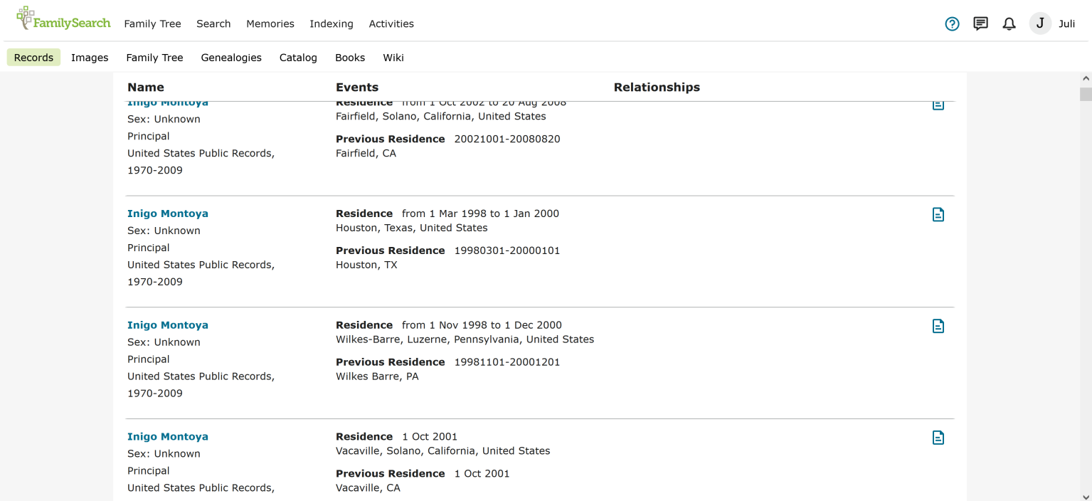
Improve Search feature

The current search feature is frustrating. I much preferred the old search feature. It was easier to use, easier to search by collection, the results were easier to see and attach to family tree. This new search feature takes up most of the page if you edit it or make any changes and then you can only see one or two results in the little box because there is so much information on the top and the right side of the screen. Is there a way to go back to the old search screen or to improve the new one so that it's easier to use and the search criteria doesn't take up the majority of the search page? family search used to be the first place I went to search for records, but now it is the last place I will use becuase i am so frsutrated with the new search features. Everyone I talk to about it feels the same. Please improve the page by removing the huge banner from the top of the page when you edit the search, and make the results the primary thing you see, rather than showing up in the tiny section in the bottom left of the screen. The old search screen was so much better.
Comments
-
There is an article in the FamilySearch Help Center that will assist you in making suggestions to the FamilySearch Team. You can click on the link below to go to the article.
How do I give feedback to FamilySearch?
https://www.familysearch.org/en/help/helpcenter/article/how-do-i-give-feedback-to-familysearch
1 -
carolbmoss: I totally agree with the submitted comments above. I have been using FamilySearch since its inception and always found the original search tool very easy to use. The filters worked well and I could always start here for record searching.
I agree I prefer to go elsewhere (Ancestry.com) for a search for records. Please consider letting us have the option of the old search feature. Thank You!
4 -
Brian/Carol
Welcome to the "Community.FamilySearch" Forum.
I am just another 'lowly' User/Patron ...
Just in passing ...
In relation to, the "Changes" of, the NEW "Search Records"; and, the resulting "Results" page/screen ...
You are certainly not alone ...
We are ALL 'Struggling' ...
And, just in case you, were not aware ...
Here are some FOUR (x4) posts, in date (and, post) order of being posted, from someone, stating, to be part of the 'FamilySearch' Team that, 'Designed'; and, 'Developed", the the NEW "Results" page/screen, for "Search Records", which appears, in some of the posts, to give some "Instruction", on HOW to use the NEW "Results" page/screen, for "Search Records".
"Ideas" (ie. 'Feedback) Section
15 July 2021
[ 1 ] Discussion 90536
'Category' = Records (Searching And Viewing)
Home > Ideas > Records (Searching And Viewing)
Hello FamilySearch Community! Try out the new update to Record Search.
29 September 2021
[ 2 ] Discussion 103619
'Category' = General User Interface
Home > Ideas > General User Interface
FamilySearch's Updates to the Search Page
https://community.familysearch.org/en/discussion/103619/familysearchs-updates-to-the-search-page
[ 3 ] Discussion 103620
'Category' = Records (Searching And Viewing)
Home > Ideas > Records (Searching And Viewing)
FamilySearch Employee Responding to Search Page Feedback
[ 4 ] Discussion 103621
'Category' = Records (Searching And Viewing)
Home > Ideas > Records (Searching And Viewing)
FamilySearch Employee Responding to Search Page Feedback
I hope, that some of the information in these posts, may offer some help/assistance.
And ...
There are OTHER posts throughout this Forum, where the instigator of the above posts has responded with, advice; direction; instruction; help/assistance, on the NEW "Results" page/screen, of "Records Search" ('FamilySearch').
Now ...
That Said ...
You may like to ADD, your thoughts/comments, in those particular posts; so that, your thoughts/comments, like those of MANY other UNHAPPY Users/Patrons, ARE 'seen', by the Team, in 'FamilySearch', that 'Designed'; and, 'Developed" the NEW look "Search".
As you can 'see' from those posts ...
DESPITE, all the NEGATIVE 'Feedback', with regard to the NEW "Results" page/screen, for "Search Records", from those that matter, the 'lowly' User/Patrons, where the NEW "Results" page/screen, for "Search Records", was 'foisted' upon them; BEFORE, being "Fully" released to ALL User/Patrons - 'FamilySearch' RELEASED the NEW "Results" page/screen, for "Search Records", to ALL Users/Patrons.
As I already suggested ...
You are not alone ...
We are ALL 'Struggling'; and, NEED "Help", with the NEW "Results" page/screen, for "Search Records", which is NOT very 'User Friendly'.
MOST Users/Patrons want the NEW "Results" page/screen, for "Search Records" to be "Reverted" BACK to the PREVIOUS "Results" page/screen, for "Search Records".
But ...
That Said ...
SADLY, I doubt that will happen ...
And ...
Finally ...
'FamilySearch' has made, MINOR "Changes", to the NEW "Search Records"; and, the resulting "Results" page/screen, hopefully such will keep occurring ...
I know, that this may NOT help/assist; but, I hope, that this gives you, some additional, insight; and, perspective.
Brett
0 -
I don't like the new search facility either, it's very cumbersome, and the Advanced Search is impossible to use. When the old search system accessed records like IGI,it was easier and more useful. Also, the year access is limited to 1700 onwards, but I now need to go back into the 1600s and 1500s. Yes I can use Ancestry UK, but I thought FamilySearch had all those records as well.
I've tried to access the Beta version you recommend, but my computer won't allow it, as it says it's unsafe.
1 -
The inability to adjust search parameters without starting over is extremely frustrating. The "preferences" link in the search results is inoperative, so, totally useless.
0 -
Thank you all for your feedback. At least I know that I am not alone. Another feature that is missing from the new search page is the ability to access the collection where you found a record for an ancestor. For example, if I found a marriage record and attached it to my ancestor, I used to be able to click on the collection that it came from and type in the surname to see all the records for that surname in that collection. In that past this feature has been an excellent search tool. However, with this new search screen, I cannot find the link to the collection.
0 -
I cannot figure out how to get back to my search once I have attached a record to an ancestor. I end up having to go back to the details page and start the search all over. Does anyone know how to avaid ths and get back to the search after attaching a record? Even with the old search engine, this was a problem. If you used the back button, you could go back, but all your search parameters were deleted and you had to input all the search parameters again.
0 -
@Jim Brown_11, I think maybe you've accidentally switched to the Preferences panel, and that's why you can neither adjust your parameters nor click the Preferences button/link/thingy.
This is a very recent change to the interface -- like, within the last week, I think. In early January, they made the "advanced search" panel uncloseable, and moved the access to Preferences from a tab at the top of the search parameters to a button-thingy above the search results. There was much outcry, so last week we got the X back -- but they've done away with the search summary/abbreviated search that used to be above the results when the side panel was closed. Instead, they've added a Search button-thingy next to the Preferences one.
The Search versus Preferences buttons really should be a toggle, since it'll only show you one or the other. If Preferences is open, then you cannot see what the current search parameters even are, never mind changing them, and you cannot click the Preferences button. If Search is open, then you can -- after much scrolling -- figure out what search parameters were used for the currently-displayed results, but you cannot adjust what fields are shown and in what arrangement.
Here's what it looks like for me with the Search panel open:

You'll notice that the magnifying-glass-and-"Search" button is gray, and the cursor changes to a slashed-circle if you mouse over it (although "print screen" doesn't show cursor status, unfortunately).
Here's what it looks like if I choose the Preferences thingy instead:

Now it's the sliders-and-"Preferences" button that's gray and unselectable, and the search parameters are invisible and unchangeable.
And finally, if I click the X on both Search and Preferences, I get this wonderfully uninformative view:

Here, I can filter my results, but I can't see what I searched for, and if I scroll down, I can't do anything: all of the bubbles and buttons scroll right off the screen.
So I ask again: FamilySearch, please just stop. Stop tweaking this miserable failure of an interface, and just consign it to the oblivion it deserves. Bring back the old arrangement. It was logical, it didn't waste screen space, and it worked.
1 -
I took a new approach today, attempting to bring light on this issue from a different direction. I'm a Stake Temple & Family History Consultant--Family History Center; in other words, I get to be the "lead" for the local Family History Center. as such, I have a monthly report that I submit to the Family History Department in Salt Lake. There is an area of that report that asks "What can we do to help you...?" I used the report for January as an opportunity to discuss this issue in writing to those who monitor the Center's operations. I can't say whether or not my input will bring any resolution to the issue, but I'm going to continue to attempt to raise the issue to a different audience. Maybe it will create some action that will result in a more "user friendly" application.
1 -
WilbergCkarkN,
Excellent idea. I used to have the same calling and they do read those comments on the FHC monthly reports. Hopefully it will catch the attention of the right people.
0 -
Hello, The old system was much easier for searching. When the father and mother was listed, you only had to click on their name and the information about THEIR parents came up so you could go further back in time. I'm finding it hard to find marriages of their children.
0