Change is Happening !

Despite early statements to the contrary, the "New Search" can be changed !
Before:
After:
So please keep the comments coming, and with enough Strategic Initiative we might get some further positive action.
( I'm just an ordinary person trying to make a difference )
Answers
-
FS GUI Developers and Users please read and comment on the outline specification in:
0 -
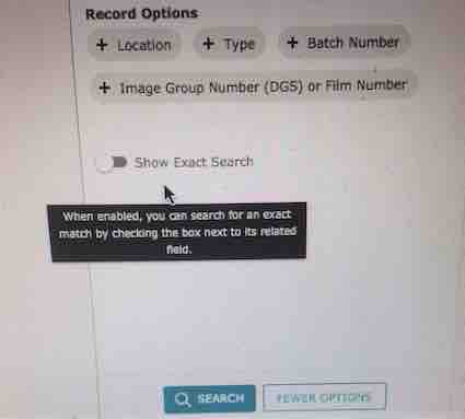
Oh, yes and "New Search" GUI staff, please move the 'Show Exact Search' switch or just move the Help Bubble to stop it from obscuring the 'Reset All' control.
It's a very basic mistake that should never have made it to the final implementation. If an item obscures another control then it is in the wrong position. Also the help bubble has a persistence property that means when it appears, as it consistently does, then I have to wait for it to expire. Only a few seconds, but for all the occurrences multiplied by all the people who use the 'Reset All' control this equates to many hours of research time lost.
0 -
It was always stated that changes would be made. The only "change" that does not appear to be on the table is reverting to the old version of the search engine.
1 -
Nevertheless, it's a promising start, and it just leaves 7 more simple changes to the GUI that I would like to see incorporated.
0 -
For many of us, making enhancements to the new GUI is not the issue. Personally, I am not encountering the same degree of trouble in finding the records I expected to find so easily using the old version. My problem is with the general appearance - graphics, fonts, etc. - that FamilySearch engineers started to introduce elsewhere (source linker process, etc.) some time ago. Even if things "worked" exactly as they did previously (with regards to the search options), I would still be unhappy at having to be constantly scrolling up and down the page, instead of being able to see all the detail on the screen, as before.
Look at the mess that was created with the source linker. Perhaps more of us should have seen this was how things were going to develop and have supported the few users (including @DonMartinThomas1) who protested so vehemently against that change.
3 -
As an example of what I am referring to above, see https://www.familysearch.org/ark:/61903/1:1:Q27B-GTPR. Very much in the "style" of the new search engine pages, but introduced some while back. Previously this detail, and the whole process, could be viewed / undertaken without any scrolling at all - well at least using my monitor. Both processes have now become a real pain, compared to the former ease of use.
3 -
Agree with all re the endless scrolling ... Nursey rhyme with added FS verses
Row, row, row your boat, gently down the stream. Merrily, merrily, merrily, merrily, life is but a dream
Click, click, click your mouse, once in every square. Merrily, merrily, merrily, merrily, click without a care
Scroll, scroll, scroll your wheel, gently down the screen.Merrily, merrily, merrily, merrily, Search is but a scream
1


