The Updated Look for Viewing and Editing

Hi,
I have been using the new look for viewing and editing records, and when I see an error that needs fixing, like households not correctly allocated in a census, for instance, I try to correct them. Currently, I have a household whose members are split across two pages. In the old view, one can go to relationships for a name, and open a split screen view in order to be able to add the other household members to the group. Now, I do not know how to find that anymore. There isn't a "Relationships" group in the editing pane, and I don't see how one is meant to do this.
In addition, as a separate issue, which is more of an annoyance and makes things more tedious, one can no long select multiple names to move several people at once to a new group. Is there an option I am missing when trying to do this in the new format? I didn't find any answers when searching the community.
Thank you for any help!
Answers
-
I have also found several problems with the Updated Look, such as it looking cluttered, fields missing from census records … I've submitted them as feedback when I turned it off and the website asked "Why?".
There are way too many problems. As such, I think there needs to be a special Group established here in the Community forum just like there is for Merging, DQS, Change Log, etc.0 -
I gave the Updated Look another try today on this record for a Death Certificate:
https://www.familysearch.org/ark:/61903/1:1:NQKF-4G3?lang=en
Problems:
Unable to add the "Address" field to the Residence section and the Death section.
Unable to add the "Cemetery" field to the Burial section.
The "Cemetery" field is in the Death section. He didn't die in a cemetery.0 -
Thank you for taking the time to identify these issues and for helping improve the quality of the records. Based on your description, it sounds like there may be gaps or changes in functionality between the previous editing experience and the new record editor, particularly regarding split-household corrections and moving multiple people at once.
We encourage you to submit this through the Feedback option within FamilySearch. Feedback submitted directly from the affected page goes to the teams that review user experience concerns, feature requests, and workflow issues. Including the specific collection, record URL (if available), and details about what you were able to do in the previous editor versus what you can do now will help them better investigate the issue.
We appreciate you bringing this to our attention and your continued efforts to improve the accuracy of FamilySearch records.
2 -
Yes, i tried the Feedback option from the page where i was working but it didn't function. There was an error message about a pop-up blocker, which i don't think i have enabled, but i have not verified yet. I thought there might be an answer or similar experiences that someone encountered. I shall try to get the feedback button to work.
Thank you for the response!
0 -
@VHC
As I stated above, another way to give feedback and probably a better way since it is specific for this feature is to:
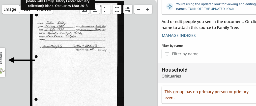
Step 1— Turn off the Updated Look:
Step 2— State Why: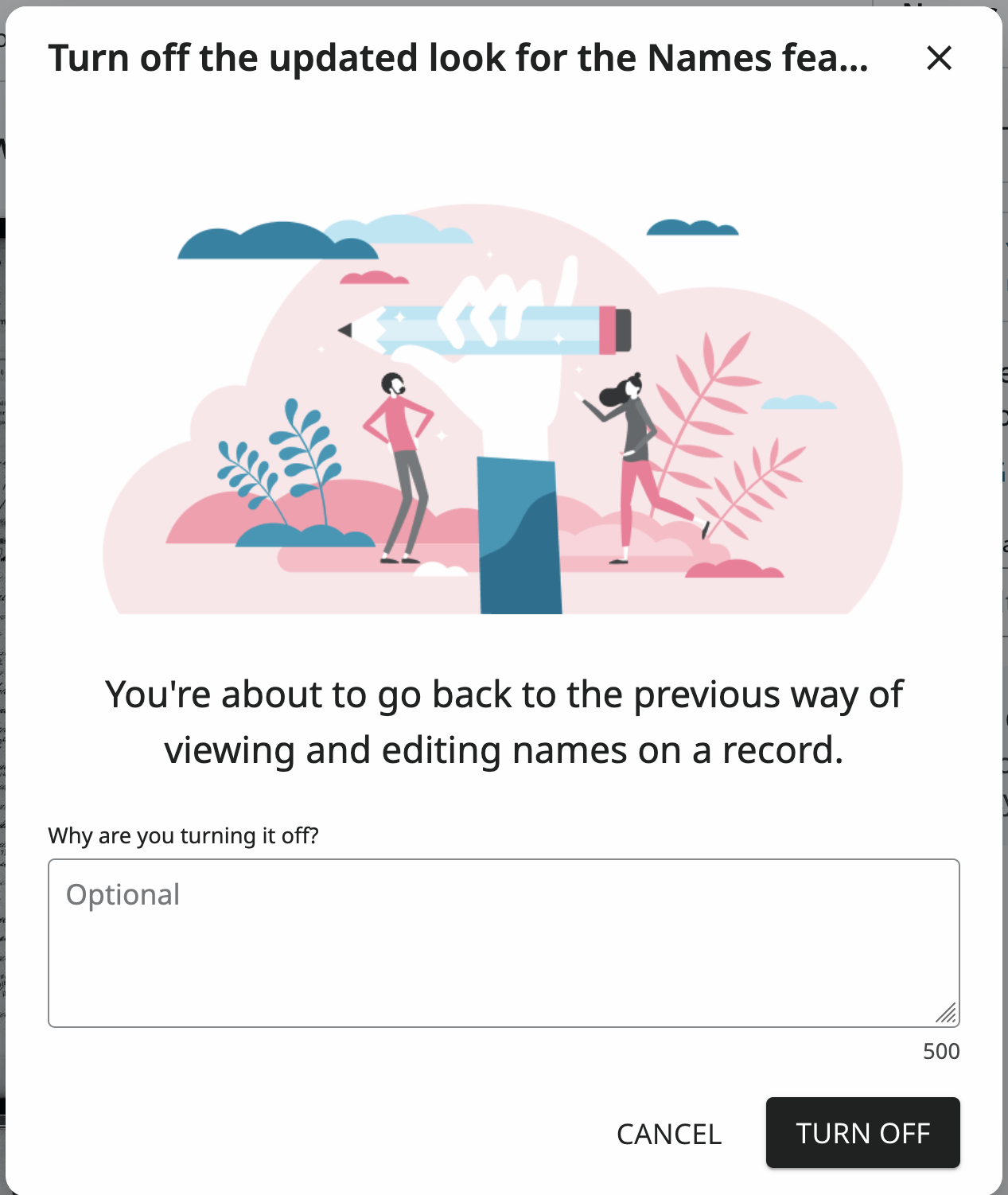 1
1 -
@dancingintherain
I thought feedback was only for a specific record and not functionality, no?
I'll state again:
There should be a Group dedicated to this subject due to the large amount of flaws and missing features.
Plus it will enable people to provide screenshots because sometimes there are not enough words to describe a problem.
e.g.
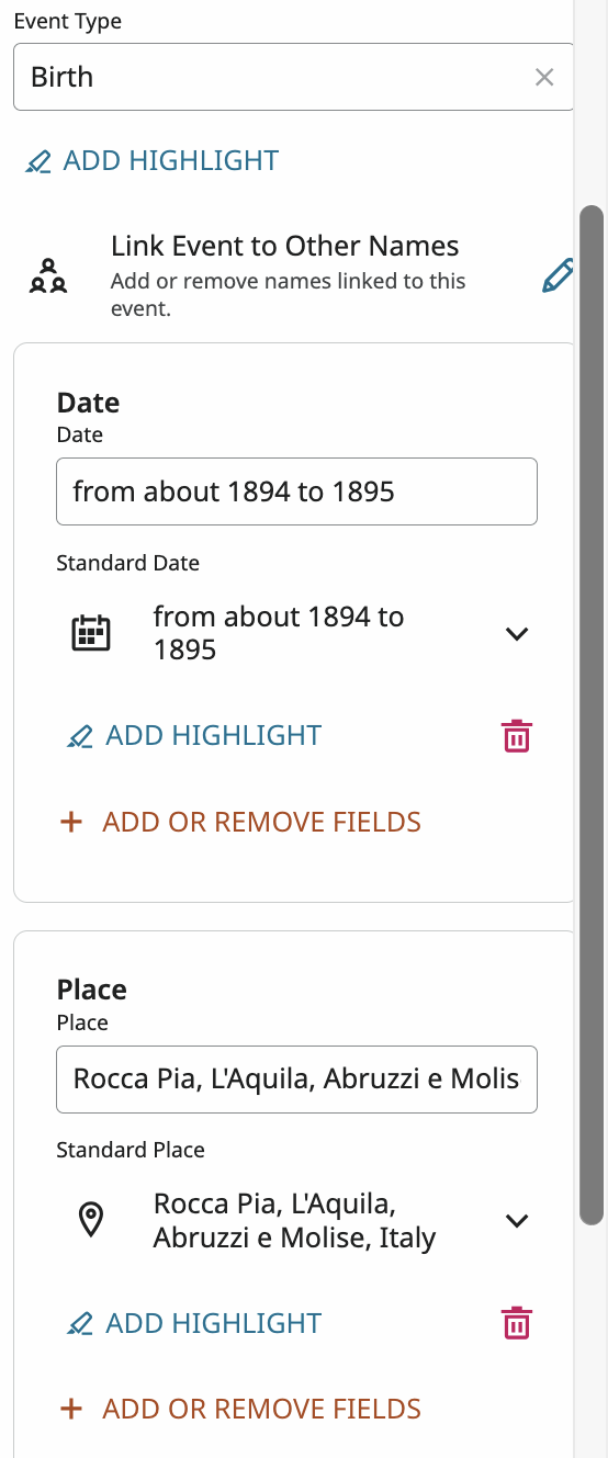
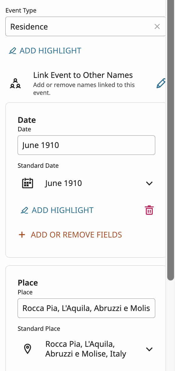
It's difficult to distinguish between Events in the new look and it will lead to incorrect indexing.
NEW LOOK:
Editing is all together, if someone scrolls to far, they will enter info in the wrong field. It is hard to see where one event ends and another starts. Plus the "Add or Remove Fields" button is missing.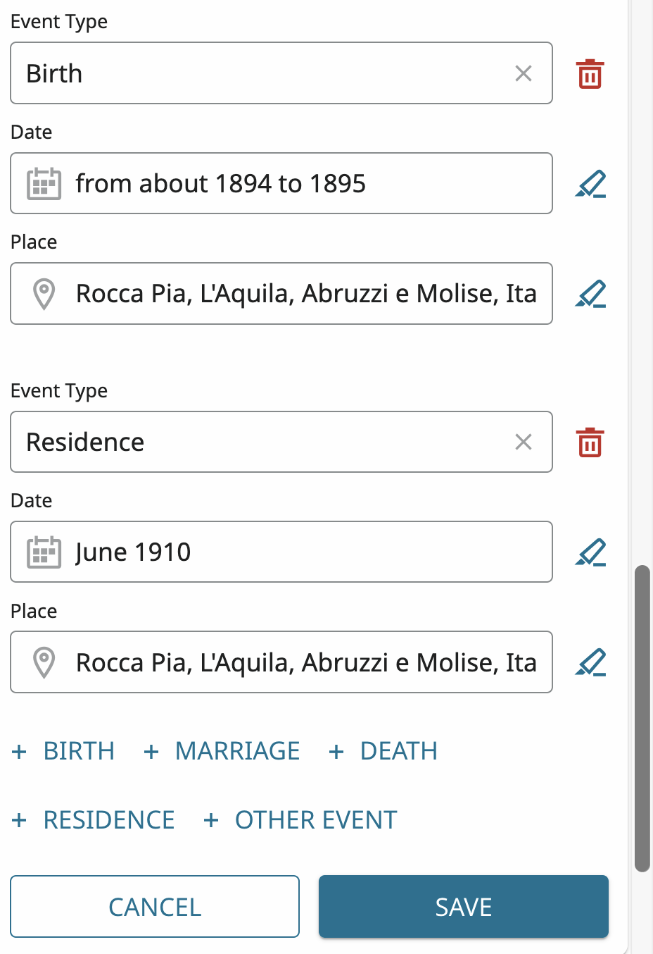
There should be something to make it clear, such as a line:
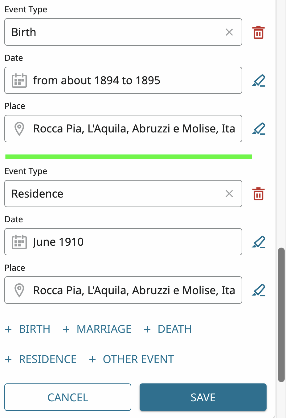
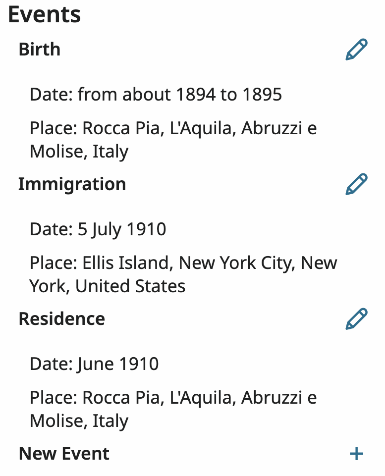
OLD LOOK - Each event required opening a separate window to edit, making it very clear
 0
0 -
Feedback is used to help improve FamilySearch services. Users can provide feedback by suggesting ideas, reporting problems, or sharing thoughts on specific features. This feedback is crucial for refining the platform and enhancing user experience. Users can give feedback through various methods, including feedback buttons on specific pages, the FamilySearch Community, and directly within apps. For this specific issue: "There should be a Group dedicated to this subject due to the large amount of flaws and missing features. Plus it will enable people to provide screenshots because sometimes there are not enough words to describe a problem." I would recommend. https://community.familysearch.org/en/categories/suggest-an-idea The "New Look" is in pilot testing, so only a select few have access to this feature. So the engineers are looking for and need feedback via the feedback button regarding functionality issues. This will help fine-tune the functionality and make the product more user-friendly for FamilySearch Users. You certainly do not have to use the Updated Look for Viewing and Editing; you can turn it off. It is totally up to you, but it is appreciated when you use it and provide feedback for the engineers. This helps in developing this feature.
 1
1