🎇New Person Page is Here to Stay🎇
Comments
-
I agree with comments above. This new format probably works really well on handheld phones or devices, but not so well on laptops. It is unnecessary for 2/3 of the screen to pop up just to add birth date and birth place and a some notes.
1 -
I really don't like the new format. Please at least give us the option of using the old format.
0 -
On mobile/phone device the About, Vitals, other, Family, Sources, Collaborate, Memories ... Etc. All have their own tabs. If Desktop users would prefer this they can certainly give such feedback on the new person pages group (where feedback is welcome. If it continues being given here in Ideas I wonder if a Moderator will combine them all under the group?)
0 -
Moderators are unable to move comments to the group. I asked.
0 -
I agree totally with Volunteer 2023.
This is definitely a retrograde upgrade. Please GO BACK ASAP!
It is so bad that I feel that I no longer want to do family history, especially if this FamilySearch site is involved. This includes temple ordinance work!!!
1 -
This format is not complete and not an improvement !!! One thing is when they say that it is not a standard place ,,,, there is no button to give us standard place options like the last format . There is so many more not friendly use I have gone through many other changes but this one makes no sence and is very hard to use and teach others to use. As a Family Search worker in the ward I always told peaple to not be afraid of the sight It is very easy to use. Now I don't know what to say because now that is a lie!!! It is not easy or friendly. You tell us to come here to tell are feedback and then you tell us to go to a different place to tell someone else( the engineers) and one can't even find that spot. Another thing I have found that is not friendly is when you click on names in family to see if they need temple work done, without going into the person itself, you have to double click. In the old format one click was so fast and on to the next name. This sights waste a lot of time!!!! In the days that we are told to get the work done and you slow the process down with you think something is a better format and you think it looks better? The old format looked good and worked so much better!!!!! The church is always improving BUT THIS DID NOT!!
0 -
I have lost almost all interest in making genealogy after the new FamilySeach website has become standard. Maybe its because Im to old to learn new. I was familiar with the previous website, it worked perfectly to me. Please, consider to make both the old and new website available now and the future, thanks.
0 -
If you have constructive feedback - the new person page group is where you are supposed to give that:
If you wish to complain - you can do that anywhere.
Community tries to group conversation threads into categories/groups so that all communicating on a particular topic can have their voice added to that particular conversation. Please be a constructive Community member.
It is pretty much a fact of life - change IS hard - but life is full of change. If you have questions about how to do something in the changed website - ask away! Community is supposed to help dealing with the changes easier - not harder. We can all do hard things - even deal with FamilySearch changes...
0 -
Please give us back the option to go to the old page! Please
4 -
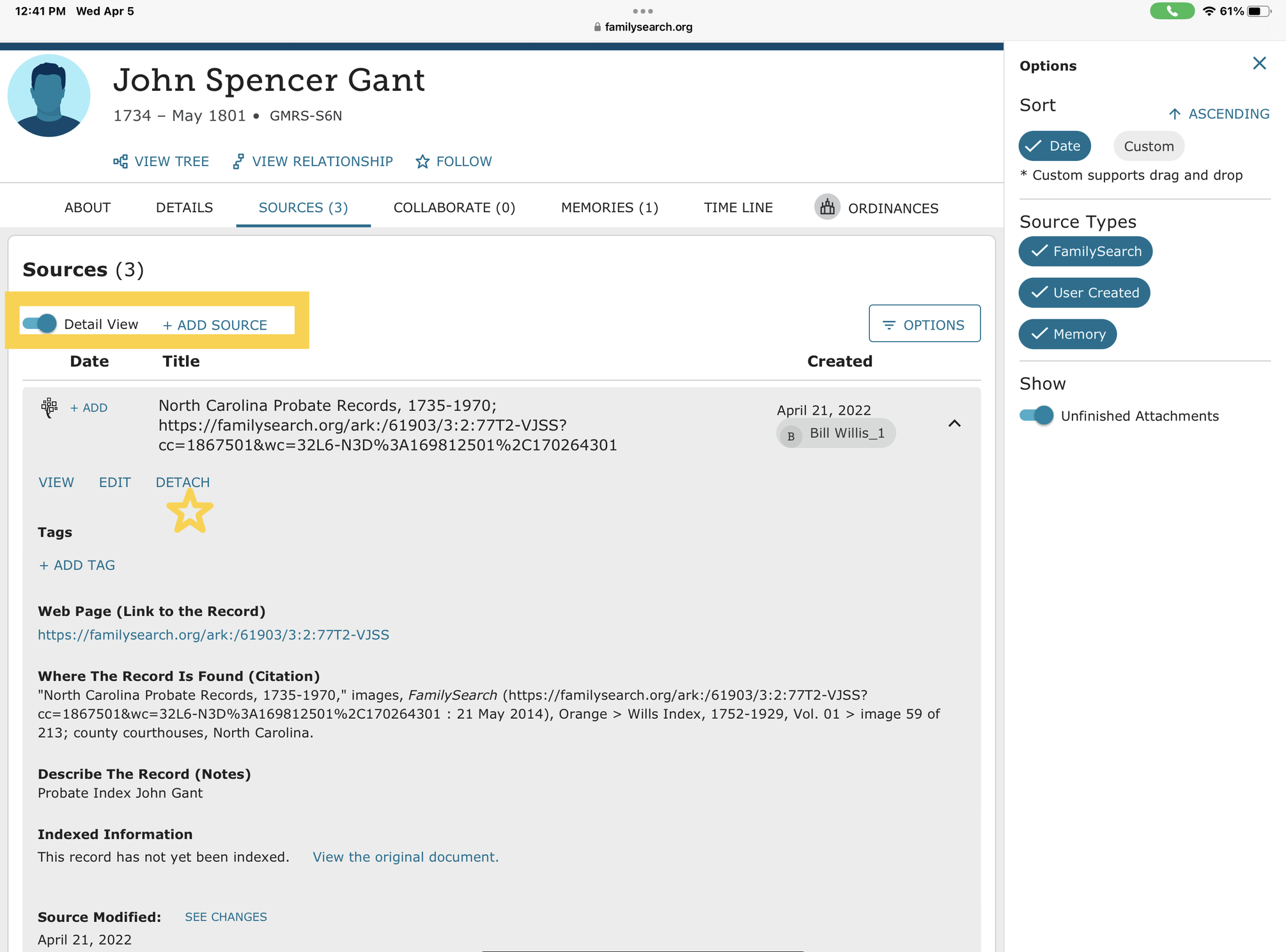
When printing from the new person page there is a lot of paper wasted because of white space between information pages. Can we compact this feature to help us not waste so much paper. These days copy paper is so costly that we cannot afford to have all the people wasting paper.
0 -
There have been some discussions of known issues with printing for a while.
Have you joined and posted in the New Person Page group, where developers have asked for feedback on the new format?
1 -
It's hard to judge PROGRESS when you are looking for PERFECTION.
4 -
1
-
Hello
I have be TRUDGING around the new person page at a Snail's Pace. It is abysmal & extremely painful to navigate around. You have to have the patience of a saint !!
Updating the date and location fields is a nightmare. You have to do several Saves for the data to populate. On a genealogical database dates and places are at it's core.
And, the layouts. There is more screen real estate given on to blank space than making it concise and easy to look at and navigate around.
When new websites and software is rolled out it highlights that the Beta testing is inadequate. This has also been the case with the New Person Page. The vast numbers of users who enjoy this database and who are not enjoying this new layout need to be seriously listened to.
Make it simple, clean, update efficient.
Ann
0 -
This new update is a nightmare. Things that were easy to use before have now become cumbersome. The old layout was so much more concise using screen space much more efficiently. Just one major thing I have encountered in the first 30 seconds of using the new interface is that I used to be able to navigate back to copy information from the details tab to use in creating new sources, now everything HAS to be typed in because you are not able to navigate away from the create new source until it has been created.
Please don't waste screen space, the more we have to scroll back and forth to see information, and with no chance of rearranging the information the more this will irritate users and discourage use.
Keep things the same... it is frustrating to have to re-learn where to find things just because someone thought we needed a new "look"
2 -
I agree with this comment wholeheartedly and so does everyone at my Familysearch Center.
2 -
The amount of wasted space is really bothersome. And the lack of a Dark Mode.
3 -
I agree. I don't like the new page. It is hard to work on. For some reason, all of the Census sources found on it show as no source, which requires tags back to the Census record. I don't have the time to do that. Didn't they show up as sources on the old page?
2 -
New person page layout is cumbersome and not user friendly. Way too busy. Listing of family group is disjointed making it harder to visualize group.
0 -
Good morning @PPamela3
Have you joined and expressed your feelings in the New Person Page Group where the developers have asked for comments?
0 -
After being miserable trying to use this new format for 4 days. I am not going to try again until the old format is restored. I myself have never received any feedback from any suggestion. This slows down the work to a halt.
3 -
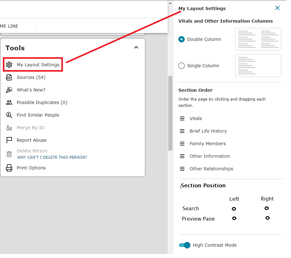
I agree that objections about the layout were made, and I was one. But because the layout is customizable (possibly reacting to people like you and me), I have moved my [beloved] Brief Life History to the top. You can customize your look. I have also set up an alert for one ancestor warning people not to merge certain individuals (as there is not enough info to confirm they are the same person.). It appears as a warning for anyone who visits that ancestor's details page. I have also added enslaved / enslaver relationships with an ancestor in the early 1700s New Jersey who was documented as owning a slave. I will continue to document the enslaved as I can, and will also document business relationships found in paperwork I've inherited. All this using the new "Other Relationships" feature. I am also going to make a point (on my to do list, anyway) to carefully date the items in my memories so they can now be viewed in chronological order. I would not call any of those capabilities bad programming at all. None of this was available on the old person page, and they are the reason I dumped the old person page months ago and never looked back.
Just give yourself more time. I encourage you to do your reporting to your leaders. There might be training sessions available. I would hope such training is being organized.
2 -
I dont like the new layout for family search, its a lot harder to use, I am on it all the time, and really liked it before, I feel it was just perfect before and dont understand why fix it if its not broken. I think its a lot harder to read and for those of us who use it daily it's automatic to use what was there. Now its more work and slower, not user friendly.
6 -
Comment/Idea: Could the option to move the Search pane from right to left be included similar to New Person Pages Layout settings?
I understand this would mean duplicating code to Search features and including some different page logic for each option rather than keeping one consistent layout for all users.
If you would like a Search feature with similar right-hand alignment and filters as previous versions try All Collections Search:
0 -
I agree with Nataliya. I made several comments/suggestions when FS was piloting the new format to no avail. I do hope they at least consider giving patrons the option to use the "old" format. It is much easier and more user friendly. Plus you can actually see a complete family without having to scroll up and down to see parents and children.
3 -
I personally sincerely dislike the new versions of the pages. I DO like most of the new features, but the appearance of the data makes my eyes hurt and makes me want to stop helping and fixing records. Before, the description section of a field would display in a slightly smaller font, allowing the information to be viewed without being in the way. Now, it's all the exact same font, which makes it much harder to distinguish the information. I just feel like everything was previously tight and compact and wonderful for use on a computer. Now things are unnecessarily spaced apart requiring twice as much effort to do the same things as before (as if you are expecting me to be using a touch screen). I'm still on the computer. And we don't all have monitors the size of TVs. Maybe my struggles with the new formatting is an ADHD/neurodivergent thing, but I was REALLY sad when you all removed the toggle on Monday allowing me to choose and forced me to use this version full time.
PS: I liked the map pins. It meant that FS liked that version of the address and I could tell that without looking at the edit page.
Speaking of editing, the "home" key doesn't work when entering dates, either, so it makes me take twice as much effort to make sure what I'm trying to type is actually being entered. Is that really necessary?
Sorry to be such a Debby-downer. I'll try to get used to it. I just wish this format literally didn't give me a headache.
2 -
Shaena Peterson You are so right about how aggravating it is to work on Family Search. I use to love it and would tell people how easy and friendly the old format was and not to be afraid to do family search. Now me being a specialist am afraid and not enjoy the extra time it takes to do anything there. We need the option to do the old way so they don't loose us dedicated for years, workers!!!
1 -
@OlerMARSHALYNN1 Your opinions are welcome anywhere but if you wish to give constructive feedback about features - FamilySearch would just prefer them to be made in New Person Page Group! Many of the issues people are bringing up over the past couple days were already discussed in depth in the group. You should probably read through the Group threads to gain an idea of how many people responded with feedback in the beta period. There are also indications on some issues that final decisions about future of this or that feature are still to be determined. In addition more feedback on particular issues may help drive future change. Please contribute constructively in the group!
3 -
The "New Person Page" Layout is, in my opinion, TERRIBLE. What were they thinking? Has it been optimized for people who don't have a PC? If they don't add the ability to use the old layout, I will be looking elsewhere to do my Genealogy research and documentation.
1 -
@SMcLearn yes - the old layout is gone. Here is the official thread/announcement.
0