FamilySearch Employee Responding to Search Page Feedback
Answers
-
Please put the exact match on/off button at the top of the search page, not at the bottom. Don't make the user scroll to the bottom of the page to turn on exact match, scroll up to check the boxes, then scroll down again to run the search.
8 -
It seems designed only for people who want to create a tree on Familysearch and add "sources" to their tree. For people who want to copy citations and data to use on other genealogy sites it seems much much more difficult. I can no longer easily copy the list of family members in a census for example. Used to be one swipe to copy the whole list. Now I have to have a half panel screen which shows each one listed in a separate table and no way to copy the whole thing. A twenty person list would take an hour to cut and paste each one separately. Ugh.
And in any search only two or three results can be easily seen at once since the top mess takes up so much space.
I can't imagine who tested it.
8 -
I'm sorry but there is no way possible that you folks utilized "experienced" users and then came to the conclusion that this new search page works better. This search page is HORRIBLE.
You want examples: I enter only a name and place and date of death (date of death 1889). What results do I now get? The 1940 US Census. On top!
My minor in college was "Research." So, please spare me and the others that use this site extensively with the lengthy explanations telling me and others how great this new search page is. You get a failing grade.
The Church needs to reverse this colossal failure now or forget your continued ability to link all families. You've just made it impossible.
Yes, I said IMPOSSIBLE.
21 -
In searching US census for an individual, the only information given in a return is the year and "United States." I need a location -- preferably county and state. The entire US is too broad to be of benefit for a search return. As a researcher, I do not have time to click on every return to see the location, then go back to the list of returns. We should be able to scan a list of returns in a couple of seconds. The new, improved, beta-tested, you will like it better after the learning curve version increases this time to about 15 minutes. Are you going to assume the extra expense in project time or cost to clients?? I loathe Ancestry, but did my searching there yesterday. I'm sure their CEO is well-pleased with your changes. Please do not respond with a link to leave feedback. It's been done. I've read the two articles posted. Nothing helpful there.
19 -
This new search page is most difficult to navigate and use.
I have found that once you attach a source to a person's page/profile, there is no 'back' button to take you back to the search page to continue to attach any other relevant sources to the same person.
You have to use the back arrow continuously to go back from attaching the source to the initial record search page.
If you can put in a 'back' button which takes you straight back to the records page that would greatly improve this situation.
I agree with most of the comments here .. the old search page was much easier to use.
Maybe you should abide by the old adage - "if it ain't broke, don't fix it!"
14 -
Despite what the research may say, I'm definitely not finding things faster. Some of my initial impressions:
1) not enough rows displayed in the search result. too much scrolling. put the data back in a denser format please
2) why is the search info on the right hand side now instead of the left?
3) clicking on a record covers up the search info, and the info that is displayed is in a huge font, bold text, with tons of white space so you have to scroll to see info and you lose the ability to see everything at once. Didn't have this problem before.
4) too little info is viewable at one time in the search parameter area, especially if the 'exact' option is turned on. All i can see on my 1920x1024 monitor at one time is first name, last name and birthplace. Only 3 items in a list requires too much scrolling to see the rest. WAY too much wasted space and white space here. This could be made much better. The older format allowed for nearly all parameters to be viewed at once, allowing for easily making changes to different values if search results were not satisfactory. This new format requires the user to remember values while scrolling around. That's a disadvantage, especially for older users.
7 -
As an retired IT User Acceptance Test Manager, I would ask one question.
WHY WAS THE INTERFACE CHANGED?
Was it failing in performance?
Was there functionaility that was missing and could not be implemented without making the change?
Did it not meet the needs of the users?
Was the platform supporting it obsolete or being made obsolete?
Did it not support new technologies (excuse me while I spit!!)?
Did it not need the demands of new or upcoming legislation?
Was it becoming too expensive to run or maintain?
Without understanding why the changes were made and what the benefits were, it is unlikely that a community of users would EVER welcome these changes
15 -
Has something changed with the search algorithm as well as the appearance. I have noticed in the new search that using a middle initial is taking my searches away from a person not closer. I was searching for a Mary A (surname) and I was getting more random names any with a A in the first or middle name position and not Marys which was who I was looking for. I have tried using some wild cards like ? and * and it does not appear to be working as well in the results or I get an error message sometimes. So while I can work with the new look I do want it to search the way it did before and I am not seeing that in my results.
My observation,
Cindy Hecker
10 -
The web and mobile app Search interfaces are now much more similar than they were before. That is a big step forward.
The mobile app interface used to be so limited and difficult to use that I would put up with using the web interface in a web browser on my phone, switching constantly between the two apps. Switching used to work (barely) but now when I switch away from the mobile app it loses my place so I cannot work that way anymore.
0 -
When I pull up the historical records initial data entry screen, and enter the surname only, it returns nothing and no error message. How is this easier or more helpful? It seems I cannot get ANY records to return unless I go to back to the initial search screen and then go to " more options". Then it tells me I have selected over 500,000 records and shows me the first 3 1/2. This is absurd. I have to say it makes me want to sign up and use Ancestry.
6 -
Previously I had a hobby to go through people who had resided in Alahärmä, Finland before arriving at Ellis Island, and try to connect their information at both ends. In the new system a corresponding search produces irrelevant results and my hobby is therefore gone.
I guess I'm leaving off to Stackoverflow until you clean this up.
3 -
You should see the discussion going on in the England Project forum over at WikiTree and how unhappy we are about it. Not a single person has said that they like it.
If you had wanted people to beta test this for you, you have a large constituency of regular users who would have been more than happy to respond to the call. All genealogists have a vested interest in seeing Family Search being the best it can be. Now the records search function is virtually unusable.
Considering that most Western European languages run from left to right across a page, and most European eyes scan from left to right when reading, why is the search box now on the right hand side of the page? This makes no sense.
14 -
I do not like the new format, I think that is is much harder to use. I tried to find an entry which I had referenced before, and cannot find it. The old format was much more user-friendly I think.
9 -
This is now day 4 of decimated productivity, and it has now also decimated my enthusiasm for using FamilySearch.
The only way I can find most records now is to search for them at Ancestry or FindMyPast, find the corresponding collection at FamilySearch, and search that collection directly with the extremely specific results I already found elsewhere. (And hope FamilySearch's indexes match those other sites.)
I'm really embarrassed that I can no longer recommend FamilySearch to researchers who are looking for records of their family members.
15 -
Since the new interface has debuted, my searches return a great deal of nonsense. Searches, including advanced searches attempting to replicate earlier searches, that were previously productive now return a lot of irrelevant information. Has the search engine also been modified? The recent changes, however well intentioned, have made the site essentially dysfunctional. Please address the failures of the current interface or revert to the marvelously effective and productive previous interface. The failure to address the problems with the current interface and search engine would be an enormous loss to your members and to to the greater genealogical community that depends enormously on the open access that you provide to records you hold and, uniquely, make available to the public.
13 -
Please make the old search page available as an alternative or get a usability engineer to redesign this page.
Queries that I could do could do straightoff now require additional keystrokes to access more options and then select each additional option I need.
For example: To search by parents names was easy and straightforward before, now I need to 1) select more options; 2) select father; 3) select mother before I can begin to enter any data
14 -
Filters don't work so well....
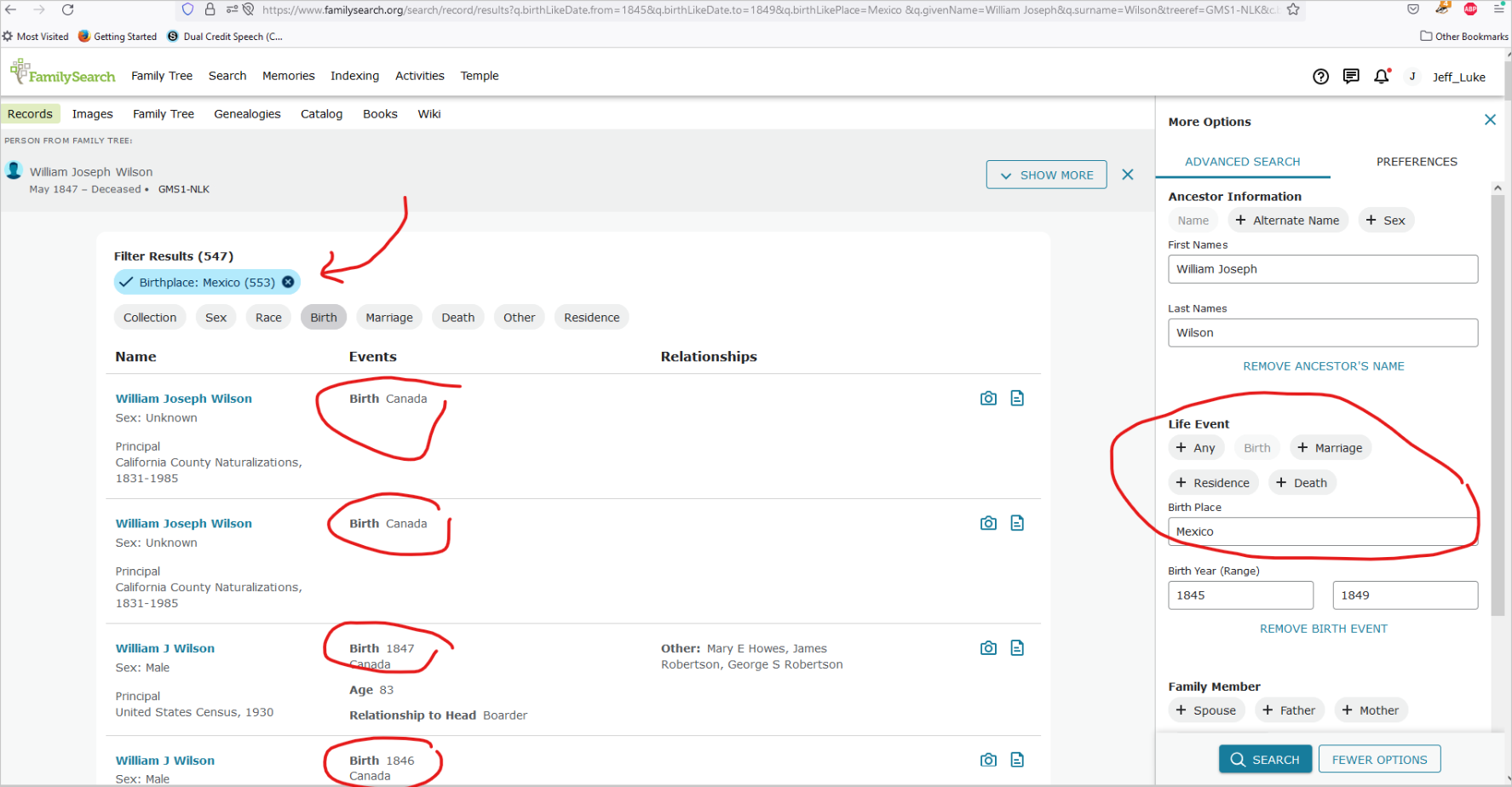
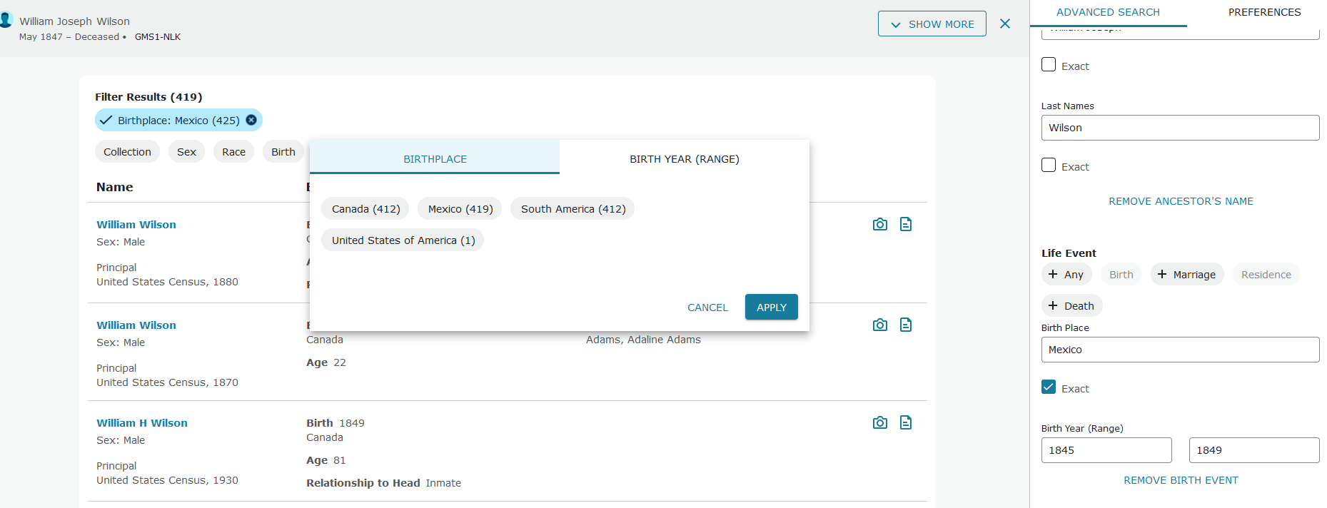
Filter set to birthplace of Mexico returning searches of birthplace = Canada.
Even with search set to 'exact' and birthplace of 'Mexico' the search results are only showing Canada...
13 -
Others have mentioned this, but can you PLEASE put the record location/residence in the search table results?
Not being able to see the location where the record is from makes it very difficult to use the search results.
3 -
Functionality must be prioritized over UI issues. It doesn't make sense to tune an UI if the system is producing crap.
Btw. the family linkage inside the church census pages of Finland has been broken ca. three years now. I know you are not ever going to fix it. I have asked.
6 -
And hey, oh, do people know that you have split.io tracking cookies on your site?
0 -
I wish you offered a previous and new search option THEN I could do a search on both and tell you EXACTLY how many steps the new way is adding to my searching. It appears that it is adding 3-5 steps for each search within each collection. Multiple that by each collection, and record and that means you've added at least 100 extra steps in a day of searching.
1. I CAN pull up censuses but I can't put them into any kind of order. I CAN'T pull up censuses in collections and then organize the search alphabetically which also organized chronologically within a country. That was helpful when doing a one surname search.
2. I CAN pull up censuses and the person's name comes up, with birth year and place and with relationship for that census BUT no column for census place. The country, so far is covered by the collection name but no states/provinces or counties are listed. You have to click on EACH one to find that out. SEVERAL steps wasted.
3. On vital records the same holds true, I can't organize the list so that all Lincolnshire England, or Illinois, USA vitals are listed together.
That is all I have time for now.
If you EVER update again I suggest that you include a link that has BOTH ways of the layout showing and arrows/instructions for EACH search filter showing and then an arrow to the placing of the filters in the new layout.
What you have done is like going home or to work and finding that someone has rearranged everything: furniture, what is in each and ever drawer, etc. and they have then said have fun.
12 -
When you wake up tomorrow, you'll find that your bedroom door has been moved to the other side of the room. And when you go to open a drawer, you'll find yourself spontaeously transported to the wardrobe where there will a new set of drawers that you didn't have yesterday. Each of these drawers will have a button on it instead of a handle. You will have to press the button to make a handle appear so that you can open it. You won't be able to close it until you press another button that is underneath the drawer that you've just opened. After you close all the drawers, you'll have to press another button to jump back to your place in front of your original set of drawers, at which point your wardrobe will disappear.
15 -
J-U-N-K spells junk, and that is what the new interface is. As one commenter said, Why should I have to read a tome to understand how to use it--especially when I've been using it for over a decade.
Latest ridiculousness: I search for a name. Does that person come up? Nope, all sorts of variations of the spelling come up. Yet, that person actually exists (yes, I found the record previously on family search).
Rather than give me results based on the actual name, spelled EXACTLY the way family search has it in their records, I get name after name after name that has NOTHING to do with their name.
I search "John Gerock" "New York, New York" no exact search parameters. I get name after name that is NOT his. ****?
I finally see I can upload an image, with your bloody little pictures at the base of this comment box. Absolutely no idea what the other icons mean.
I guess I should have grown up in the 2000s. Maybe then I would understand your damned interface. I doubt I'd like it, though, because it is NOT user-friendly, and that's putting it mildly.
I guess your many testing people all love to click and mouse and click and click and click. And then when results come, they love to scroll and scroll and scroll.
They have no interest in quicky scanning through results. Nope, I guess they just click one result, then the next, then the next. And, of course, with every result they love to do multiple clicks, they love to be forced to move the mouse all over, click again, click again . . . .
BECAUSE THE LONGER IT TAKES TO LOOK AT RECORDS, and the harder it is to go through records, THE BETTER!
Are you modeling yourselves on Facebook, where the idea is to keep you there forever? Well, guess what, Family Search, IF you still had decent site, we would stay there a long time--but actually be productive instead of having what you used to be an enjoyable pasttime turn into a frustrating journey to hell.
Should I pick an emoji? Are you guys serious? If I did, it would be a very angry face, a puzzled face, and a completely exasperated person.
So glad you will keep this interface. Your testing is a joke.
Just a few days ago I told someone that Family Search was better than Ancestry. Completely ironic that the very next day I sign into the utter hell this site has become.
15 -
0
-
Did you notice, Casey and the others at Family Search: Almost every comment says how incredibly cumbersome, slow, and non-functional the new interface is.
Apparently, you disagree, since your tests show users like it. Well, here you have real users, and they hate it! Person after person says that they are slowed down, impeded, must click and click--and you IGNORE all that feedback. Your response is not a real response. It's just a lengthy version of "We changed it, we aren't gonna change it back, so too bad for you!"
Like one other commenter, since the bloody site is now barely functional, I post my comments on what's not working. Then, I try to search one thing--and get completely frustrated yet again and come back and post on what MORE is not working!@!
16 -
Please, please we beg you. This is a disaster. I am so upset. I want the ability to make only a first name 'exact' or only a surname 'exact' or use initials with a *star. I cannot understand anything that is going on with these screens, and frankly I don't want to. I have Indexed thousands of records already for free, on my own time. I am not prepared to use this system. I'm lost and just so sad. Why on earth spend time and money fixing something which was not broken. It's horrible. And then to reply breezily that 'We are highly unlikely to go back...'
13 -
You have described my experience perfectly. This seems to have been designed by a crazy person.
8 -
Summary of common constructive Feedback that I have seen(not to say there couldn't be some more): Most of the constructive feedback is fairly specific and generally five-fold - where 'new Search' is not operating as users 'expect' in comparison of efficiency of 'old Search':
- The Search Preference> Fixed Table> All Information ≠ Display all information from the record details. (specifically residence/location is missing)
- the 'old Search' was vertically scrollable on left-hand side - not toggle between Search Parameters and Preferences tabs (which some users say takes longer to input)
- the Search Results in both Fixed Table/Data Sheet format take up too much space and are not as efficient to scroll. There is too much whitespace and 'not enough responsive web design' is implemented to determine layout of Results for smaller screen devices. There is the option to close Search Parameters/Preferences which allows more room horizontally.
- The Results are not finding what is expected. If filtering is always going to be required or if 'exact results' needs to be selected to see 'most relevant' Results - the user needs to know this up front. Is there a defined algorithm for what is returned with default results?
- There are only three 'superficial' differences between 'old Search' and 'new Search: More Options' (which is not the default - to be less 'intimidating') - 1. Sex 2. Order of Life Events 3. Show exact Search slider (instead of checkbox). I consider this to be essentially the same - but I 'think' the Results of the search are not appearing to be what users 'expect' and different from 'old Search' Results. The main UI difference is the graphics - the 'old Search' appears more functionally intuitive - the 'new Search' is more 'media' intensive. I think users are preferring the functional intuitiveness of 'old Search' more.
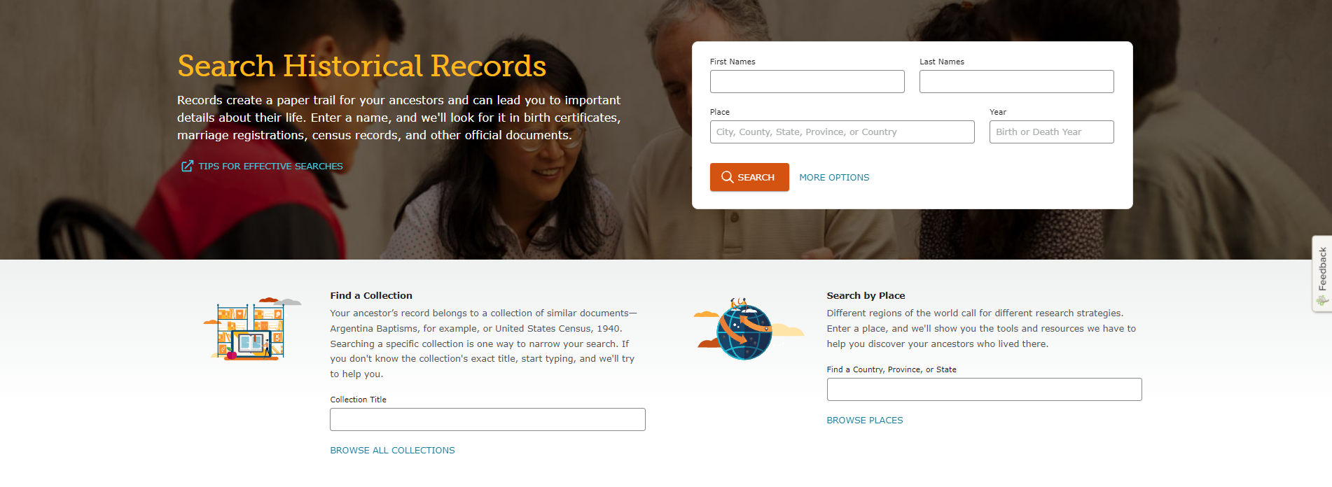
I also think some of the features are improvements but I can also understand the desire for a more efficient setting of Search Parameters/Preferences. Perhaps the idea - similar to others I have seen suggested - allow Search Preferences to be set on the Search 'homepage' or some other nearby Setting location (maybe bottom of page with 'Cookies') and not tabbed 'behind' the actual Search Parameters? Maybe even the option to skip the 'new Search homepage' and move Search by Collection and Search by Place as options below Search Parameters. There is also a point about being allowed to move Search Parameters/Preferences to the left-hand side - so as not to interfere with the browser scrollbar and the Feedback button is a little in the way. Is there a reason why these (Parameters/Preferences) couldn't be moved to the left-hand side or made draggable so the user has some options? I'm ok either way but do see the valid points of these requests.
@dontiknowyou I believe attached/not attached is visible in results that have tree icon/don't have tree icon.
Thank you.
7 -
The new search is horrible! Is there someway to create a "use old search" button or something?
9 -
I think the new interface makes it harder to find somebody who is "lost/missing/unknown". If you type in exactly who you're looking for, as you know who it is - and where they are, you can probably see the results easily. But it's the ancestors who "disappear" or are harder to find who will remain obscured in the new results.
I'd quite often just open up a new search with: Anybody whose surname XYZ, who was born between XXXX +/- 20 years and who was born in a particular county. Show me everybody in the whole of England who meets this criteria - then show me 100 results as I can see you've found 93 - now my eye can scan down so I can skim and see if I've some likely candidates.
If I still l can't see them, then I might want to change the county for the country "England" and open it up to all worldwide records.... see if I can spot something in any country abroad.
5


