UX Feedback

I've used it twice. The functionality is good.
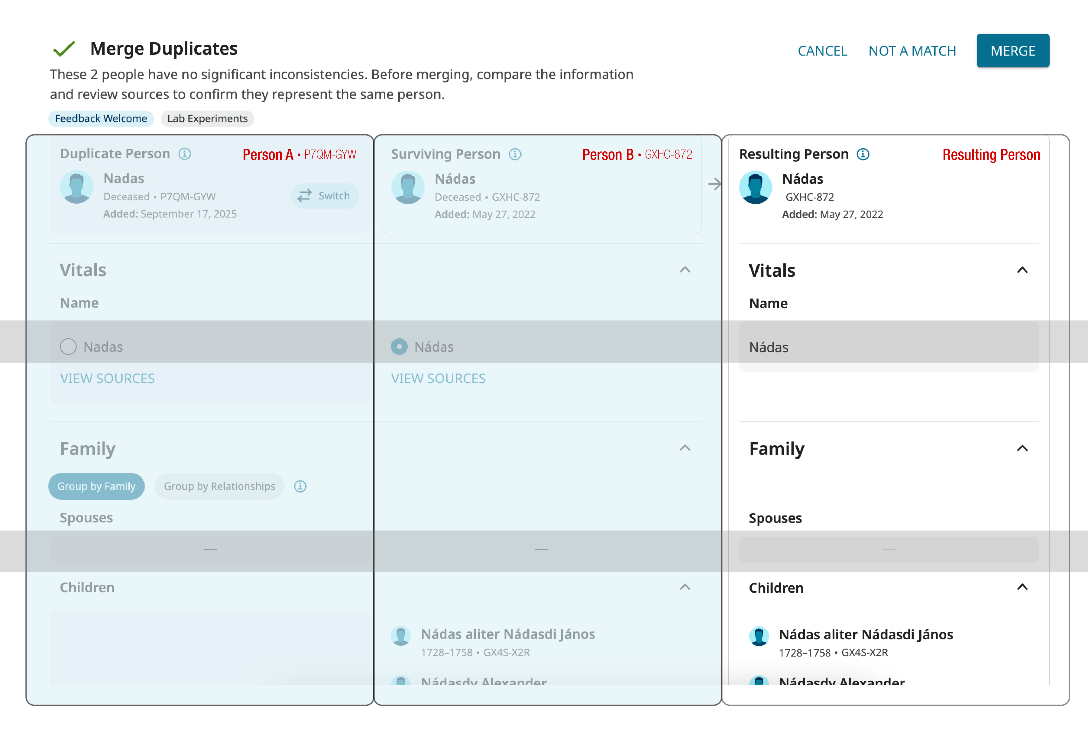
Visually, it's kind of jarring. There is a lot of content presented all at once and the background field doesn't help segment it in a way that reduces the volume hitting the viewer all at once.
Also the labeling convention is confusing. "Duplicate Person" "Surviving Person" "Resulting Person" - Surviving and Resulting mean the same thing, and either profile can be the "duplicate". It should be some configuration of: Profile One, Profile Two, Resulting Profile
I know it's a change from the old, but it's relevant to the new layout. The user doesn't need to know that the resulting person is actually Profile Two. They just need to follow the order of information.
Keep the horizontal greys across the board, but there needs to be stronger verticals.
Respectfully, the target demographic is older folks, right? You need to double check the ADA contrasts. Our eyesight starts changing around… 35-40? Don't get me wrong, I'm all about subtle design! It's hard to find the perfect balance between information design and UX.
I realize that is probably also a whole conversation about brand standards. This is a perfect opportunity to loop in the designers and find the perfect solution. Personally, this is the kind of situation that I would want to know about asap. It highlights the flaws in the brand standards, because it doesn't work for this application. And I would want to add a whole section to the manual about charts.
Comments
-
@Julie62354 Thanks for the feedback!
There is definitely a lot of content to present, and it can be overwhelming.
We are open to new labels for the columns, and have found that there is a need to state either "Deleted Person" or "Duplicate Person" to show which person is deleted.
We are very aware of ADA, and it is definitely a tricky balance. Currently, we have stronger columns than rows, and making both the columns and rows explicitly clear is challenging without overwhelming users further with more colors on the page. Would you prefer the columns or rows to be given stronger emphasis?
Would it help if the titles like "Name", "Spouse", and "Children" titles were listed in the middle column?
Thanks!0 -
@Mary Anna Ebert In this use case, I would prioritize the columns to reinforce that we are working our way through separate individuals, towards a completed new individual.
Since the alignment between profile details from column to column doesn't align perfectly horizontally every time, the labels in the middle column would be an asset. 1. So you don't have to try to micromanage alignment and variable character lengths. 2. As that visual reminder of "following the bouncing ball" through the process. Which will be a huge asset for less experienced users - to keep them on track. (or neuro spicy folks)
Sorry I didn't reply sooner! I forget to pop over to this side and login. :(
ps. That image was not reflective of proposed design changes, it was just a visual aid for the speaking points… because I have a hard time explaining something without a visual.0 -
@Julie62354 Thanks for the feedback! We will take another look.
0