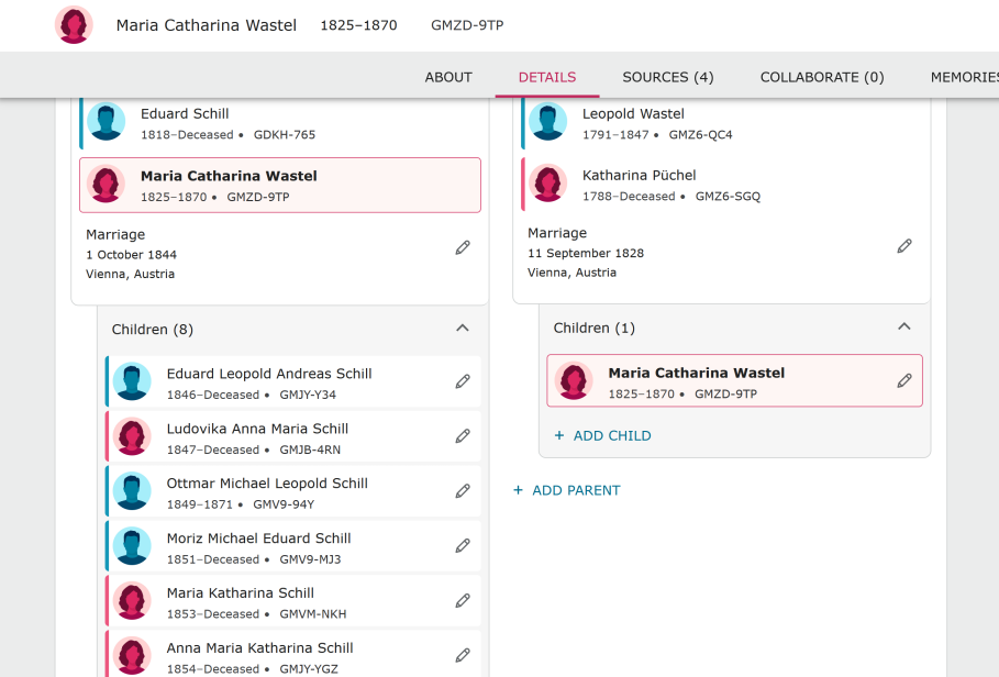
new pages for FS-boring
I personally do not like the lack of color on the new person pages. I know FS is always trying to come up with new and improved ideas for the program. I personally need the color. I find it is inviting and welcoming which will help me want to use the program. I have noticed a turn in our society to the greys and blacks. These colors are boring to look at. In my opinion they make businesses look dark and shabby, not welcoming at all. Even McDonalds is going grey shades. It doesn't look like a fun place to be any more. Now it looks the same in FS dark and dreary.
Just my opinion.
Grramz
Best Answer
-
Thank you for your comment. There is a group in the community specifically for sharing feedback about the new person page. You may want to share your feedback there. https://community.familysearch.org/en/group/316-new-person-page
Maile 🙂
0
Answers
-
"Lack of color"?? Are you looking at the same site as the rest of us?
0 -
I am talking about the top part of the person page, where the living statue shows. The old version is yellow. Nice color, draws attention.
The new version is black, lacks attention for me. I do not like the black and brown look that has evolved on various businesses ie: Fast-food restaurants.
0 -
I had to go and look at my spouse's page to see what you mean about yellow versus black. (I don't use my private space much at all; I don't think I've edited anything in it since my aunt's husband died in 2018.)
The new header bar was originally colored (blue or red), with a sort of floral pattern to it, but people complained, so they reduced the height, then removed the pattern, and then eventually reduced it to that thick line of color above the name that we have now -- and I don't know about anyone else, but this makes me very happy. I did not like the big colored header, especially on female profiles (because red is the color for alerts and warnings and problems). The header is now very similar to the old page, to the point where I need to pay attention to other details to tell which version I'm on.
On the group dedicated to suggestions for the new person page, the reception for the new header has been quite favorable, but nobody has mentioned the yellow-versus-black question. Perhaps you should join the group and make your suggestion there? Just try to be concrete and specific. ("Yellow was a nice color for the 'Living' banner because it draws attention" rather than "I don't like the black banner".)
2 -
I guess your post illustrates how impossible it must be for the product designers to cater for all our preferences!
Personally, I'm all for black and white. In my "amateur photographer period", I shot mainly in monochrome; as illustrated in another thread, I like plain black and white calendars (no pretty, colourful scene at the top - just a page full of dates), and I even dream in monochrome.
I just believe black and white helps us focus on the facts, and feel no need for any colour to brighten things up, but distract me from the serious work I am undertaking.
(BTW - as you may have guessed, I love the new McDonald's signs - same as with my bank changing its signage, from gaudy red and blue to black and white!)
1 -
General comment: If discussion on new pages needs to be moved to the Group of which you need to subscribe and be a member - then other discussions should be moved there by Moderators and discussion contributors automatically enrolled in the Group (it is difficult to know where posts should be made if one is unaware of such).
Thread comment: Yes, what an impossible task to please all!
I prefer some color to b/w - but do not need lots of interface graphics. The current minimal coloring as demonstrated in Julia's post above is sufficient for me. I do however dislike the new tree view white background and hope they continue the feature of inverting colors.
0 -
I agree that the lack of colour on the personal and family screens are bad. I find it more difficult to find what I am looking for. FS should go back to how it was.
0 -
Re: General comment: If discussion on new pages needs to be moved to the Group of which you need to subscribe and be a member - then other discussions should be moved there by Moderators and discussion contributors automatically enrolled in the Group (it is difficult to know where posts should be made if one is unaware of such)
I would totally love to move all posts regarding the new person page to the group @genthusiast, but the system does not allow me to move from a category to a group. All I can do is to let people know about the group and let them choose whether or not they get involved there.
2 -
I agree with this. The new version seems less inviting and colorful to me, though I couldn’t pinpoint exactly why until I put the two different views right next to each other. The biggest change that makes the new page seem to lack color is that the links, particularly text for people’s names, are no longer blue.
0


