Indexing training - bug found
As I was going through the indexing training, I found a bug. I was to fill in the fields with info found on the sample draft registration card. After I finished the card, I had the option of clicking buttons for "Create Entry 2" or "Submit Batch". The training steps said I should click "Submit Batch", but I wanted to see what would happen if I click "Create Entry 2", so I did.
The new entry fields appeared, ready to be filled in. Of course, there's no new info to be entered, so I just wanted to go on with the next part of the training. However, when I clicked on the "Submit Batch" button at the bottom of the "Entry 2 of 2" form, I got several errors saying that I didn't fill in the fields. If I went back to the "Entry 1 of 2" form, the "Submit Batch" button was no longer shown.
There needs to be some way to remove an "Entry n of m" form, especially if the form has not been filled at all. I can easily see how someone could be working on a batch of many entries, say a dozen, and on the last one, they accidentally click the "Create Entry 13" button. Once there, they are stuck. They either need to fill in a fake entry 13 or scrap the entire batch.
Comments
-
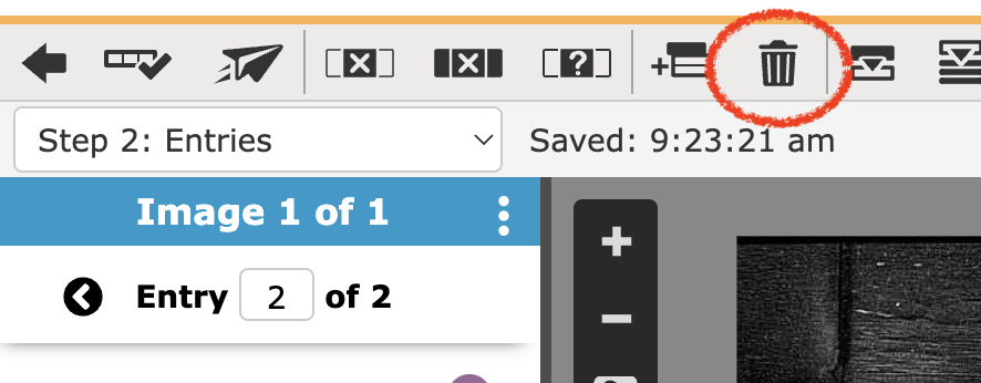
@sloanlance I am sorry to say that you did not find a "bug" in the indexing training. If the image you are indexing only has information for one card once you fill it in and get to the bottom you would not click on create an entry you would simply click on submit the batch. If there is another image you would fill in the first form, then go to the trash can on the toolbar and delete all blank entries go back to the form and you will see at the bottom the option "next image", click on it and index the information on the image if it can be indexed and submit.
I know this can be a bit confusing, but with practice, you will get it. Thank you for coming to help index these records for families.
0 -
Thanks for the info. I stand corrected, it's not a bug that it won't let users delete new entry forms that they may have accidentally created. It's an application design flaw. The odd placement of the trash can icon doesn't make sense. The entry form itself should also have a button or menu item for deleting the form.
I'm a software developer with a focus on web applications. I have 28 years of professional experience. If I had produced a user interface such as that, it wouldn't make it through accessibility testing or quality assurance. I hope FamilySearch will consider improving the UI.
To clarify on the description given earlier, users need to click on the icon for the trash can tool…
Then they will see a dialog box prompting them to delete just the current entry or all blank entries…
0 -
@sloanlance Thank you for your information and you may want to make a suggestion to FS. If you will look at the Categories box you will see "Suggest an Idea" and you can leave it there.
Again thank you for helping the researchers, indexers, and reviewers.
0 -
The program went through extensive testing with many users prior to being released. I was an indexer involved in the beta tests and recall discussions on the icons and even the designs. The FamilySearch team was excellent.
Most of the project instructions I have read include the following:
Images may show multiple records. The default number of entries is [ ]. You may need to add or delete entries in the data entry area to index all of the records on a document or remove unused entries.
It probably would be helpful if they included images of the icons to add and delete the entries with that instruction. The number one question for beginning indexers is - "why won't my batch submit" and the answer is usually "you have unused entries and need to delete them using the trash can icon". Another problem is that a lot of people never read the project instructions.
But, Suggest an Idea is definitely a good place to add your suggestion.
0


