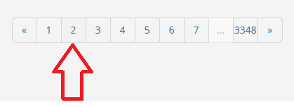
Minor Problem/Issue. Insufficient "Contrast"/"Definition", to Indicate, "Page"

Administration
Community.FamilySearch Forum
Attention: @Mark McLemore
Subject: Minor Problem/Issue. Insufficient "Contrast"/"Definition", to Indicate, "Page"
I would suggest, that there is a "Minor" Problem/Issue, with regards to insufficient "Contrast"/"Definition", to indicate; as, to which "Page" one is on - ie. towards the 'Bottom' of any page/screen.
Example:
The ONLY "Contrast"/"Definition" currently, for the "Page" one is on, is that the Page Number is an ever so slightly a "Darker" shade.
Far too difficult; especially, for 'Older' Eyes ...
Just in passing ...
Even if, it was just the "Background", for the "Page" one is on, was "White" (to 'stand out' from the other Pages), would be better than nothing.
Just my thoughts ...
Humbly submitted for your, information; attention; and, consideration.
'Thank You' in advance.
Kind Regards
Brett
Answers
-
Um, yeah. If I hold the screen up to my nose I can just barely make out that the current page's number is a plain gray, while the other numbers are blue-gray. At a more reasonable viewing distance, the only discernible difference is the behavior of the pointer when hovering over a number -- if it's the current page, then the cursor stays as an arrow, while if it's not the current page, the cursor changes to the pointing finger. If I were using the touchscreen, I wouldn't even have that.
Please highlight the current page number in some much-more-visible manner. You've already used a lighter background color to indicate "unavailable", so maybe a second outline around the box, and/or the number in bold?
1 -
Julie
I was trying to be 'Reserved' about it, for a change ...
Rather than my usual self ...
Which has gotten me ...
Brett
ps: My usual self ... while doing very basic "Testing", on my own accord, during "Development" ... was more often than not, not appreciated (and, in those cases, it was much more that my usual 'Style") ....
.
0 -
@Brett . & @Julia Szent-Györgyi - thanks for the feedback. I've asked the dev team to look into ways this can be done in a future update.
1
