Potential Confusion from placing of notices

Although the merge warning looks fine when the group by family slider is off:
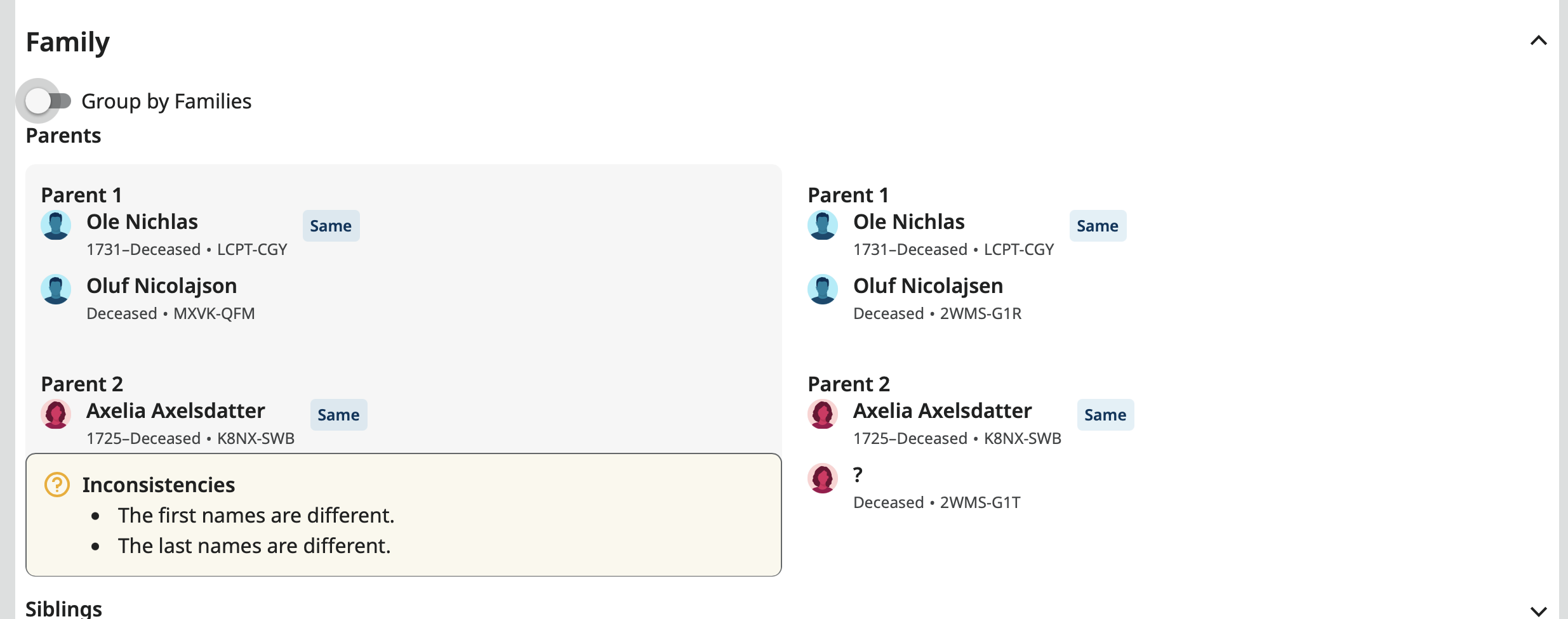
It's rather confusing at first glance when the slider is on:
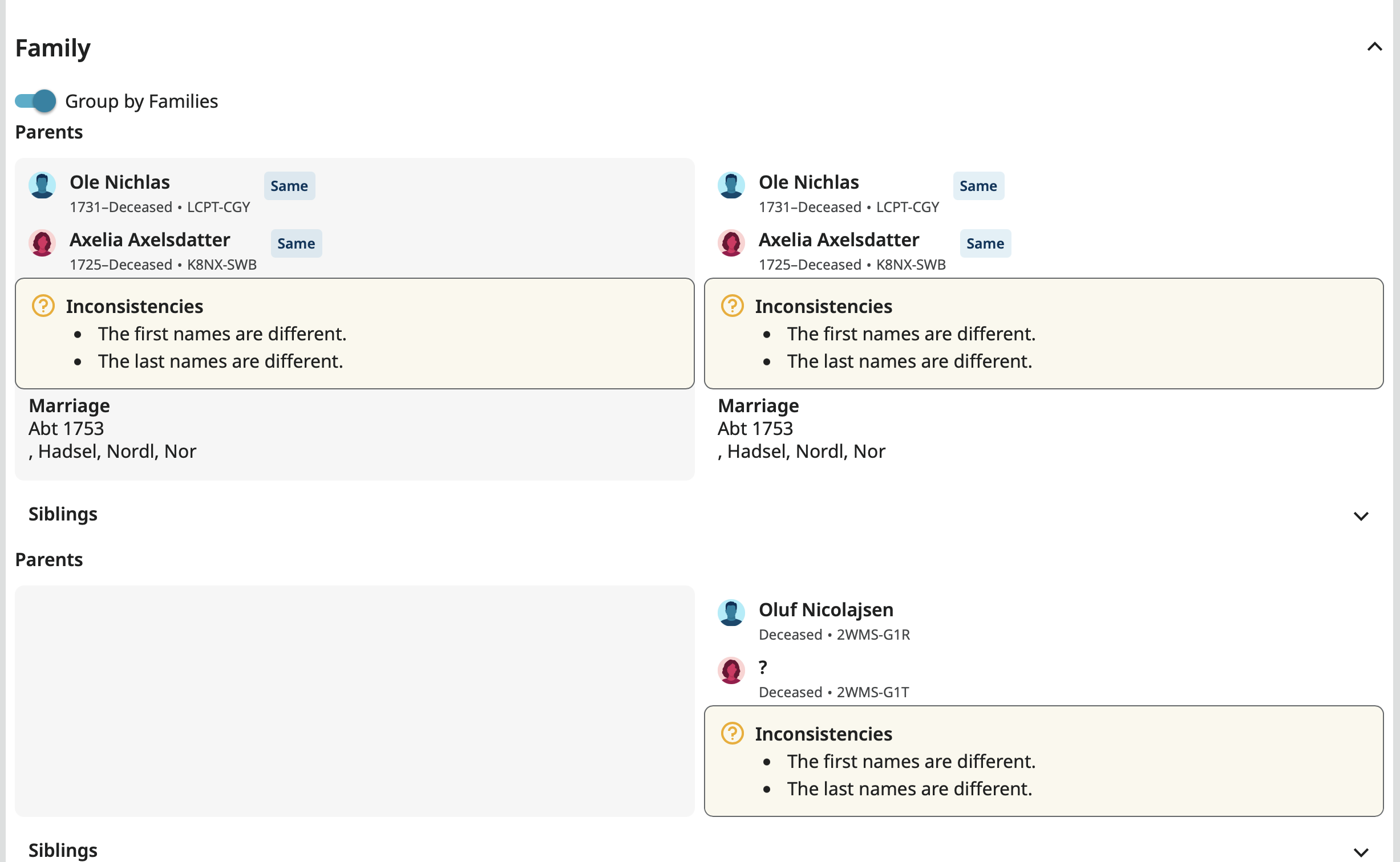
It seems the top notice on the right should not be there since not only are the first and last names are the same, the ID numbers are the same. A profile can't be inconsistent with itself.
項留言
-
Thank you for your comment.
We are working on cleaning up the placement of the inconsistencies and cleaning up some of the layout.
Do you like the two views of the families?0 -
Each has it advantages so I think having both is a good idea. But I agree with a post here a few weeks ago that the Group By Families setting should be a sticky user preference, as the View Details slider is on the profile page, since many users may only want to use one of them.
1 -
@Gordon Collett I think we have fixed this when the slider is on. Thanks for pointing it out!
1 -
Good to hear. I'll let you know if I run into this, or something similar, and it is not fixed.
0