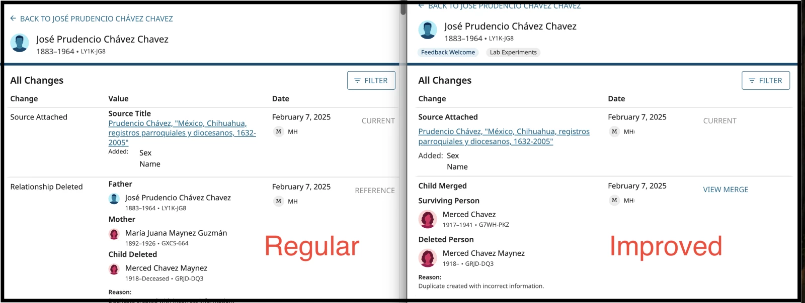
Layout for "Improved Person Change Log" is NOT as good

LAYOUT for the new Changelog is NOT as good as the regular changelog. The new changelog smashes everything into the left 1/3 of the page and leaves the right 2/3 of the page a big huge empty white space. In my opinion, it was way better when it was 4 columns: change, value, date, and the unlabeled 4th column.
With the 'change type' and all the 'value' information all crammed into the left side of the page, it makes it very difficult to easily scan the page and see what changes have been made because the text is all stacked up on top of each other like one big run-on paragraph (for no discernable reason that I can determine).
I see they tried to mitigate this by making the "type" of change in bolder text but that only helps marginally. There are way too many font sizes, font weights, colors, all caps vs upper&lower case, indentions, etc to make reading the page very easy. Bold text regular size, regular weight blue text, regular weight black text, smaller text regular weight, bold weight but tiny text, regular weight but tiny text, separator line, etc in a dizzying series of changes all the way down the page.
I can't comment on other changes that were made, as the page is so hard to view that I immediately changed it back (i.e. turned the experiment off). I would be happy to try it again when the new improved changelog's layout is improved.
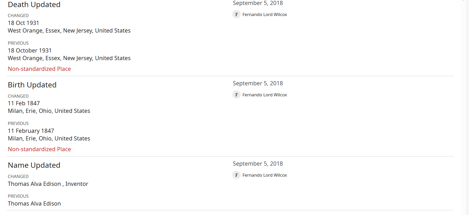
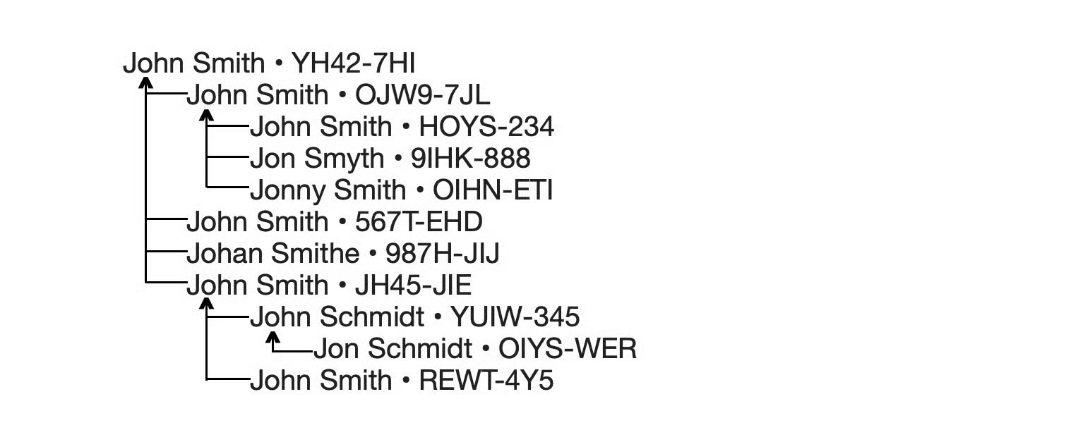
It is so much easier to see that 4 changes were made in "regular" version :
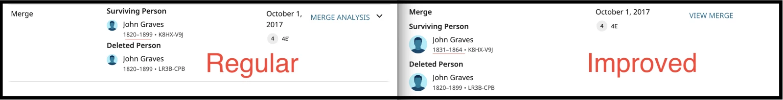
- I DO like that you can now see when children/spouses/parents have been merged with links to view the merge right in the relative's changelog. This is a good change that makes it a lot easier. It would be nice if the reason statements also displayed for those merges. Oh never mind, I see the user "FamilySearch" who made those merges was naughty and didn't include reason statements for their merges, not even the auto-generated ones, in the Thomas Alva Edison example.
- I do NOT like that you can no longer have the option to just expand the merges that are for the person whose profile you are in and see a summary of the changes, instead you have to View Merge and study the merge analysis in a separate page to figure out for yourself what changes were made.
- What I WISH the changelog would show is the history of ALL the merges that were made on itself and all the previous profiles of this person. Something like this :
pic by Gordon Collett
I make something similar to Gordon when I am trying to untangle a bunch of bad merges, but I also include on each line the date that profile was originally created, date merged, and the birth/death dates & locations prior to the merge.
I absolutely HATE that when clicking MORE it's now a popup instead of expanding the information right on the screen (for example Brief Life History). Inexplicably, MORE for the photo attached on Oct 11 2015 is not a popup and expands like normal (Thomas Alva Edison).
Couple other things to note:
- Filters are not working
- Why are some of the words soooo big ?? In the Thomas Alva Edison example, things like "Child Merged" in the left column is way too big font size. If people have visual handicaps, they can change the font size within their own settings in their own browser. If I want to make the text a normal smaller size, it also changes all the other text on the page, making the rest of the text too small.
- The changes made during the Person Merge for him on September 7, 2014 are no longer viewable in the new changelog and there is no View Merge to click, so there's some bug going on there. Surviving Person Thomas Alva Edison • LZ2Q-W96 / Deleted Person T. A. Edisin • LWLJ-PMP
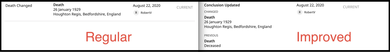
- I'm really happy that all that "conclusion" nonsense from an earlier version of the new changelog has already been changed to real words (i.e. instead of "conclusion updated" for every item, it now shows similar to how it reads in the regular changelog like "death updated" and "alternate name added")
Comments
-
@Angela84282 Thanks for your message! This is awesome feedback.
I will go through this with our designers and see what we can do with your suggestions and feedback.
Thanks0