New Widget: "Family Tree"

A lot of patrons I've worked with seem to feel lost or overwhelmed when they first go to the FamilySearch website, and I've found one of the best starting points to take them to is their family tree. They can discover their ancestors or work on adding them.
But currently, to get to the family tree, you have to go through "Family Tree" and then "Tree", which I'm noticing isn't very intuitive to new users. I think it would be really helpful if the homepage had a widget to go directly to the family tree. It would be one of the first things users see when they log in, which is already what a lot of them are looking for.
Here are some examples of how it could be structured:
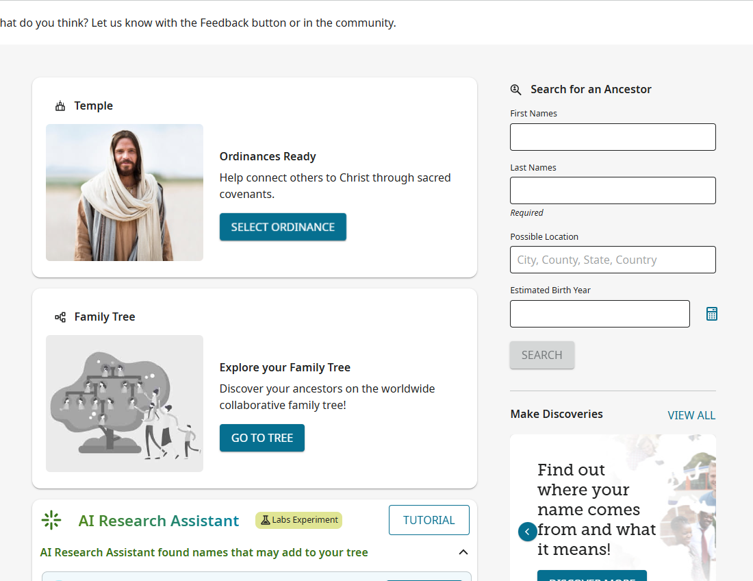
I mean, it would definitely look better than either of these (I was a bit hasty finding a picture to go with it), but this gets the general idea across.
Comments
-
@Carter J Parker Good idea! But for now, the easiest thing is to create a bookmark to their Family Tree which will redirect them to the login screen and then directly to their tree.
Mine would look like this: https://www.familysearch.org/en/tree/pedigree/landscape/KWDW-1Q6
The letters beyond the last "/" is my ID so they would have to find out what theirs is and replace the ID with their ID. The easiest way is to just have them login and go to their tree and then bookmark that page.
Hope this helps.
0 -
@David A Wilson That is a fair point, especially for regular home users. However, very few patrons at our library have their personal computer with them to create a bookmark, and any bookmarks we create on the library computers are erased at the end of the day. Users who have rarely or never viewed their tree before won't have it bookmarked either. Even if we taught patrons how to make a bookmark back at home, not all of our patrons (or workers) know what a bookmark is in the first place and could struggle figuring it out.
Making a bookmark is really only a band-aid solution to the bigger issue of user-friendliness. With the homepage in the process of being updated, it seemed a good time to recommend adding widgets linking to the site's core features, not just tools for experienced researchers. Some users come with a firm determination to find their family but literally don't know how to hold a mouse. I think as workers, it's our responsibility to make their experience as seamless as we can, without creating more of a problem by overwhelming them with too much information.
1 -
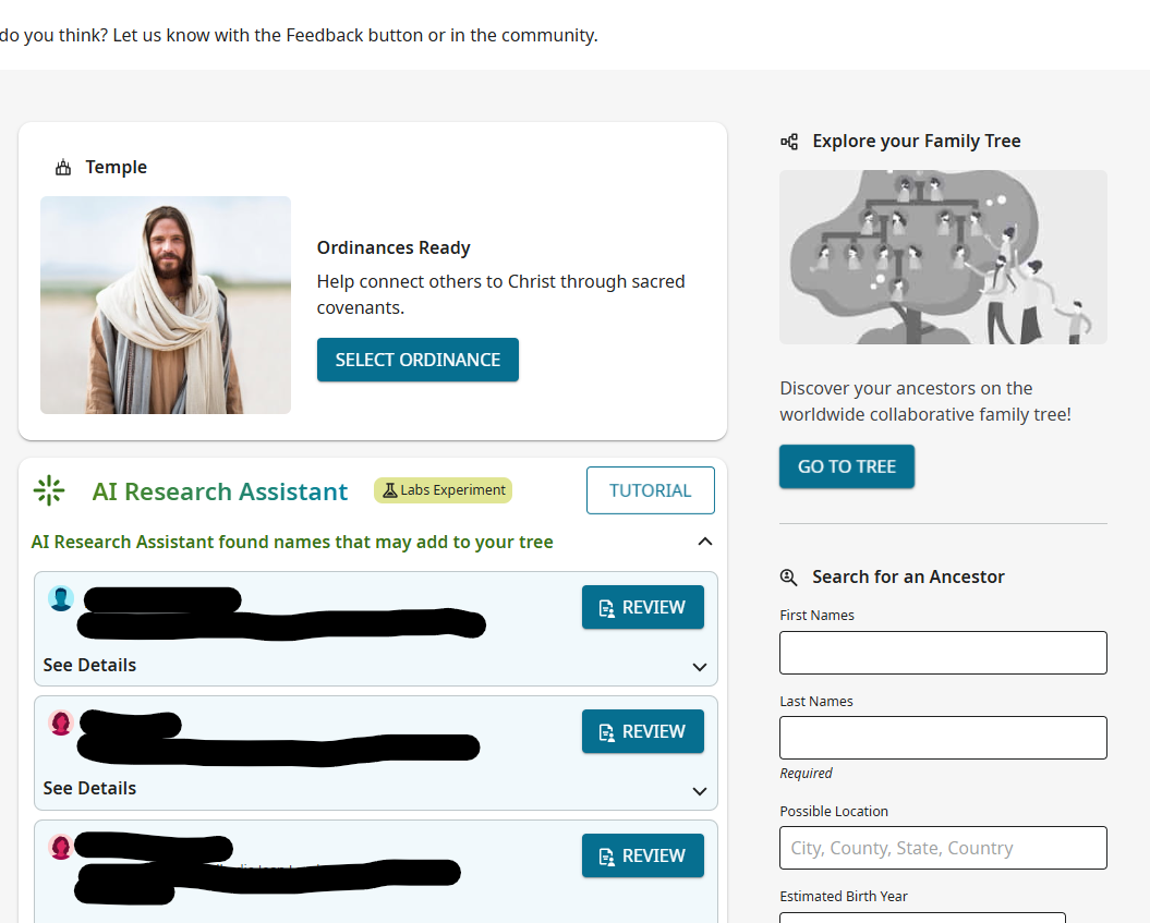
I think this a great idea, but I would make this just as obvious as possible and add a couple more choices as in this Photoshop mock up:
Note that I really would have My Pedigree and not My Tree. I would be concerned that the same people who can't manage the top level menu and just click Family Tree and choose Tree or Recents are the same ones who will have enough trouble understanding that Family Tree is a universal, shared tree and not their private tree without reinforcing the concept of a "my tree."
0
