"Search for an Ancestor" is confusing patrons

I think a search dialogue is a great feature to include on the homepage. However, it's been confusing the patrons I work with. When someone logs into the website looking for a specific person in their tree, the first thing they see is the search widget. It says that it's where they can "Search for an Ancestor", but I have to explain that it will actually search for RECORDS, not for profiles.
I would suggest renaming the widget to something along the lines of "Search for Records" or "Search for Records of you Ancestor". Or (my personal preference), the widget could actually search for ancestors in the tree, maybe being renamed to "Search the Family Tree".
Comments
-
I would love to have a feature that you could actually search for ancestors in the tree. I know I waste a lot of time trying to see if I have a certain person's data in the tree already. This time could be used looking for other data.
I toggle between other family history sites and Family Search. There is no quick way to see if I have the data in my tree already. The search feature is the only way to try and see if it is there, but it takes me down several rabbit holes in the process. I seem to have to know more information than I do at my fingertips to see if they are already in my tree. Especially when you have family members who name their children all the same names as the Scottish do.
The old PAF had a directory with all the names you had in your tree. You could click on it, and it would take you to their record which could show you more information quickly.
I would love that feature in Family Search. Please consider it. The search button is confusing like stated above. Thank you for all you do to make this site great! I appreciate it!
0 -
"The old PAF had a directory with all the names you had in your tree. You could click on it, and it would take you to their record which could show you more information quickly." The trouble with that is that we don't have individual trees. There is just the universal, wiki-style, world tree (unless you set up a CET tree). That index of names, depending on how extensive you have built out your personal lines, could be millions of names.
0 -
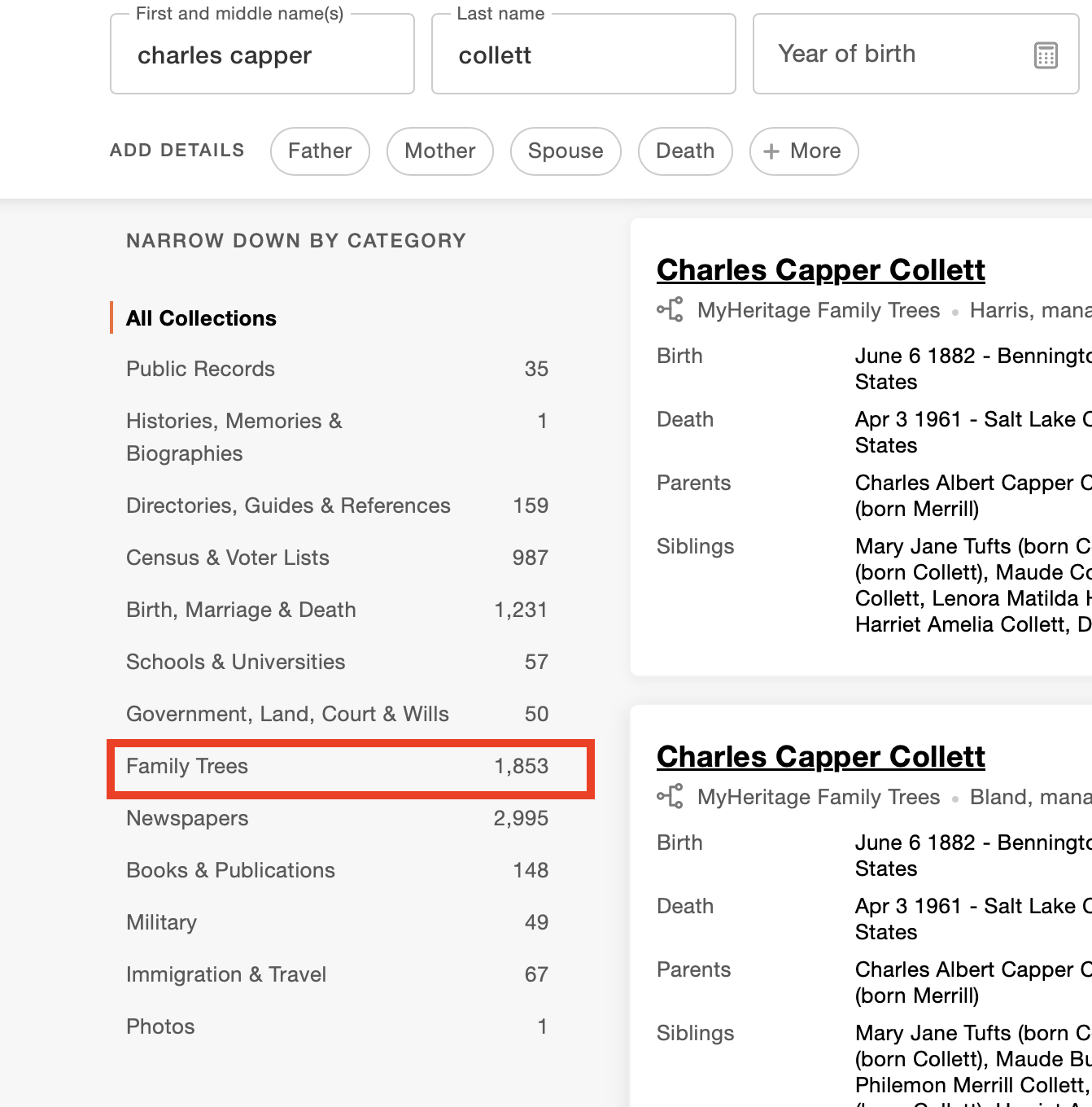
@Carter J Parker I agree that that general search on the home page is a bit confusing. However, it does search more than records. It does find Family Tree profiles and Family Tree memories. It also searches in all the various files in Genealogies.
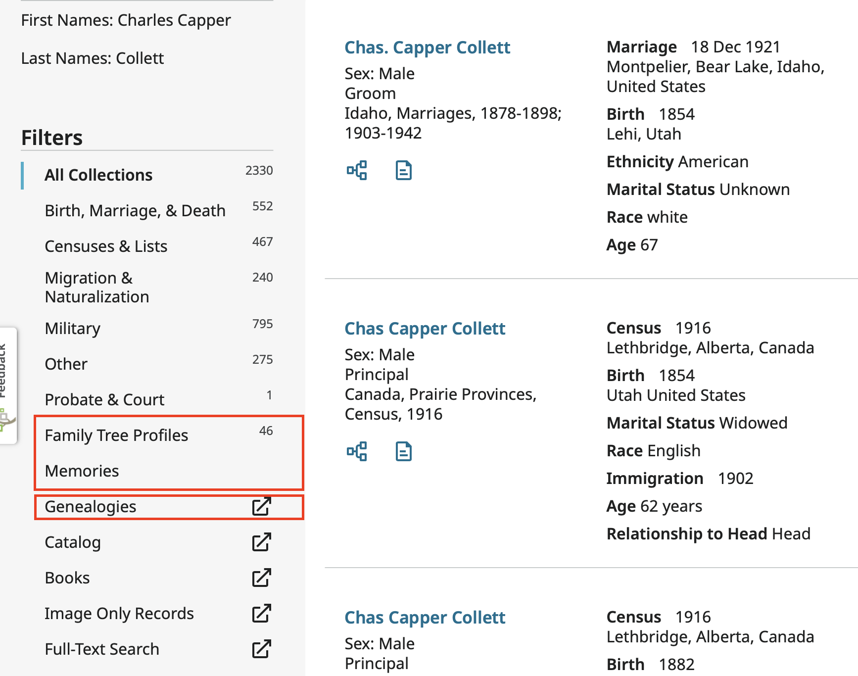
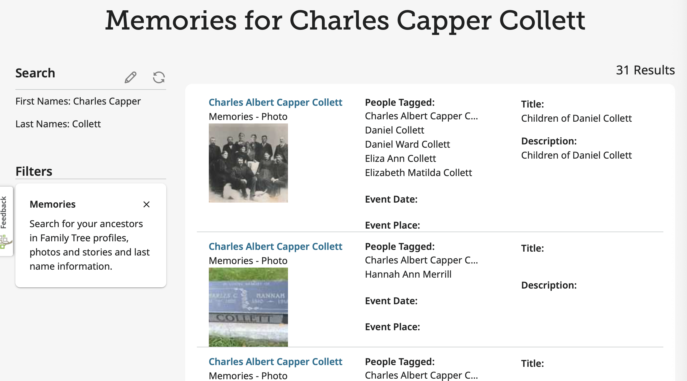
Even though there is not a number next to Memories, there are 31 of them to be seen when you click on that tab:
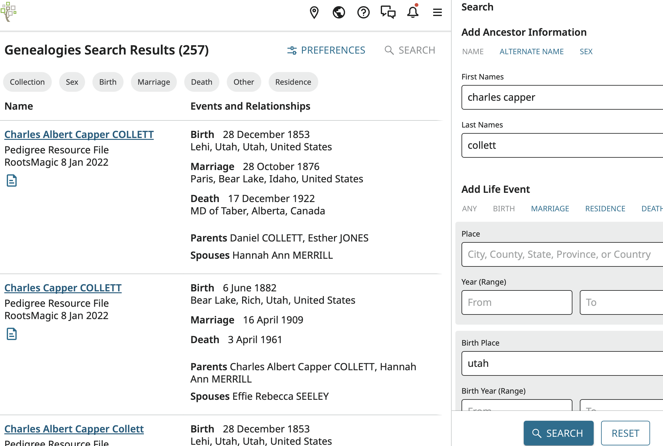
Clicking on Genealogies takes you to a search of all the compiled trees in that section such as the Pedigree Resource File and even the Ancestral File:
I'm not really too thrilled with this search for beginning users because I think it confuses original records and compiled trees but anyone who uses Ancestry or My Heritage should be familiar with this kind of general search since those website both have a similar general search function.
 0
0 -
@Gordon Collett Whoops, I completely missed that option on the side! Thanks for teaching me something new!
Maybe it could be changed to be a bit easier to see, or maybe I just wasn't paying enough attention…
0 -
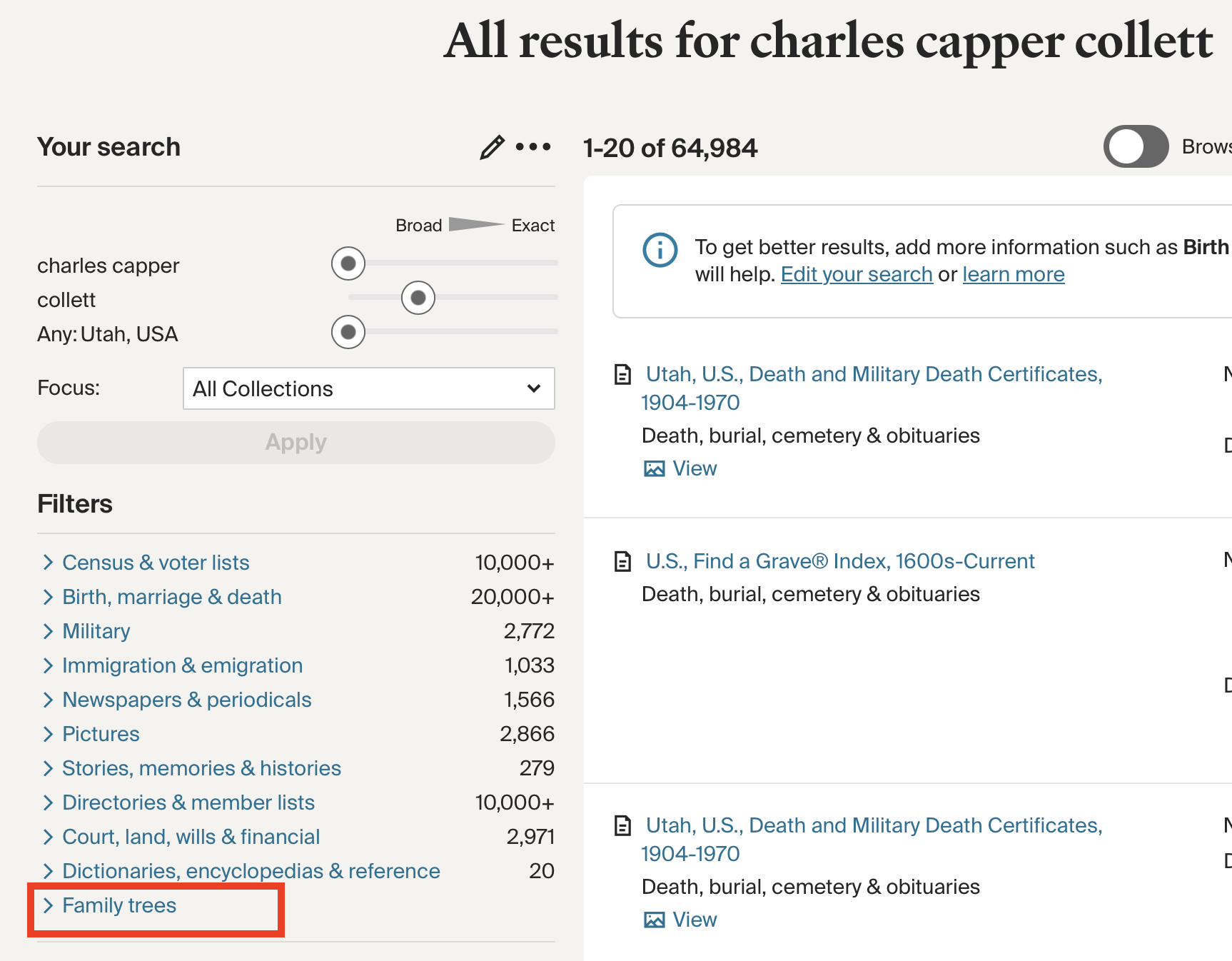
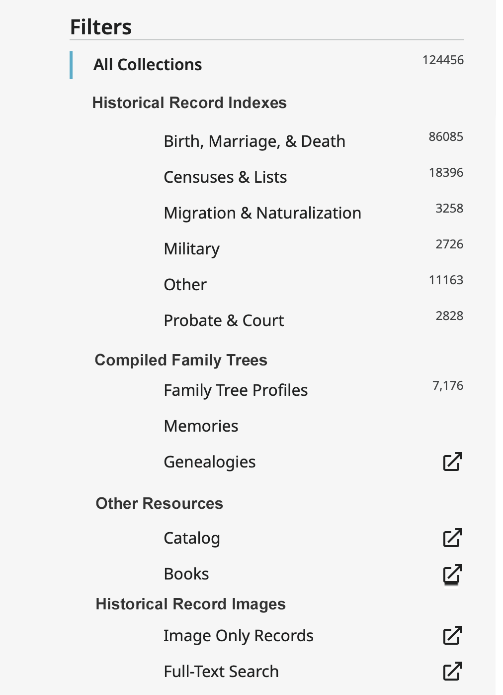
Maybe changing the result page to something like this could help with the confusion your patrons experience:
 1
1 -
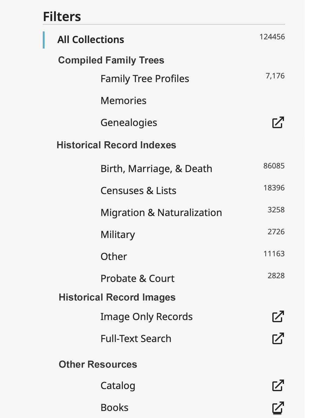
Actually, now staring at my above image, if I were in charge of anything, I would rearrange the order of results to match what I think most new users would find useful:
 0
0 -
@Gordon Collett I really like that layout! It's so much less intimidating then the current giant list of options. If there was anything I would change, it would be adding options to view all of the historical records, or all of the record images, etc.
One trouble with the current page is the "filters" can only be selected one at a time, so it's really just different options, not really filters. Combining this more organized layout and improved filter functionality would make this search MUCH easier to navigate and use in a meaningful way.
0
