Decreased clarity with the new design

As much as I appreciate new details being visible with the person change log, I struggle to understand why you decided to display the content in such chaotic way.
Previously it was easy to quickly scan the nature of the change (change type). Now the type and the details of the change are presented in the same place, with the same text size and weight, without any clear space.
The easiest categorisation that comes to my mind is simply:
- change type
- "before" state
- "after" state
- reason, date, author
In possibly horizontal structury, since it is natural for human to process it this way.
Of course this is my own perspective, so I'd love to know if you did Usability Tests before implementation.
Comments
-
I generally find style changes are not much of an issue. It just takes a few weeks to get used to them. But I'm never adverse to contributing to discussions about them. So here is the old Change Log:
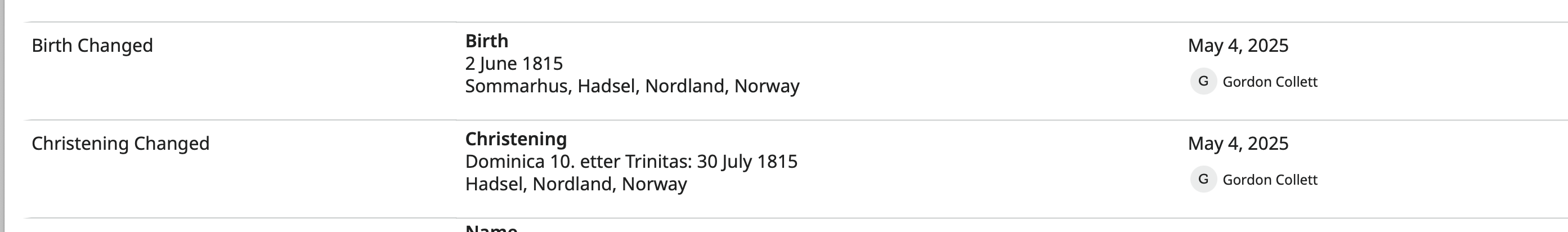
Here is the new one:
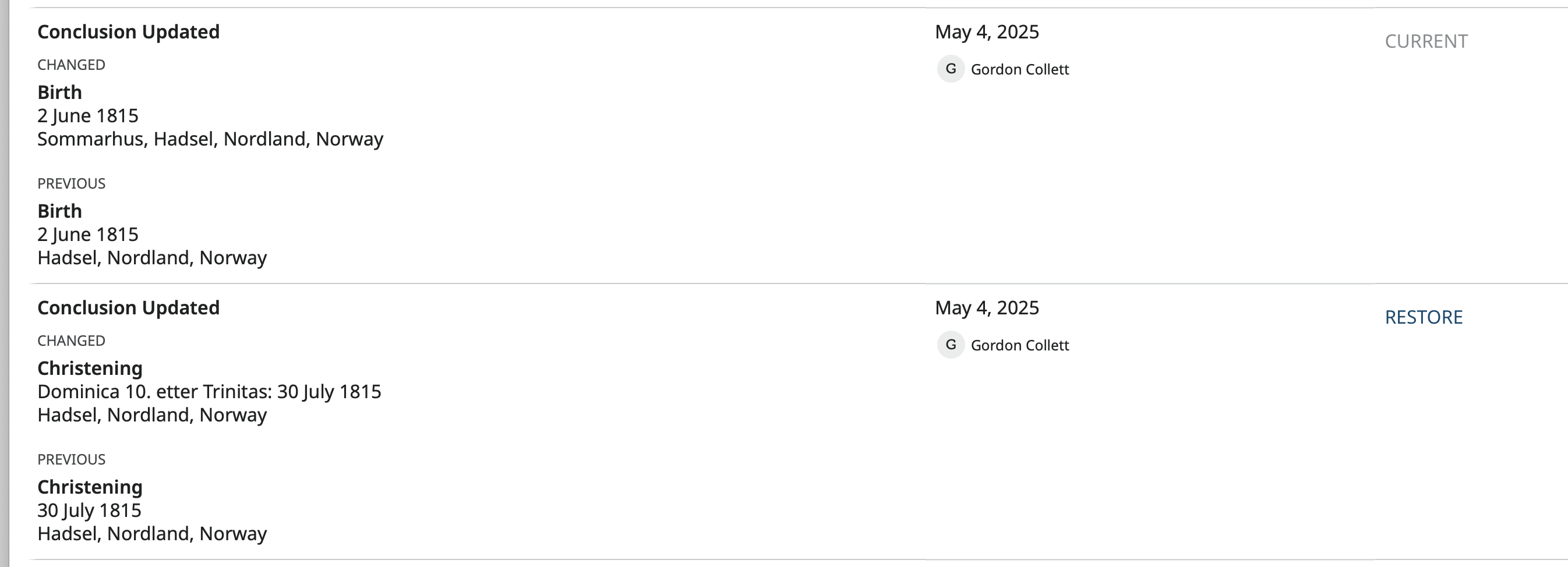
I can see the concern that having everything in a single column makes scanning the information harder. Also, one thing that I've not really understood or been too fond of is the change to "Conclusion Update." That statement really does not contain any useful information. The old statements such as "Birth Changed" did let you know right away what was being changed.
However, having Birth Changed, then Birth, then Birth seems rather redundant.
Then there is the subheading "Changed." You could argue that what comes after that was not changed. It is the result of the change.
So changing the heading to be informative, removing redundant statements, making the subheading more accurate, and indenting to allow a quick scan down the list looking at the types of changes but keeping the single column so that the format does not need to change as the browser window is narrowed, I came up with this in Photoshop:
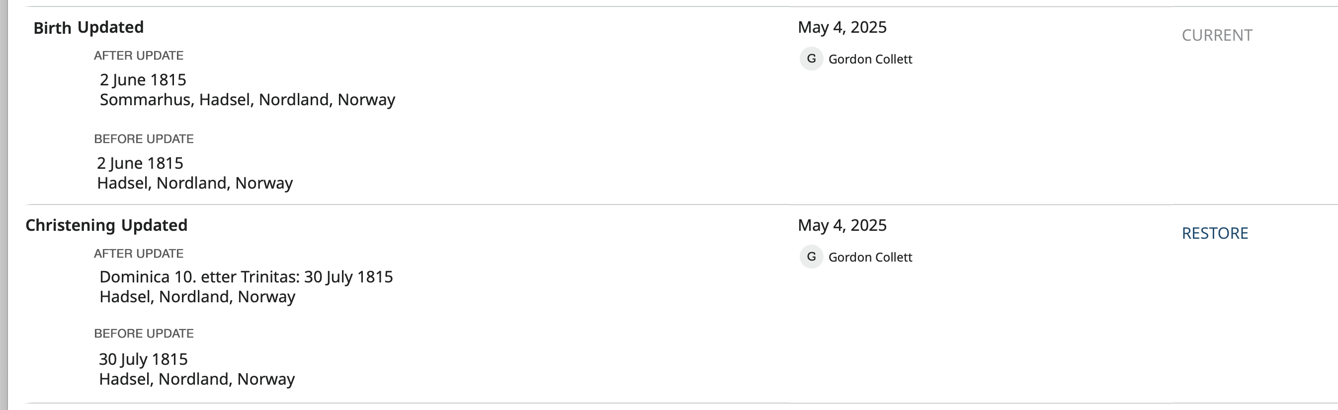
Does seem a bit more legible. I kind of like it, of course.
0 -
I like your suggested display, Gordon. Much easier to scan.
0