Sorely missing: the five drop-downs

It seems clear the new interface is meant to answer all needs among all users. This goal is too scattershot. Few new users will understand all the actiity available on the long, long, long landing page.
Your developers need to rethink clarity and simplicity.
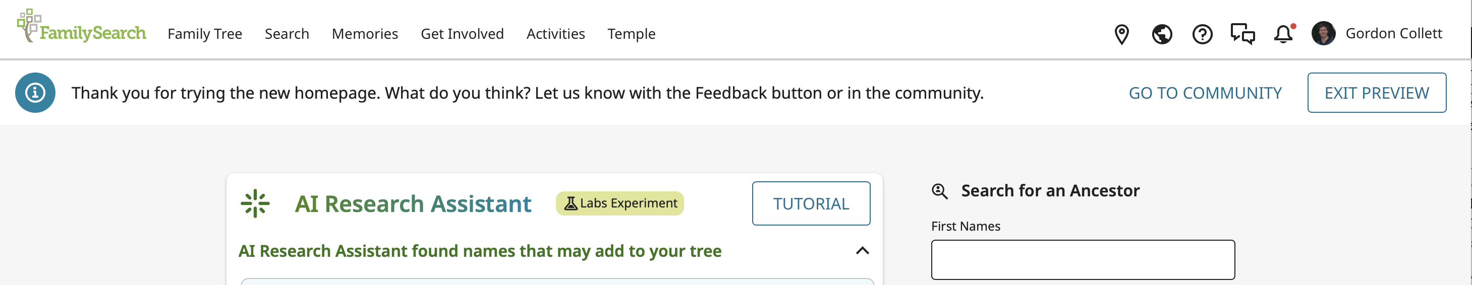
One of the most useful organizers of activity on the original landing page (as well as many other pages) is the top banner with simple text titles of five drop-downs and then several icons on the right for other activities.
I encourage your staff to reinstate the five dropdowns.

I use frequently the Search capabilities. I document my family, but I also assist other researchers who are active in nearby Sicilian towns. The dropdown is clean, crisp, and reliable. It gets me to find the record I need from the town my "client" is interested in.
In the new interface, that is impossible.
I've noticed while looking up the other comments about the new interface, staff responses are less than encouraging. I hope that any reply does not try to advise, for example, setting a browser shortcut or excusing the decision not to act on a heavy workload or an undesired return to a workable interface.
Comments
-
On the new homepage I see, that menu bar has always been present, still is, and is still on all the pages it has always been on:
You have apparently run into a bug. Many problems that arise with web pages are due to devices, operating systems, and browsers. If that is the case for what you are seeing, then the software engineers will need to know your device and model/version, operating system and version, and browser and version.
Sometimes to fix such things, you just have to clear history and cookies and make sure your browser is up to date. They only support the current version of the browser and the most recent past version.
1