New format is not good

I don't like the new format. Also, in the indexing it doesn't show how many records we have done for the month, it just shows for the day. Please change it back to the previous format. This format is not pleasing to the eye.
The previous format was better. Why change things that are working?
Comments
-
Thanks for the feedback @JKinikini-Tafisi - we appreciate the time you took to leave this suggestion. There is no plan at the present time to change this display. You can set a monthly goal and the system will show you where you are in relation to your goal for the month. In trying to answer your question, there are a number of reasons some things have changed including making the site more accessible/usable for users around the world. You can read about it in the FAQ's. Hope this helps!
0 -
Typical of the responses to user feedback about page design. >sigh<
Yes, why change things that are working? Interface design is not for brand-new S/W engineers.
1 -
What is not pleasing to the eye? What was better in the old homepage? What is wrong with the old one? In my opinion, there really isn't all that much of a change:
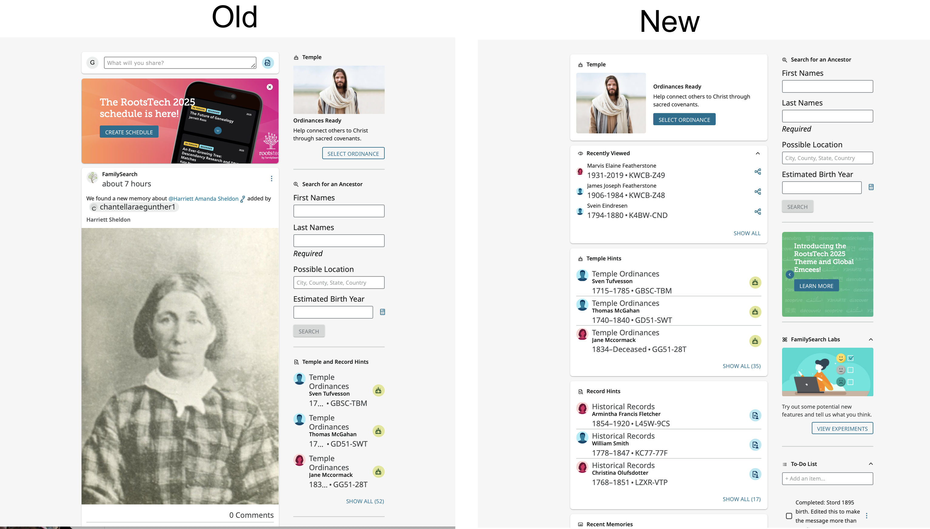
- The rotating announcement was moved from the top of the left column to low in the right column out of the way.
- Ordinances Ready was moved from the right column to the left and the general search thereby moved to the top of the right column.
- Memories have been shrunk in size and moved to the bottom so they don't overwhelm the page.
- Record Hints and Temple Hints have been divided into two panes so the can more easily be worked with separately
- The most useful item on the entire page, Recents, has been moved to be the second item in the left column where it is instantly accessible instead of low in the right column.
2 -
I agree that the new format is not good.
1. No way to add Widgets or explanation if that is possible and no Record Hints accessible.
2. Widgets should be moveable according to what the user prefers.
3. I really do not see any improvement in appearance.
0 -
Appreciate the time you took to provide this feedback @kayhaden1 - These formatting observations have been shared by others in the many comments. The reasons for the updates are included in the FAQ's for this page. Amongst them is the need to make the FamilySearch platform useable across the world and for people using primarily or only a cell phone. After using this platform now for several weeks, I can usually get to most everything just as fast as before. Hope this helps.
0